Forms are how your users sign up for events, subscribe to a newsletter, make a purchase, or request more information. All critical interactions for an organization. When something goes wrong, and users can’t complete a form, that’s where error messages come in.
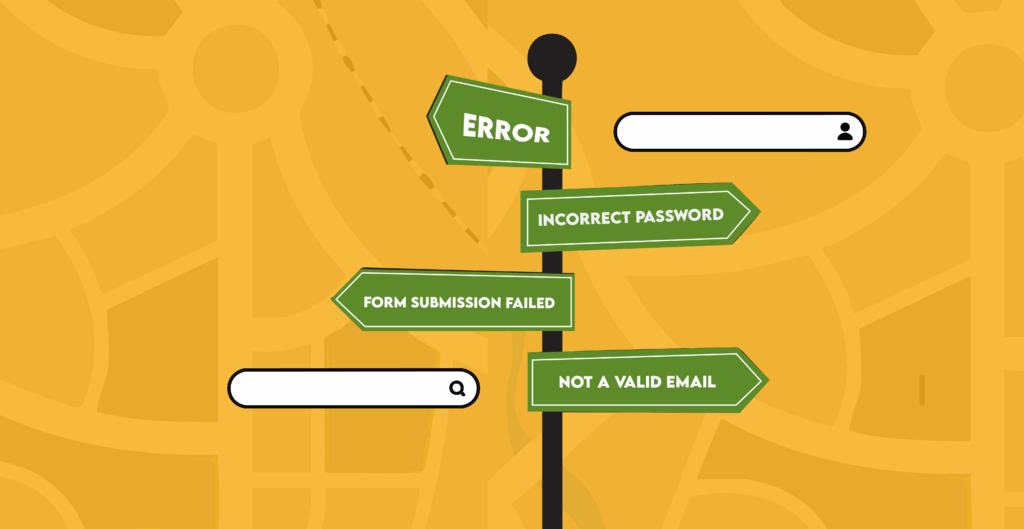
Getting stuck on a form can feel like being lost: frustrating, confusing, and enough to make someone turn back. That’s why your error messages need to act like a map, guiding users with clarity and reassurance, turning a moment of frustration into a moment of trust.
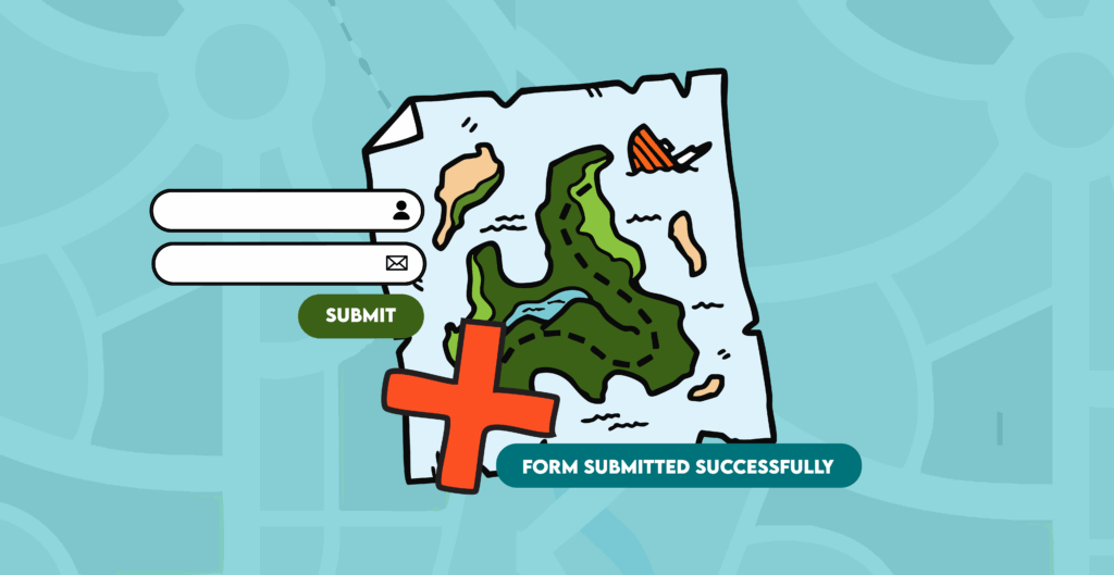
If we view a form as a map and a successful submission as the “X” on the spot, then building accessible error messages is about charting a clear path to our destination. In this article, we’ll follow that map step by step:
- The limits of browser defaults: Learn when to disable the auto-generated map.
- Error summary above the form: Add a legend so users know all roadblocks at a glance.
- Error messages inline with form fields: Put up signposts pointing users to the exact trouble spots.
- Combine color with symbols: Icons and text combined with color make the map easier to follow.
- Test your form: Make sure your map takes your users to a successful submission.
- The complete form: Our final destination. We’ll bring everything together with example code to show how an accessible form works like an effective map.
The limits of browser defaults
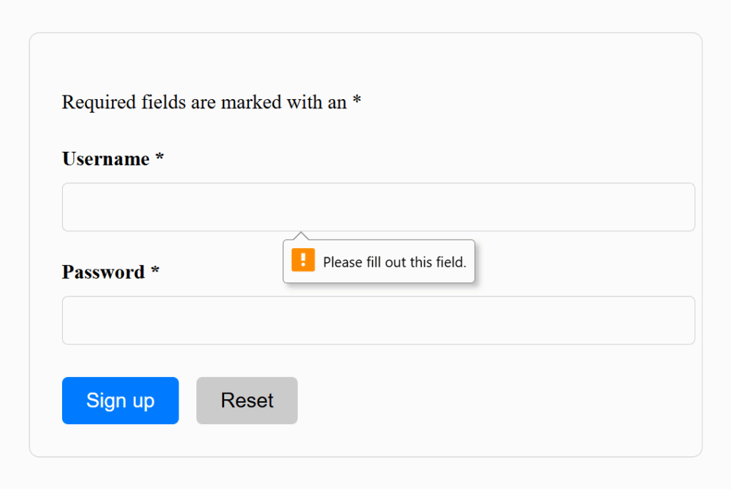
Most browsers pop up their own error messages automatically, but they often do more harm than good. You might see a generic “Invalid input,” a red outline, or both. The problem? A color-blind user can’t see the red outline, and a screen reader may not announce the message at all.
In the example below, we demonstrate what default validation of a required field might look like. The message, “Please fill out this field”, is vague. Plus, these default tooltips are not reliably accessible to those using assistive technology.
Here are some of the most common issues with browser-default error handling:
- Vague messaging: Many browsers simply say “Invalid input” or “Please fill out this field,” without explaining what’s wrong or how to fix it. Users are left guessing.
- Inconsistent appearance: Each browser displays its own style for form errors. This leads to unpredictable layouts or confusing visual cues.
- Poor screen reader support: Some default messages aren’t announced in a logical order, or aren’t connected to the form field, forcing screen reader users to hunt for the problem.
- Focus issues: Focus handling is inconsistent. Sometimes it focuses the user on the incorrect field, sometimes it doesn’t, and rarely with an explanation of what is wrong.
- Reliance on color alone: Browsers often highlight errors only with a red border. Users with color vision deficiencies or low-contrast screens may miss the error entirely.
Browser default messages are like an autogenerated map. They lack human considerations and design, meaning it might work for some users, but it’ll never guide everyone as well as directions crafted with inclusion in mind.
For more examples, see Adrian Roselli’s article Avoid Default Field Validation.
Code for disabling browser defaults
To disable browser defaults, add the novalidate attribute to the form element. This disables the browser’s built-in validation for the entire form.
<<form id="signup-form" novalidate>
...
</form>
You can still (and should) use input attributes like type and required. Even with novalidate, these communicate with assistive technology. Then, use your own validation logic to add clearer error messages, consistent visuals, and better focus handling than the browser defaults. The rest of this article covers the specific form elements and accessible code for them.
Error summary above the form
An error summary above the form lists all the issues a user needs to fix. It gives users an immediate overview, preventing frustration from guessing or scrolling, especially for keyboard and screen reader users. Each error in the summary should act as a shortcut, linking directly to the field with the inline error message.
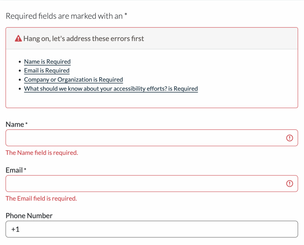
Think of it as a map’s legend: the summary tells you what the problems are, and the links guide you straight to where you need to fix them.
Next, we’ll break down how to code the top of form error summary into three steps: creating the container at the top, populating it with errors, and setting focus on the container after an unsuccessful submission.
1. Add a container for the error message
The top-of-form error container acts as a central hub: when validation fails, all error messages are collected here so users don’t have to hunt through the form.
To make this container accessible:
- Give it an “id” so your code knows where to put error text.
- Add tabindex=”-1″ so you can move focus to it programmatically when errors appear.
- Apply a CSS class for styling (red border, padding, background).
- Keep it hidden by default and show it only when errors exist.
- Include a heading with a visually hidden or aria-hidden icon for additional visual cues.
<div id="error-summary" tabindex="-1" class="error-summary" hidden>
  <h2 id="error-heading">
    <span aria-hidden="true">⚠️</span> Oops! There is a problem.
  </h2>
  <ul></ul>
</div>
2. Populate the summary with errors
Displaying errors in the container happens after server-side validation. Your code’s response should:
- Populate the top-of-form summary with a list of all current errors.
- Make each error a clickable <a> link in the summary that points to the corresponding input field.
3. Managing focus for error summaries
It’s not enough for the summary to just exist visually. You also need to manage focus so that users, particularly those using assistive technologies, are guided straight to it after an unsuccessful submission.
Some people use role=”alert” for this, which causes assistive technologies to automatically announce the error message when it appears. While that can work, it doesn’t actually move focus. This means a screen reader user might suddenly hear the alert but still be focused somewhere else in the form, which can feel disorienting.
There are two ways to handle focus: tabindex and using a fragment.
Managing focus with tabindex=”-1″
Our demo form uses tabindex=”-1″ to set focus on the top of form summary. Because it has tabindex=”-1″, we can use JavaScript to set focus to it.
When a validation error occurs, set the focus to the summary. This makes the summary both focusable and announced, and once users have reviewed the errors they can press Tab to move naturally back into the form.
Here’s the container HTML from above. Notice the tabindex=”-1″ attribute, which makes the error summary focusable:
<div id="error-summary" tabindex="-1" class="error-summary" hidden>
  <h2 id="error-heading">
    <span aria-hidden="true">⚠️</span> Oops! There is a problem.
  </h2>
  <ul></ul>
For more information on tabindex, see our article Tabindex: What it is, how it works, and when to use it.
Using a fragment to handle focus
Another way is to set focus by returning the user to a URL fragment (anchor link) after a validation error. In this setup, when the server re-renders the form with errors, it also appends a fragment to the URL that matches the error summary’s id. For example:
https://www.pope.tech/demo#message-widgetWhen the page reloads, the browser automatically scrolls to and focuses on the element with that “id.” This way, assistive technologies begin reading the error summary right away.
Error messages inline with form fields
Now, users have a clear legend of all their errors at the top of their form. They still need signposts that explain the issue at the field with the problem.
Inline error messages provide those signposts. They typically appear below the field that has a problem, giving users immediate feedback while they fix issues.
We’ll add these in three steps: adding the container for the error message, writing specific messages, and adding error handling logic.
1. Add the container for the error message
Before you can give users clear, contextual guidance, you need to set up your form fields and give each one a place for inline errors. Every input field gets a unique “id” so both the label and its error container can reference it.
<!-- Username field -->
<label for="username">Username *</label>
<input type="text" id="username" name="u" required autocomplete="username">
<div id="username-error" class="inline-error">
Here the error containers are “empty signposts” waiting to be filled after there’s a validation error.
2. Write specific error messages
Good signposts give the right amount of detail to get where you’re going. Tell your users exactly what went wrong and how to fix it. Here are three guidelines for writing helpful error messages:
- Name the problem clearly: Don’t just say “invalid.” Say what’s wrong and where.
- Explain how to fix it: Give clear steps so users know what to do next.
- Keep it short and friendly: Be concise, direct, and avoid blame.
| Field | Vague Error | Specific Error (Better) | Why It Works |
|---|---|---|---|
| Student ID | Invalid input | Student ID must be 8 digits (example: 12345678) | Tells the user exactly what’s missing |
| Date | Invalid date | Date must be in MM/DD/YYYY format | Gives the expected format |
| Password | Error | Password must be at least 8 characters | Clear requirement, no guessing |
| Credit Card | Declined | Card was declined. Try a different card or contact your bank. | Provides next steps |
| You entered your email wrong | Please enter a valid email address (example: name@email.com) | Fixes the problem without blaming the user; short, friendly, and clear |
3. Add error handling logic
After a validation error, your code should:
- Reset old error states. Any errors from a previous submission should be cleared so that screen readers don’t announce outdated problems.
- Keep anything already filled in. If they completed fields, those fields should still have what they entered. There are some exceptions with sensitive information like passwords.
- Check each field and display in-line error messages. Every field that fails validation should clearly show its own message right next to it.
- Mark invalid fields with ARIA attributes. Add aria-invalid=”true” to any field that fails validation so screen readers announce the error state. Also, add aria-describedby=”” to link the input to its inline error message. This way, when a user focuses on the field, they hear both the label and the error message.
- Reset those ARIA attributes on each submission. They should only exist when a field is actually invalid. Resetting avoids confusion and ensures users only hear current errors.
Combine color with symbols
Forms often rely only on color to show errors, especially with inline messages. A red outline alone isn’t enough, because not all users can perceive color differences. Adding an icon and descriptive text ensures multiple pathways to the same information.
In-line error messages should include:
- A red outline on the input field (visual cue)
- An error icon next to the message (non-color visual cue, marked aria-hidden=”true”)
- Descriptive text that explains the problem (essential for screen reader users)
We’ll define a class called .inline-error in the CSS to style all inline error messages consistently. Then, we add this class to the field with issues after a validation error.
/* Input and inline error styling for invalid fields */
    .inline-error {
      color: red;
      font-size: 0.9rem;
      margin-top: 0.25rem;
    }
input[aria-invalid="true"] {
  border: 2px solid red;
}
Test your form
Even clear code and messages can go off course without testing. Tab through fields, check focus, try a screen reader, and verify all cues make sense. Automated tools like WAVE help catch issues, and manual checks let you experience the journey as your users would.
Automated and manual testing
Automated tools like WAVE can help you get started by checking color contrast, labels, and basic ARIA usage. They’re a great first step, but won’t catch everything.
Manual testing is essential. Walk through the form as a user would:
- Keyboard navigation: Can users tab logically? Do errors receive focus in order?
- Screen reader experience: Are error summaries and inline messages announced clearly? Does aria-describedby describe the field accurately?
- Focus behavior: Does focus go to the correct spot after an unsuccessful (and successful) form submission?
- Color-only cues: Can someone with color blindness identify errors without relying on color?
- Message clarity: Are messages specific, friendly, and actionable?
Watch our videos on testing forms to get started:
- Test a form for accessibility checklist and demo (YouTube video)
- How to test your form for accessibility issues with the WAVE extension (video)
User test if you can
User testing, having real humans try your form, is the ultimate check, especially if you plan to use this form design throughout your website or app. Diverse testers using different devices, abilities, and levels of web savvy can reveal confusing spots you might have missed. If you don’t have access to a wide range of users, even a few friends or coworkers can help uncover bugs before your audience does.
By combining automated checks with hands-on testing, you can avoid sending your users into a maze. Think of testing as walking the map from your users’ perspective: tabbing, listening, and reading along the way to make sure no one hits a frustrating dead end.
The complete form
Let’s zoom out and look at the code all together. The form code below shows every accessibility feature working together as a finished guide. When validation runs, any problems are gathered and displayed in two places: a top-of-form summary that lists every issue, and inline messages next to each input. Both the summary and inline errors combine color, symbols, and text so users aren’t relying on one cue alone.
In our demo code, we simulate that workflow entirely on the client side. The showErrors() function takes the list of current errors from our JavaScript validation and dynamically updates the page. It builds the top-of-form summary, inserts clickable links that jump directly to each invalid input, and updates inline error containers with descriptive text and icons. It also applies accessibility attributes, like aria-invalid and aria-describedby, so assistive technologies announce the problem clearly. Finally, the function moves keyboard focus to the summary and scrolls it into view, ensuring that all users, regardless of device, are made immediately aware of the issues.
This approach mirrors what would happen with server-returned errors in production, but here we’re using JavaScript for demonstration purposes so you can see how the accessible flow works without needing a backend.
Pulling it all together
Thoughtful error messages help users understand what went wrong and how to fix it, reducing frustration and making the form easier to complete. Top-of-form summaries give a clear overview of all errors, while inline messages provide immediate guidance at each field. Using symbols along with color cues ensures that users with visual impairments can perceive errors too. Testing your form ensures these cues actually work in practice.
Accessible error messages build trust. They say, “We see you. You can fix this, and we’re here to help.” By designing your form error messages with inclusion in mind, you open your website to a broader variety of users. You’re building a map with your accessible form validation that demonstrates to your users that you care about their experience.