In this video, we define what manual testing is, demonstrate four basic manual tests, and show how to incorporate sampling strategies into your accessibility workflow.
To help you follow along, the transcript includes headings for each major topic we cover:
- Webinar agenda and housekeeping
- What is manual accessibility testing?
- Sampling for manual accessibility checks
- Manual testing demos
- Manual testing workflows
- Wrapping up
Transcript
Whitney Lewis: Okay, we’re going to go ahead and get started. We’re glad everyone’s here. Thank you for chiming into the chat and letting us know where you’re from and why you’re here.
Okay, so to get started, I’ll just introduce our team. My name is Whitney Lewis. I’ll be the main presenter today, and I’m a web accessibility content creator at Pope Tech.
We’ll also have Jay Pope present a little bit for us today, and he’s a web accessibility specialist at Pope Tech.
And we also have Mark Pope with us today. He’ll be helping us out on the chat. And he is also a web accessibility specialist at Pope Tech.
Webinar agenda and housekeeping
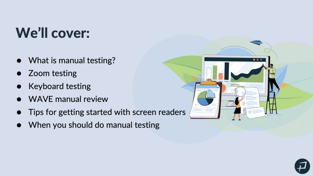
Whitney Lewis: Today we are going to cover, “What is manual testing?”
We’re going to cover three, well, four different types of manual tests. So, zoom testing, keyboard testing, a wave manual review. So that’s with the free wave extension. Tips for getting started with screen readers and when you should do manual testing. And that part’s really going to cover how you can incorporate manual testing into your workflows.
Whitney Lewis: A few housekeeping items before we jump into our content. Live captioning is available. And Mark just put that into the chat. So, that is an option if you would like to use that. This webinar is being recorded. The recording has started. After the webinar, we’ll send an email with a link to the recording. We’ll have a link to the slides, a feedback survey, and a chance to try Pope Tech’s built-in manual testing for free, along with our automated testing results if you’re interested in giving that a try. So, we’ll send that no later than tomorrow.
What is manual accessibility testing?
Whitney Lewis: Okay, let’s get started.
So, what is manual accessibility testing? So, you can let us know in the chat, what are different ways to manually test accessibility? Why does manual testing sometimes seem intimidating? And I’d love to see your thoughts in the chat.
Manual testing equals time. Yes. Definitely time is a resource we think about when we think about manual testing.
Making sure you can reach everything with the tab key. Keyboard testing. Yes, we are going to talk about that today. Keyboard, keyboard, keyboard. Yes.
Using a screen reader. Yes, I think thinking about screen reader testing is very common when we think about manual testing but not knowing how to operate one. A screen reader can come with a learning curve, and understanding am I using the screen reader correctly or is something wrong with my website can be part of that learning curve.
Knowing what you’re actually looking for in testing, using assistive technology to evaluate, these are all great answers. And yes, we’re all right on the nose.
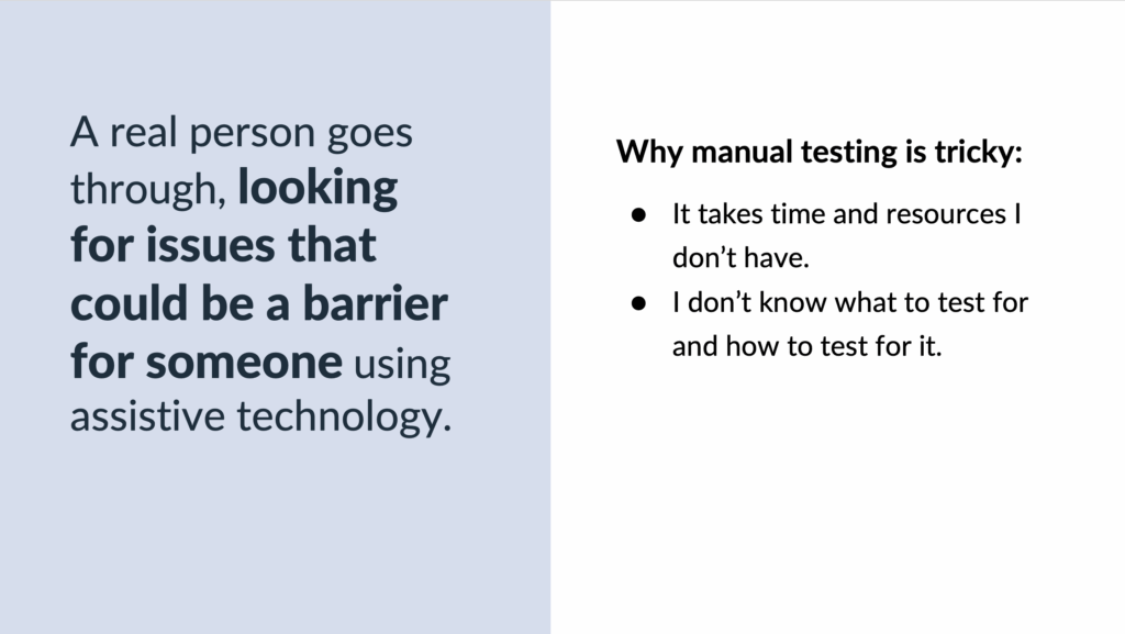
So, manual testing: it is a real person, goes through looking for issues that could be a barrier for someone using assistive technology. So, a real person is looking for issues that could be a barrier for someone using assistive technology. That’s what manual testing is at its core.
Why it’s tricky? We saw this in the chat. It takes time and resources I don’t have, and I don’t know what to test for and how to test for it. So, there’s the time and resources and then there’s the knowledge to do it. And hopefully, in today’s presentation, we can kind of bust some of those struggles with manual testing and help make it more approachable today.
Whitney Lewis: So, which one of these is a manual test? And you can let us know what you think in the chat.
- A third-party organization completes a comprehensive accessibility audit using real people to test web pages.
- A content writer checks images and graphics for appropriate alt text and contrast issues.
- A developer runs a quick test with zoom tools to make sure no content overlaps at different zoom levels.
- A website manager uses automated accessibility tools to help guide them through checking their website’s template for issues.
- A developer uses a screen reader to go through a custom widget they’re adding to the homepage.
Yes, all of them. Thanks for humoring my trick question. All of these are manual tests.
And the idea here is your manual tests, they don’t have to be extensive manual audit for them to be a valuable manual test.
So, on this slide where we talked about A through E, there’s a zoom test, there’s checking for images and graphics, there’s using automated tools to help you with your manual testing. It’s not always looking at every single success criterion and doing every single manual accessibility test.
Sampling for manual accessibility checks
Whitney Lewis: So, it doesn’t have to be an extensive manual audit for it to be a valuable manual test. So, I want to make sure that you leave remembering that. And what’s going to help us with this is sampling. So, meet your manual testing best friend and that is sampling.

Whitney Lewis: So, this is how you are going to combat the time and the resources issue. So, we still need that knowledge, but we’re going to get a lot of that here today.
So, sampling means we’re picking parts of your content to manually test. It can be parts of the content, but it also can be picking specific manual tests. And we will talk about different samples that we can do.
A quick side note, manual and automated testing are going to be better together. And it’s because of that, they both do really good at specific samples. So, a strong accessibility strategy uses sampling to incorporate both automated and manual testing strengths.
So, automated testing, it’s really good at testing every page, but only for issues that are programmatically detectable or only for issues that a computer can find. So, this means less issues when you manually test. That’s the sample automated testing is really good at. It’s really good at all the pages and for certain results that a computer can find.
Manual testing, on the other hand, it finds issues automated testing can’t and can determine the impact of those issues. But we typically can’t test every single page because of the time and resources dilemma that we typically have.
So, the two samples of automated and manual testing really work together very well. And let’s talk specifically about some manual testing samples. So, our world, typically we’re going to live in this partial manual audit, side of the continuum. And some examples of samples for partial manual audit, you can focus on specific results.
Whitney Lewis: So, for example, testing all images and just focusing on image results, or testing like they’re alternative text and making sure it’s appropriate. Or you could just focus on issues in the main content versus issues in the website template. So, that might be the header and the footer, or everything that stays the same. So, you can sample by focusing on specific results.
Focusing on specific pages. So, for example, instead of testing every single page with manual testing, maybe you focus on four different pages: the homepage, a complex page, a key user flow and a random page. And that can still give you a lot of insight into manual testing issues that you would find on your website and can fix really throughout the website.
Another sample could be only doing certain tests. So, for example, doing a WAVE review, or zoom and keyboard tests. So, maybe you don’t do every single test, every single time. So, sampling is really powerful because you are going to pick how you want to break up that manual testing to make it approachable and doable in your workflow. And we’ll talk about at the end some specific samples and how you can incorporate those into your workflow.
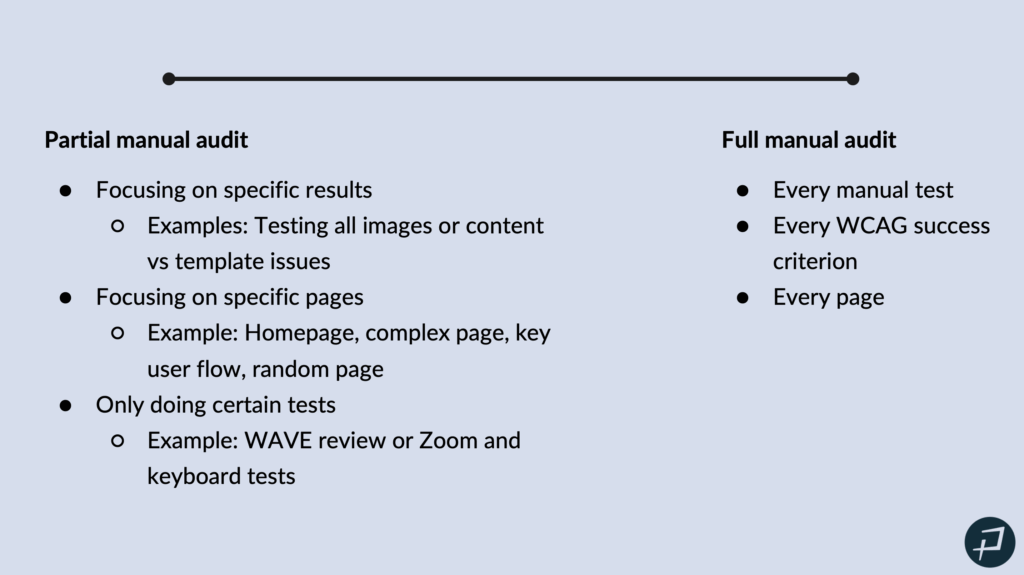
Okay. And then on the other side of the continuum, we have that full manual audit. And so, that full manual audit is every manual test, every WCAG success criterion, on every page. And that’s typically for a lot of organizations is going to be like a third-party manual audit that you outsource to an accessibility company that does that.
So, we’re living on this partial manual audit side. And then remember, all of these are valuable manual tests that are worth doing and adding to your workflow. And they’re also actually possible in the time and resources that we talked about.
Manual testing demos
Whitney Lewis: Okay, so we are going to jump into actually talking about what these manual tests are with some demos of how to do them.
Zoom testing
Whitney Lewis: So, with zoom tests, there’s two tests that we’ll do when we’re doing a zoom manual test and that is zooming in to 200 %. That’s the first test. And the second test is to adjust the viewport to 1280 pixels wide and then zoom to 400%.
And what we’re testing for here, we don’t want any overlapping content. We don’t want any horizontal scrolling for the page. Horizontal scrolling can be okay for tables and things like that, but for the entire page, we don’t want horizontal scrolling. And then just making sure the content is readable and usable.
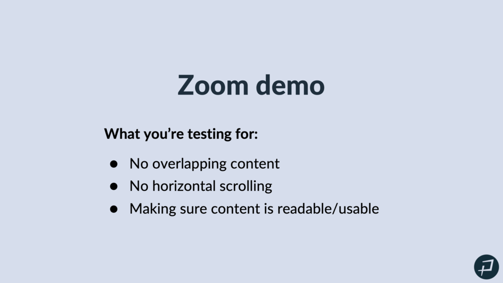
Whitney Lewis: So, this is really checking the reflow of your page, and I mean you’re basically going to see how your website works responsively, but oftentimes it reflows when users who need to zoom in to read the content. When they zoom in, it reflows much how it would for your mobile responsive view.
Okay, so we are going to do a demo of these two zoom tests.
200% zoom test
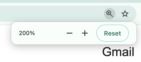
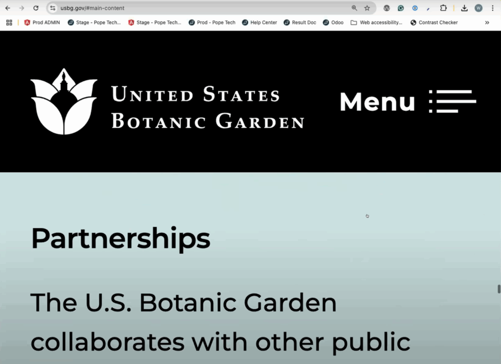
Whitney Lewis: Okay, so I’m going to exit out of the presentation and I’m going to go to the United States Botanic Garden website. And I am on Chrome. And for that 200% zoom test, I’m just going to select Command or Control if you’re on Windows, and then select my plus key until I get to 200%.
Whitney Lewis: From here, all I need to do is scroll through the webpage and check for the demo full screen. Does the demo look full screen for everyone? Awesome. Okay. Okay, thank you. Awesome.
So, I zoomed into 200% and all I need to do now to check for overlapping content, and I’m checking for that horizontal scroll. I just need to scroll through the page. So, this is pretty simple. I do want to make sure I check the menu navigation as well. So, I’m going to open that and just scroll through and look through here and make sure nothing’s overlapping. Everything is readable.
And now, I’m just going to start scrolling through the page and really everything is looking good. I don’t see any overlapping content. This looks good. This carousel with the images, I can see all the images, and that’s all I’m going to do. I’m just going to scroll through and make sure none of the content is overlapping. Okay. And that all looked good. There was no overlapping content. Everything was readable. Everything looks like it re-sized properly. And that is my 200% zoom test.
400% zoom test
Whitney Lewis: So, now I need to do my 400% zoom test, at 1280 pixels. So, it’s important to make sure your zoom is back at 100%. So, I’m going to go back to 100%. And now, I need to get my screen size to 1280 pixels. So, I’m going to right-click and select Inspect. And when Inspect is open, when I resize my window, I can see up in the top right, how many pixels it is wide. And so, right now, I’m at 1654. So, I got to go a lot smaller to get to 1280. And there we are, at 1280. So, now I’m at 1,280 pixels and I can close my Inspect.
And now I want to zoom in to 400%. So again, I will zoom in to 400% using Command or Control-plus and now I do want to make sure I check the menu again. The menu looks good. It looks like it reflowed well. And I do want to point out, I’m on a large screen right now.
Typically, these sticky headers, they start to pose an issue at these 400%. It’s not terrible on this large screen, but on like a laptop size screen, this sticky header cuts off at like the halfway mark of the page. And that would be an issue because it’s going to make it really hard to read the content.
Whitney Lewis: But again, I’m just going to scroll through and make sure everything reflowed. There’s a little bit of horizontal scrolling. You’ll see if I move my cursor from left to right, there’s a scroll bar at the very bottom. So, there’s a little bit of horizontal scrolling.
And I’m going to go through this carousel. In this carousel, as I start to go through it, you’ll notice that that’s where the horizontal scrolling is. Some of the content starts to get a little bit cut off, but it’s not too bad on this large screen. I do think it would be worse on a smaller screen size. And so, again, that’s all I need to do.
I just need to scroll through the page and make sure nothing’s overlapping. And so, I might, the horizontal scrolling and the sticky navigation at the top and then that carousel where it was cut off a little bit, I know on a— again I’m on like a very large desktop screen. I know on like a smaller laptop that would be an issue. And so, I’d probably log those, so that development could look at that and we can make it a better experience at this zoom level.
Zoom testing questions
Jay Pope: Hey Whitney, there’s a couple questions. I’m just going to clean up a few things in the chat. So, as Whitney was zooming in, in the top, in the browser, it would say the zoom level. So, that’s where you can see it. It might depend on your browser. At the very top, there’s a black box that says 200%. And you can also open up your dev tools and go to a specific. So, you right-click and Inspect and go to a specific zoom level, too. So, maybe that will be helpful.
So, another thing, like there was a question on what’s the solution. Today, we’re not necessarily going over all the— we don’t have enough time in an hour to teach all the accessibility principles. But one of the things there is you want to have relative containers. So that and let text wrap. So, if text can wrap to a new line, as it gets smaller, you can use media queries to potentially make it smaller. If you have one word that would be bigger than, but that would also be bigger than a phone, too. And so, you’re probably causing both accessibility issues and issues for anyone on a phone.
There was another question, if you can apply these to other things on a website. So, yes. These same things would be applicable to any web apps, like a Canvas course or like you’re in an LMS. Anything on the web, right? And similar principles are applicable for mobile apps, but the way you would test them would be a little different. Today, we are talking about testing on a web app or a website. So.
Whitney Lewis: Awesome. Thanks, Jay. Okay, we’re going to now— Jay, there’s a quick question in the chat you might be able to answer in the chat.
Jay Pope: Yes, so what if it goes to 400% on a mobile version? So, there is a specific rule, like a specific WCAG or WCAG success criteria. And so, that is the standard, and it does say at 1280 pixels, being able to zoom in.
But the same kind of principles apply that if you’re making things relative, it’s going to be a lot more flexible. You’re not in fixed height in pixels and the content can go outside the container. So, the same principles are going to apply and they’re going to help even beyond what the success criteria is. But there are specific rules that are defined for WCAG, specifically. But yes, if you follow those principles, you’re going to be better off for everyone, even outside the specific rules, if that makes sense.
Whitney Lewis: And if it goes to the mobile version at 400%, I would say that’s common because when you’re at 400%, that’s basically what your mobile version would look like, if that’s what you’re referring to.
Jay Pope: I actually think that is what they were saying, and I misunderstood. So, yes, if you start at 1280, it basically triggers the media query, and you will end up showing the mobile version. And so, that’s a great test. And like Whitney said earlier, if your website is responsive, then a lot of this is you’re just double-checking there’s no issues with your responsiveness.
Whitney Lewis: Awesome. Great question. Okay, awesome.
Keyboard testing
Whitney Lewis: We’re going to move on to keyboard testing. So, this was a common one people thought about with manual testing. Some of the keys we’re going to use in keyboard testing is
- Tab to navigate down the page
- Shift+Tab to navigate back up
- Enter to select a link or button
- Space Bar to select like a radio button checkbox or drop down
- Arrow Keys to help navigate interactive elements. So, those arrow keys help you navigate if you’re in a form input or something like that.
- Escape to close a dialog box or a modal.
And yes, Tab is only on interactive elements. So, when we do the test and we tab down the website, you’ll see that we are jumping from links or form inputs or navigation items, because it’s just going to different interactive elements.
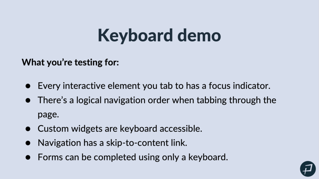
Okay, so what we are testing for in a keyboard demo: Every interactive element you tab to has a focus indicator. So, a focus indicator is what visually shows where the keyboard is on the page. And we’ll see that in our demo and I’ll point that out.
There’s a logical navigation order when tabbing through the page. So, the navigation order, it shouldn’t jump around the page. It should follow the reading order of the page. So, if you have two columns, it should go down the first column and then go to the second column, not be jumping back and forth.
Custom widgets are keyboard accessible. So, everything should be able to be done using only a keyboard.
The navigation has a Skip to Content link. That can be really important with keyboard accessibility, because if there’s so many super-long or big navigations and someone has to tab through the entire thing, that can take a lot of time. And then forms can be completed using only a keyboard.
Whitney Lewis: So, the moral of the story with keyboard testing, everything can be done with only a keyboard. Okay. And we are going to do a keyboard demo.
So, I will exit out of our presentation and I’m going to go back to the United States Botanic Gardens website, and I’ll go back to 100% zoom and the top of the page.
Starting keyboard testing
Whitney Lewis: When I keyboard demo, I like to click into my URL in the address bar just to make sure I start outside of the content and then I can tab in. And the first thing I notice when I tab, there’s a Skip to Main Content link which is great. That’s going to make it so I can skip the navigation. And if I select that, it takes me to the main content. So, I have a working Skip to Main Content link there.
So, I’m going to scroll back and actually go back to my address bar just so I can keep tabbing, because I do actually want to test that navigation. So, right off the bat, right now you can see my focus indicator is a dashed white line around the logo in the top left. So, that’s my focus indicator.
Focus indicators, they do have some requirements. So, really important is that visually you can see them. And so, they do have some contrast requirements to make sure visually they stand out on the page. So, that white on black, that looks great.
So, for keyboard testing, it can be as quick as five minutes. I’m literally just tabbing through, making sure everything works. And with this navigation, I’m going to select Enter and then start tabbing through it to make sure this all works. And it looks like I’m able to get everywhere.
I’m not going to go through every single one for this demo, but if you were testing, you would want to make sure that you tested the entire navigation. So, I’m just going to keep tabbing through. I’ll press Enter to select things. And it’s looking good, so far. Right now, it wants me to close this navigation. There we go.
Okay, so now I am in the carousel. And I have a white dashed line focus indicator on one of the buttons. On the arrow button to move the carousel, I’ll press right. And that looks like it’s working well. That white focus indicator, it could lose its contrast requirement depending on the image that’s behind it. So, that could make it hard to see sometimes.

Whitney Lewis: But again, it’s just tabbing through the page. If you have a form on your page or something like that, you will need to make sure you’re making sure that form works. So, you’ll probably use more than just the Tab key to go through.
We are now in the YouTube embed. So, when it comes to embeds, if you don’t have control to change that focus indicator, that’s actually called out on the focus indicator appearance success criterion as something that you wouldn’t fail for. But if you do have control over it, then you are responsible for it.
And so, I’m just tabbing through. Right now, is that blue focus indicator in the social media embed. Otherwise, this is looking good. My focus indicator didn’t disappear. I was able to tab in a logical order. You’ll notice in these columns, I went down the column and then to the next column, and everything I checked, some interactive elements, and everything was working, as expected.
Okay, so that is keyboard testing.
Okay, next we’re going to talk about WAVE manual review. So, WAVE is a free manual automated testing tool, but you can use it to help guide a manual testing review. This is one of my favorite ones.
Keyboard testing questions
Whitney Lewis: In the chat, do you have an example of these things failing? We can pull up some examples at the end of some non-examples. But we could also send some out in the email after. And it would just be a quick tab through.
Jay Pope: One of the most common things is you just can’t get to content. So, without using your mouse, you can’t do something, or you can’t get to something. That’s a clear failure. So, now someone with a disability is not able to do this. So, Whitney now, just went to weather.gov and is showing some examples here.
Whitney Lewis: So, this one I kind of like because I’m just holding Tab right now and there’s actually this map of the United States and you can see the focus indicator going wild on it. While I am able to tab to everything, this to me, it seems like an issue, because I think as a keyboard user, I would want the option to skip that. And right now, I’m pressing Tab and I can’t see the focus indicator on the page. It disappeared and now it showed up on that America Samoa link. So, those are type things that I would want to log as issues.
Jay Pope: So, you can’t access something, something’s difficult to access, or there’s no visual indicator, there’s no focus indicator of where you’re at. So, those would be examples of failures.
Whitney Lewis: Yes. Awesome. Great question.
WAVE testing
Whitney Lewis: Okay, I’ll go back to our WAVE manual review. So, the free WAVE extension, it can help you do a manual testing review and it can kind of act as a guide.
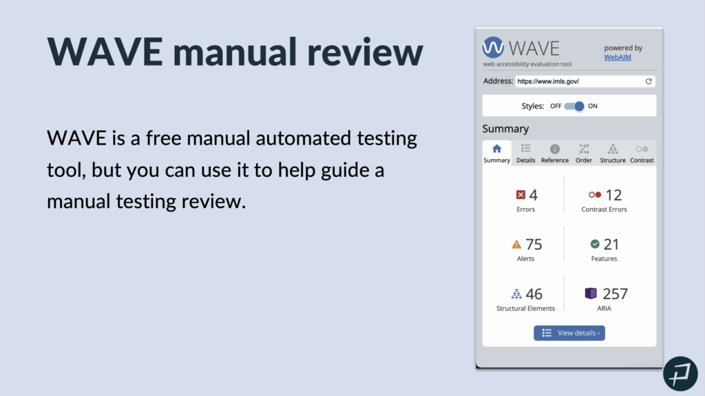
Whitney Lewis: So, what you’re testing for, when I’m doing a manual review with WAVE, the main areas I’m focusing on are
- Feature results in ARIA, which we’ll take a look at when we do the demo
- Order tab
- Structure tab
- Contrast tab
Sections of the WAVE tool
Whitney Lewis: So, we are going to go to a different website. We’ll actually go to the Bureau of Land Management website. And I already have the WAVE extension installed. So, I’m just going to select it and to activate it. And it pulls up on the left side of my screen and it starts on the Summary tab which is just going to give me a summary of my results.
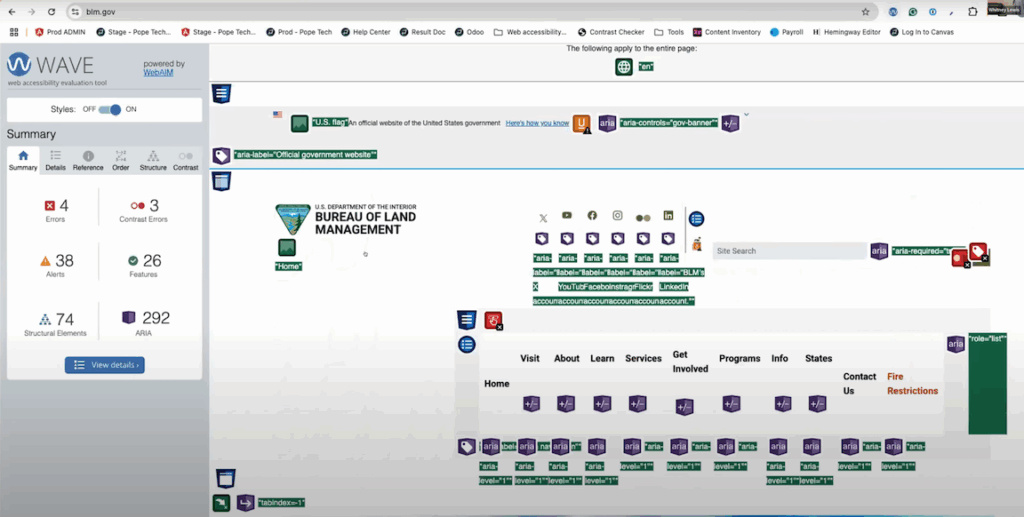
The first thing I’m going to go do is go to my Details tab. Now, Errors, these are things that the automated testing is really good at finding out. So, we’re not going to talk about these errors today, because we know those are issues. Those should be logged. Automated testing is good at finding those. So, I’m going to select that checkbox just to remove them from the page, to declutter our view a little bit.
Contrast Errors is another one that automated testing is good at finding. So, I’m going to uncheck those.
Alerts is where I can start to use WAVE to kind of do some manual accessibility testing. It’s going to point out things that are probably issues that I need to check and confirm. And if they are issues, then log them in our project management software so that they can be addressed and prioritized.
Especially this long alternative text. Sometimes, long alternative text is needed. Most of the time it’s not. And actually, in this case where the image is just this kind of decorative for a blog post. I don’t think it needs to be this verbose. So, I can look at that and then rewrite it to be more appropriate. So, that helps me identify places where I do need to manually review it to make sure it’s appropriate or not.
But I’m going to turn Alerts off because those probably are issues that automated testing is pretty good at finding. And we’re going to go to the Features section.
So, the Features section, these are things that should be helping you, accessibility-wise, but it’s important to make sure that they are being done correctly and actually helping you. So, this is where it can help you do a manual review. It’s finding every instance, this first one, the alternative text. It’s finding every image on the page and it’s going to tell you what the alternative text is, making it really easy to go and review it and make sure it’s appropriate.
Whitney Lewis: It’s finding your skip link, making sure that it’s working, helping you make manually test that skip link.
It’s finding your language up here at the top of the page. So, I can make sure my language is actually correct.
So, these things help you do quick manual tests of a lot of different things, helping pinpoint it so you can quickly check it. So that’s Features.
Structure, I’m going to talk more about in the Structure tab. So, I’m going to uncheck that.
WAVE testing and ARIA
Whitney Lewis: The next one that’s really important is ARIA. So, I would say that every website at some point should check all of their ARIA. ARIA is a big one. No ARIA is better than bad ARIA.
ARIA is meant to make your website more accessible when it needs to be. So, it’s HTML that you can add to your website to help with accessibility. That’s what ARIA is: HTML you can add to your website to help with accessibility. If used incorrectly, it can actually make your website less accessible.
So, the power of the WAVE extension right here, is it shows every single ARIA instance on this website. So, a developer can go and review these and make sure it’s being used appropriately, make sure it’s being used in a way that is actually helping accessibility. So, that’s really powerful. It just finds every instance for you to make that review a little bit easier.
Okay, we’re going to go to the Order tab. I love the Order tab because it’s going to give you a sneak peek into your keyboard and into your screen reader testing. So, the Order tab shows you the order of the elements on the page, which is the order that you tab through them. It tells you the role and then it tells you the accessible name. The accessible name is so important, because that’s what’s announced by a screen reader. So, it’s going to tell you this for all interactive or navigable page elements that are on the page. So, it’s just an easy way to check your order or check your tab order. And then it’s a great way to check your accessible names.
So, this third one says Button, Here’s How You Know. And then included in the accessible name is actually some incorrect ARIA. ARIA-controls=”gov-banner”. So that’s an issue. That’s a wrong accessible name. And assistive technology, a screen reader would actually announce it just like that.
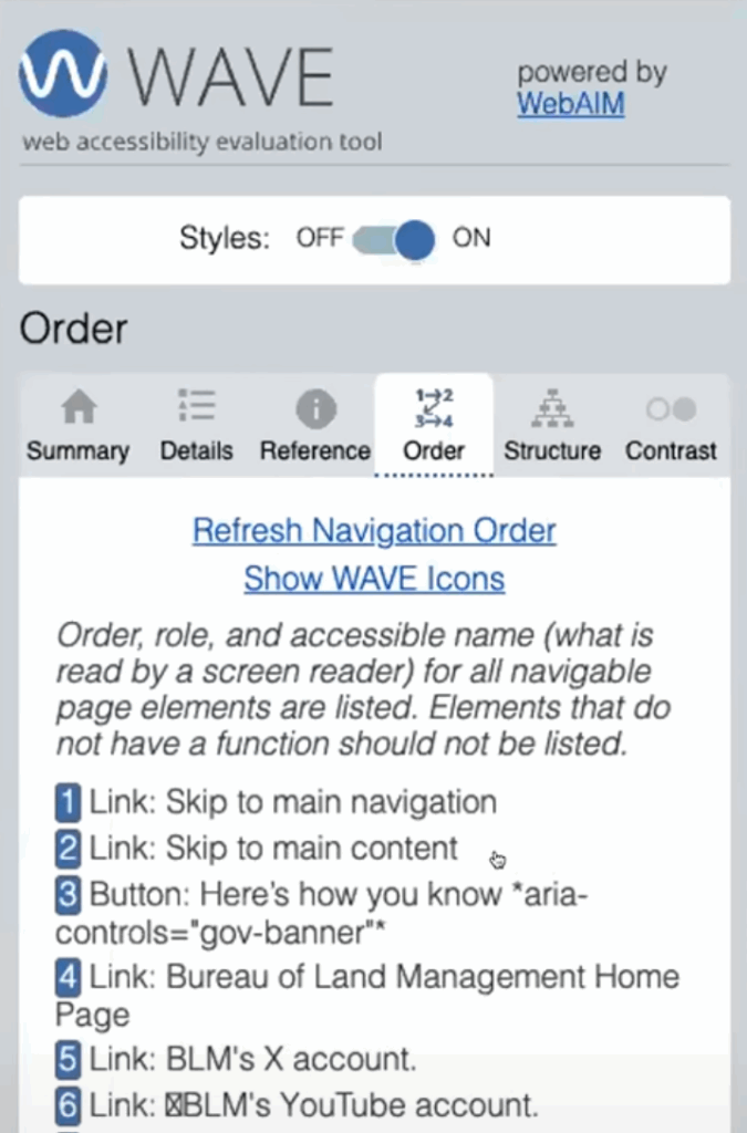
Whitney Lewis: So, this is a really easy way to just scroll through and make sure all of your accessible names are correct. Quickly check the order of your page, and it just gives you that sneak peek into screen reader testing, which is really great.
WAVE tool: Structure tab
Whitney Lewis: The Structure tab, this is going to show you the structure of your regions. So, your regions, your HTML-5 regions, are things like navigation, header, their main content area, any regions that you use, and your footer.
And then it will also show you your heading structure. So, depending on if you’re a developer or a content writer or what your role is, you might look at both. You might focus on one or the other. But these are really important to make sure that they make sense and they’re in a logical order, because screen readers use these to navigate a page. So, I would do a quick check and just make sure my heading structure looks correct here.
This heading, Bureau of Land Management Seeks Public Comment on the Draft, and it keeps on going for like four lines. This is a heading three. That’s not a proper heading. That’s paragraph text. And I can see that really quickly in my Structure tab. So, this is just a great way to help you manually check your headings to make sure they’re logical.
WAVE testing questions
Whitney: Isn’t 294 ARIA labels on a single page too much? Probably. That does seem like a large number to me.
Jay Pope: So, there is no definitive number. Right? ARIA just needs to be used correctly. So, if it was all used correctly and it was making things better, then awesome. But if it’s not, and in this case there’s a couple things that jump out that probably don’t need ARIA. They could be just done with native, just HTML. And so, that would be a better path and it would be cleaner and you have to test less and it’s more maintainable and be more accessible. So, yes. It can be a signal when there’s too much ARIA, that there are issues underneath, but it is possible that it actually is used correctly and there could be a lot of it.
Whitney Lewis: That’s a better answer. Thanks, Jay.
Quick question on the Order tab. Confirming the text in the left column for order is how screen readers will say it. Yes. So, it goes order and then the role. And then after the role, there’s a colon, this content. So, skip to Main navigation. That’s the accessible name that screen readers announce. Great question.
The last tab we’ll talk about is this Contrast tab. Mark sorry, go ahead.
Mark Pope: No, I was just trying to sneak in. I thought I had the pathway there. There was a question a little bit earlier that happened in the Q and A that I think we want to get on before too much. It was just saying that “Is it okay to leave out the Alt text for images like that which don’t really add any useful information?” So, they’re talking about decorative images, and you can mark an image as decorative. And so, instead of putting alternative text in there, it would be alt=“”. But it must have the alt=”” in there to mark it as decorative. So, we’ve got great resources on images and that, but since we’re talking about WAVE and that’s where it came up, I didn’t want to wait too long before I jumped in on that one.
Whitney Lewis: Awesome. Thank you, Mark.
Mark Pope: Yes.
WAVE tool: Contrast tab
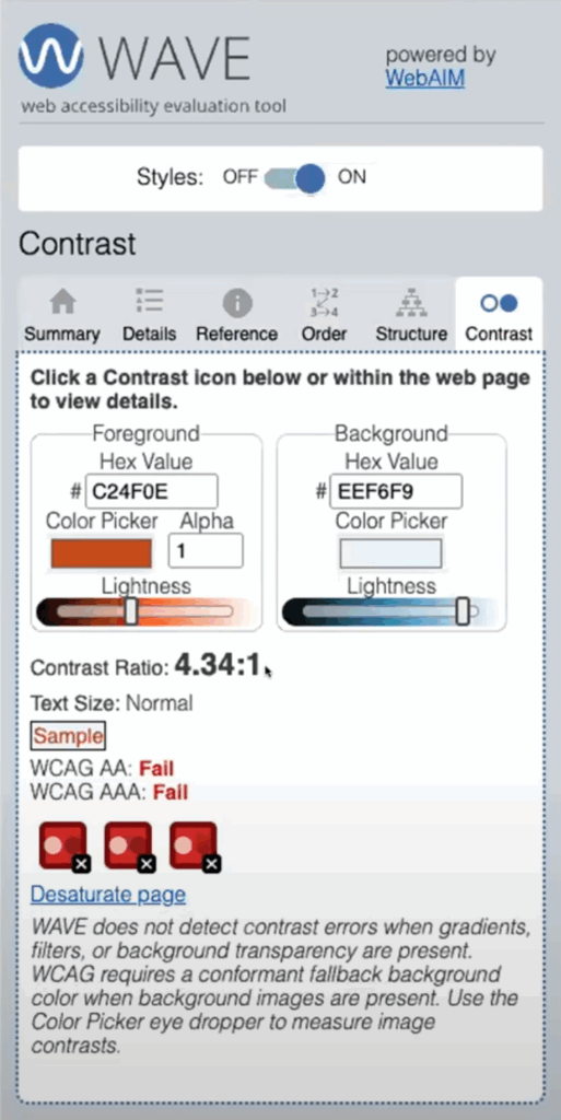
Whitney Lewis: Okay, the last tab we’ll talk about is this Contrast tab. So, while automated tools are really great at finding contrast issues, like specifically in text where it knows the text color and it knows the background color from the code, it’s not great at finding contrast issues in images or in infographics or any type of graphic like that.
So, if you have text over an image, that needs to meet contrast requirements. If you have an infographic that uses a lot of different images or chart or a line graph, that needs to meet contrast requirements.
And you can use this Contrast tab, to manually check that. So, I’m just going to pick one of these icons right here just to test it. So, in this Contrast tab, I have this color picker swatch, and if I select it, it actually opens this color picker panel where I have this eyedropper that I can select. And then I can go select a color on the page and it will fill that in.
So, I selected that for my foreground color. Now, I can select this background color. It’s the same way. I’ll select that color swatch, select the eyedropper, select the color on the page, and now it will tell me the contrast ratio of those two colors. So, it’s 4.34:1. And depending what I’m doing, if this is a graphic, the contrast ratio is actually 3:1. That may or may not pass. But I can use that information to adjust my image. But that’s a great way to do some manual testing right on your webpage if you need to.
Whitney Lewis: Okay, so the WAVE manual review. We’ve talked about how you can use the features in the ARIA to help with manual testing, the Order tab, the Structure tab, and the Contrast tab.
WAVE can only scan one page at a time, but Pope Tech’s free plan lets you check multiple pages and review your results in one dashboard.
Screen reader testing
Whitney Lewis: Our last manual testing topic is going to be screen readers.
I want to start with Getting Started with Screen Readers and some tips there. So, the first thing you need to do is set up either NVDA for Windows or VoiceOver for Apple. We do have two great videos that talk about the settings of how to set those up. You could have it set up today in ten minutes.
If you do have an option between Mac’s Voiceover or NVDA, I would suggest starting with NVDA. I feel like the learning curve with its output and its navigation is a little bit smaller. I started with Mac’s Voiceover, so it’s definitely doable. I started knowing nothing about it. And it didn’t take too long to learn the navigation and output and get familiar with that. But if you do have a choice, I would suggest NVDA.
Yes, the screen reader tip: learn the button that stops the screen reader from talking. Jay can probably demo that for us when he is demoing NVDA.
The next tip I have is practice using it on a website you know doesn’t have a lot of issues. So, you could use that on Pope.Tech. And that’s just going to help you understand what a normal output is and what navigating a page without issues, so that you don’t have to decide, “Is this a screen reader thing or is this a website thing?” So, it’ll help you with that learning curve.
And then there is a learning curve. So, the best thing to learn how to do it is to just start using it. And when you run across an issue or something you’re not sure about, going and doing a little bit of research. So, little by little you’ll get more comfortable and get better at it.
Screen reader testing goals
Whitney Lewis: Okay, so we will do an NVDA demo. If you have already done automated testing, so this is going back to automated and manual testing work better together, you’ll find a lot of issues that would affect a screen reader before screen reader testing. And that’s great because that helps you understand what is actually an issue. So, this means your screen reader testing can focus on all focusable elements are announced correctly. Dynamic content is accessible.
So, real quick, that “all focusable elements are announced correctly,” that’s that accessible name we talked about in the Structure tab. The dynamic content is accessible. So, something that changes on a website due to user input, making sure that that’s being announced and that’s making sense as it’s happening for a screen reader.
Form instructions and error feedback are announced correctly. Forms are a really big one to check with, a screen reader to make sure everything’s announced correctly. And if they receive an error submitting the form, that that process makes sense. And then custom widgets are navigable and announced correctly.
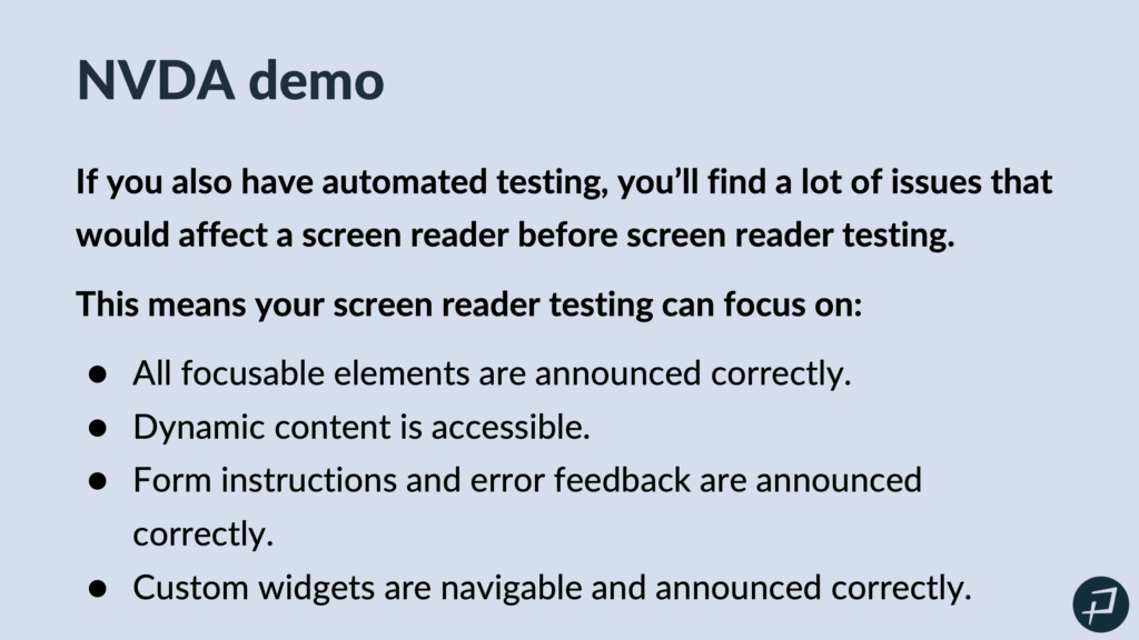
I do want to do a quick note here. Custom widgets like accordions or carousels or things like that, making sure that they work with a screen reader. That’s not reinventing the wheel. There are patterns for that and how to properly use ARIA to make sure that those work correctly with a screen reader. And we could put a link to those patterns if that’s helpful for anyone in the chat. But that said, I will pass it to Jay, who will do the NVDA demo for us.
NVDA demonstration
Jay Pope: Thanks, Whitney. I’m going to share my screen. And real quick, just before I turn on, so we’re just on the Pope.Tech website. Before I turn on my screen reader, I’m going to do with NVDA on Windows on Chrome.
Today, we’ve kind of gone over a lot and we’re teaching you some different tools for manual testing. And so, don’t feel overwhelmed, because you could take one principle, you could learn about a specific thing and then use them just for keyboard testing, right? Kind of like Whitney talked about in the beginning. And so, I think it’s useful for everyone just to download NVDA. It’s free, and give it a shot. Just make sure you know how to turn it off, as was mentioned, and I’ll kind of show you how that works.
So, I’m going to open up NVDA.
NVDA: Welcome to NVD— welcome to NVD.
Jay Pope: And I just hit the Control key. It was about to read me that whole paragraph. And so, I hit the Control key to pause what it’s reading. And as I either move the mouse or the keyboard, it’s going to read what’s allowed. That’s what a screen reader does. Someone who is potentially blind or has a hard time seeing, would use a screen reader. And other assistive technology is going to be similar. It’s going to interact with those same accessible names, as a screener would. And so, screener’s a great one to kind of test with.
So, I’m going to close this modal.
NVDA: Simplify web app toolbar. H— blank. Pope.Tech trial selected.
Jay Pope: So, I just went to Pope.Tech/trial. And we’ll actually share a link with this later, to you as well. So, we’re going to do a test on a form that does work well because it’s kind of the best to start when you’re testing, like Whitney mentioned. And I’m going to kind of do the same thing we did before. I’m going to tab through, but now we’re going to listen to what the screen reader reads.
NVDA: Navigation landmark, Pope Tech graphic link.
Jay Pope: So, you’ll notice, even on that first logo, first it said navigation landmark. Someone before had asked what did these headings and footers and these are landmarks. And in this case, I have a nav landmark. And as a screen reader user, I’m able to jump right to the landmark, which makes it really easy. I can just go jump to my foot footer, if I would like. I can also tab through. And so, everything Whitney showed before, impacts the screen reader testing.
If those automated errors are fixed and clean and if we’ve kind of reviewed the ARIA, we’ve already keyboard tested, we’ve looked at focus indicators, we’ve likely identified any custom widgets, it makes screen reader testing a lot easier and more approachable. And so, I’m just going to tab through and we’ll notice kind of what’s read and then I will submit a form and we’ll look at some error messages and some different things.
NVDA: List with five items. Websites link current.
Jay Pope: You’ll notice it said, “List with five items.” So, it actually tells me that the HTML has a list. There’s a semantic list that’s five items. That’s awesome. We have five things in our menu and I’m able to navigate through.
Just to show more, I have an interactive one. I am going to open up my dev tools and look at a mobile view.
NVDA: Then you submit professional— link —or professional.
Jay Pope: Okay and then I’ll stop the screen reader again by hitting Control. So, Control just pauses it. The moment you move your mouse or tab, it’s going to come back and start reading. And so, this shows something that’s interactive. I’ll test with it.
NVDA: Pope Tech menu button collapse.
Jay Pope: So, we have a menu button, it’s collapsed.
NVDA: Expanded. List with five items. Websites link current.
Jay Pope: And so, here there’s a specific pattern and here ARIA was used. Before we’re asking what ARIA actually does. ARIA is telling us that this menu is collapsed or expanded and I can inspect on that.
NVDA: Menu, sub— dev tools.
Jay Pope: And so, on here we have there’s some ARIA-expanded=true and that ARIA is telling the assistive technology what’s happening. And so, ARIA can be great. It’s just a lot of times people just copy code and it actually isn’t doing what they think it is or they don’t even know what it’s doing. And this one also has ARIA controls and says what the ARIA expanded is controlling. And so, that can be really useful.
So, these are the kind of things you’ll test. I’m going to go back to the full desktop version.
NVDA: Profession— made of —how your organization— manual— name star edit blank.
Jay Pope: And we’ll put a link in the chat for some common short keys for NVDA. But I’m able to navigate by headings or by the header footer. I can just go by links. So, there’s a lot of tools that I have as a screen reader because you wouldn’t want to have to tab through something. As a visual user, that’s not how I— kind of jump to what I want and so you’re able to do that with the screen reader as well. But you’ll notice when I put my focus in here, it read the label, and I’ll go to the next one.
NVDA: Work email star edit blank.
Jay Pope: And so, it’s telling me there’s no value, it’s blank and it reads the label. And I’m going to submit this form and then we’ll kind of see what happens.
NVDA: Would you like a free consultation— Pope Tech to request account— professional plan trial Pope Tech. Main landmark. Hang on. Let’s address these errors first. List with three items, bullet length and eight.
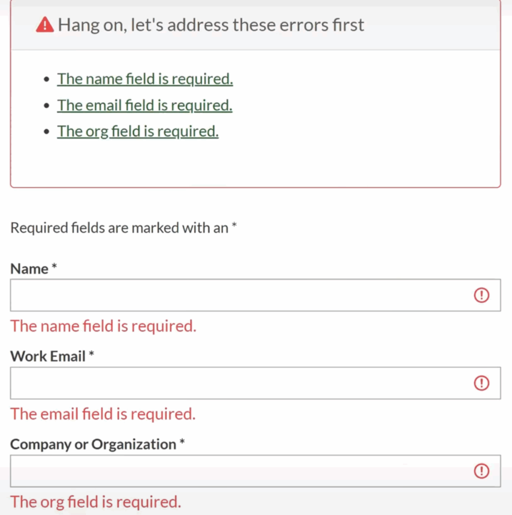
Jay Pope: And so, on here, when the form is submitted, we put the focus on the error message which is read to us, and it gives us that kind of feedback because it’s programmatically tied.
One more thing I’ll show is if I go into now one of these fields that has an issue. So, the name field.
NVDA: The org field is— name star. Edit invalid entry. The name field is required. Blank.
Jay Pope: And the way that we get it to read, “The name field is required,” is also with ARIA. So, it’s programmatically that input has a label and a description that’s tied to it.
And for today, we don’t have a ton of time. We are going to share some videos on how to test the screen readers and things. But you just test the common accessibility principles, and you focus on those things that Whitney shared, like do things work correctly? Extra time on any custom widgets. And most issues, I’ve already kind of identified before I get to a screen reader, if you follow that flow that Whitney showed.
So, with that, I’m going to close. So, how I close it is Caps Lock N and you can change Caps Lock in your settings, but that’s the shortcut. So, Caps Lock N.
NVDA: NVDA menu. Exit NVDA.
Jay Pope: And then I hit Exit. And so, now I’m closed. So, make sure before you open it, you know how to close it because that can be really annoying. There also is an option if you want it to auto run when your computer starts. You know, if you’re not a user with disability, you probably don’t want that. So, you’re going to turn that off and then you can be off and running and testing with NVDA. Let me just pull up in the— I’m going to stop. Well, let’s see the chat for a second. Okay, awesome. So, with that, Whitney, I think I’m going to turn it back over to you and we might have some time for a few questions at the end.
Manual testing workflows
Whitney Lewis: Okay, so let’s put this all together with your workflows. So, we’re just going to have a couple examples of a sample you could do, to incorporate manual testing into your workflows.
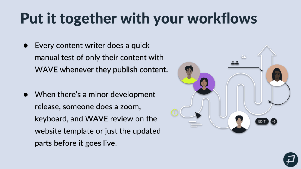
So, a common one for content writers, every content writer does a quick manual test for only their content with WAVE whenever they publish content. So, that’s something that I do whenever I publish content. I use WAVE to do some automated testing, but I also use that Structure tab. I also use the Features to do some manual testing, as well.
When there’s a minor development release, maybe someone does a zoom, keyboard and Wave review on the website template or just the updated parts before it goes live. So, we’re sampling. We are choosing the types of tests we’re going to do. We’re also choosing what we’re specifically going to test.
Whitney Lewis: Major development releases. Maybe we do all the tests. So, we do zoom, keyboard, waiver view and screen reader tests. But maybe we’re only testing the affected parts. So, we’re sampling on the parts of the website or the app that we’re testing.
Once a year, maybe you do outsource a third party extensive manual audit. And that’s part of your manual testing strategy is you incorporate all this into your workflows, but you still do an extensive one once a year.
Or, if that’s not for your organization, then once a year you do a manual test on four pages of your website. So, you do all the manual tests that we talked about today. You do keyboard, you do screen reader, you do a WAVE manual review and zoom tests, but you only pick four pages. And that gives you a good sense of your website’s testing and helps you find issues that manual testing is really good at finding.
Wrapping up
Whitney Lewis: Okay, so what we learned today to wrap it up.
Manual testing. Hopefully we debunked that it doesn’t have to be scary. We can use sampling or pick what and how we test, and it’s still meaningful and impactful.
Automated and manual testing work best together because their samples complement each other. If you do automated testing, your manual testing can be a lot cleaner. If you do some of those manual tests we talked about early on, like keyboard testing or WAVE review, it can make your screen reader testing a lot simpler. You can focus on things that screen reader testing is really good at finding.
So, you can go try zoom, keyboard and a WAVE review test on your own pages. You can go set up a free screen reader. That should take about ten minutes. And you have options when in your workflow you should incorporate even a partial manual test.
So, what’s next? Hopefully you take what you learned and go test some of your own pages today, or this week. And we will send you an email with a link to the recording and slides.
It will also include a chance for you to try Pope Tech’s built in and guided manual testing AIM Score for free for one month, along with your automated testing results. So, Pope Tech does have a guided manual testing feature called the AIM Score, which takes you through a manual test that includes WAVE review, it includes keyboard testing, it includes zoom testing. So, you’re set up with all the tools that you would need to be able to go through that AIM score and get a manual testing score for your website.
So, we are about three minutes until 12 o’clock Mountain Standard Time. So, if there’s any questions, we are happy to answer them. Otherwise, we will send that email out shortly. Thank you so much for everyone for coming. Thanks for being in the chat and we’re looking forward to the accessibility progress everyone does.
Yes, the slides will be available. We will send them out in a email to all the attendees here today.
Yes, we’ll make sure that the resources that we share today are in that email.
Jay Pope: Because there’s two minutes left, I’m not sure if the person is still here, but I will just— there was a question about Title II ADA, if links to third party websites applied.
So, this is for government entities. So if they have a contractual agreement with them. So, like if you sign up even for a YouTube channel, like it’s your YouTube, then absolutely. If not, there’s nothing specific in there but like if it’s part of your course and a student can’t access it, then, you know, I would definitely say yes. So, a little bit of nuance on that. But, yeah, Title II is coming, so. It’s already here just to increase focus on it, but that’s a whole different webinar.
So, well, thank you all. Have a great rest of your day.
Whitney Lewis: Thank you. Bye.