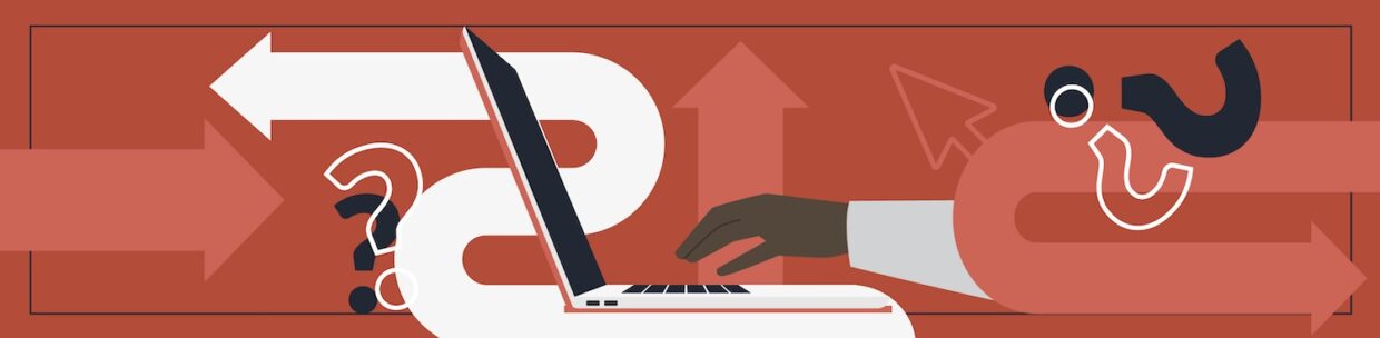
Have you ever lost your mouse cursor on your screen? This is what it is like when keyboard users don’t have focus indicators. It’s like navigating with an invisible cursor. This means focus indicators aren’t just a “feature” but a necessity for those who navigate the internet with keyboards.
In this blog, we’ll go over:
- What is keyboard focus and who needs it?
- How keyboard navigation works
- Key design considerations for focus indicators
- Common pitfalls for focus indicators
- Pope Tech example
- Summary
What is keyboard focus and who needs it?
Often, when navigating the website, some users move by using Tab to jump from one interactive element (like a link or button) to the next.
- Focus: When a user moves to a specific element, that element is said to have “focus.”
- Focus indicator: This is the visual change, often a ring or border, to signify that part of the website has focus and can be interacted with.
While we often design for mouse users, some of your audience rely on keyboard navigation for different reasons:
- People with mobility limitations: Users with conditions like tremors, arthritis, or paralysis may find the fine motor control required for a mouse impossible. They may use standard keyboards, or assistive tech like “sip and puff” systems or mouth sticks to mimic keyboard strokes.
- People who use screen readers: Blind, low-vision, or users with cognitive disabilities navigate via keyboard to hear the content of the page. For sighted or partially-sighted screen reader users, the visual focus indicator helps connect what they are hearing to what they are seeing on the screen.
- Advanced navigators: Some users navigate with a keyboard because they find it much faster. They use keyboard shortcuts to save time. When focus indicators are missing, they can’t see where they are, and this affects their productivity.
Without a clear focus indicator, keyboard navigation becomes a guessing game. The user can Tab through the page, but they have no idea where their “cursor” is.
How keyboard navigation works
The best way to see if your keyboard navigation works is to do keyboard testing. Here are the high-level keyboard shortcuts for most website navigation:
- The Tab key: Moves the focus forward to the next interactive element (links, buttons, form fields, etc.)
- Shift + Tab: Moves the focus backward to the previous element
- Enter or Spacebar: “Clicks” the element that currently has focus
- Arrow Keys: Often used to navigate within specific components, like moving through a dropdown menu or moving between radio buttons.
Key design considerations for focus indicators
When designing focus indicators, contrast and size are the main elements to focus on, but it is also important to consider designing different focus indicators for different types of elements.
Contrast
To make sure more users can see where they are on a page, we look at the contrast ratio.
Contrast is simply how much one color stands out from another. We measure this with a ratio between the brightness of the background and foreground.
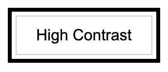
The highest ratio you can have is 21:1. An example of this is a black outline on a white background, like this black focus indicator below.
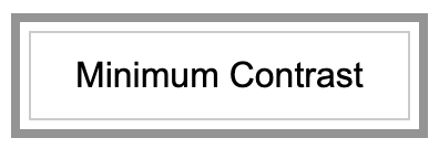
The minimum recommended contrast is 3:1, represented by the gray focus indicator below.
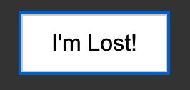
The ratio between the dark blue focus indicator on the black background in the next example is 2:1, which doesn’t pass contrast ratio requirements, and it is visibly difficult to find.
When thinking about a focus indicator’s contrast, there are two parts:
- At least a 3:1 contrast with the background: The indicator must stand out from the page itself. If the contrast ratio between the indicator and the background is below 3:1, the outline will “wash out” and the user won’t be able to find their place.
- Contrast of change (focused vs. unfocused): The element must look significantly different once it receives focus. If the ratio between the focused and unfocused state is too low (like changing a border from a dark blue to a slightly darker blue), the change isn’t visibly distinct enough to signal that the element is active.
Size
Beyond contrast, a focus indicator should be large enough to be physically seen. If an indicator has high-contrast but is a single pixel wide, it can still be nearly invisible to a user with low vision or someone using a screen in a bright environment.
The general rule
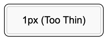
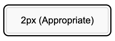
As a general best practice, your focus indicator should be at least 2 pixels wide.
The example below is a button with a 1 px focus indicator. When it’s large it seems big enough, but on a smaller screen, it disappears.
Below is an example of a 2px focus indicator. This ring is more obvious than the previous 1px option.
Getting creative
Think of the 2px rule as an area requirement. It isn’t just about drawing a solid line, it’s about making sure your indicator occupies enough surface area to be unmistakable.
- Why this matters for your design: This is where you can get creative. You can try unique designs, like thick 9px bars on the left and right of the element.
- Minimums vs reality: Remember that 2px is the floor, not the ceiling. While a 2px line might stand out on a small button, it can easily vanish on a massive card or a full-width banner. For larger components, the minimum often isn’t enough, so adjust your thickness until it is clearly visible at a glance.
How can you tell what is enough pixels for your focus indicator? The answer: math. You need to calculate if your indicator takes enough surface area to be equivalent to a 2px outline.
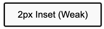
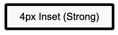
Insets
For designs where the focus indicator is inside the element (an inset), it actually needs to be wider than 2px. This is because an inset ring covers up part of the element itself, which can make the overall shape look smaller or more cluttered. To compensate for this crowding, a thicker line is usually required to stay accessible.
Designing different focus indicators for different elements
While a global focus style is tempting, it is also important to design different indicators for different types of elements to match their specific environment and shape.
A one-size-fits-all approach often fails in the real world. By tailoring the indicator to the component, you ensure users can tell at a glance whether they are about to navigate to a new page, trigger a command, or enter data, making the experience intuitive rather than just “compliant.”
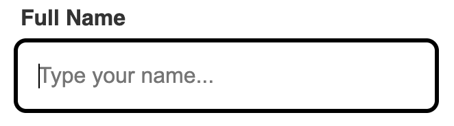
Below is an example of how you might style the focus of links and form fields differently:
Common pitfalls for focus indicators
Even with the best intentions, focus indicators can break due to CSS conflicts or design oversights. Most errors fall into these three categories.
Technical implementation
These are intentional developer choices that inadvertently hurt accessibility.
- Global reset: Native HTML elements have default browser indicators that often clash with a brand’s aesthetic. Some developers remove them with CSS like outline: none.
- The fix: Replace them with a custom alternative.
- Hover vs. focus confusion: Focus styling usually appears on click, not just keyboard focus. Some developers remove all focus indicators because they don’t want them to appear on a mouse click.
- The fix: While it is tempting to remove on click styling, this is important for many users with low vision, cognitive, or motor disabilities. If you must differentiate between click and keyboard focus, use the :focus-visible pseudo-class. This CSS allows you to show focus indicators for keyboard users and not for mouse interactions.
Visual disappearance
These pitfalls occur when a focus indicator technically exists in the code, but the user cannot physically see it.
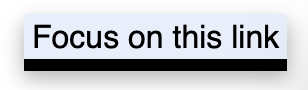
- Contrast blindness: Using a single-color indicator that works on white backgrounds but vanishes on dark or busy backgrounds (like image carousels).
- The fix: One fix is to design different focus indicators for different backgrounds. Another fix is to use a two-tone focus indicator. By sandwiching two high-contrast colors, such as black on white, you guarantee that at least half of the indicator remains visible regardless of the color or complexity of the image behind it.
- The overflow clip: If a container (like a card) has overflow: hidden, any focus ring sitting outside the element is sliced off.
- The fix: One way to fix this is to bring the focus indicator inside the element with outline-offset (an inset).
- High contrast mode erasure: If you use box shadows for your focus indicators, it often disappears when a user turns on Windows High Contrast Mode.
- The fix: Adding a transparent outline ensures the indicator reappears for these users.
Layout and navigation blocks
These indicator pitfalls physically prevent the user from reaching or seeing the focused element.
- Sticky header overlap: Elements can scroll underneath the sticky headers. The user tabs, but they cannot see the focus indicator because it is underneath another element.
- The fix: Use scroll-margin-top to keep focused items in view.
- The “display: none” dead end: Hiding “Skip to Content” links or other elements with display: none removes them from the tab order entirely.
- The fix: Use visually hidden CSS techniques to keep them accessible to the keyboard but hidden from mouse users.
- Animation lag: Adding slow transitions (fades or slides) to focus indicators might seem fun, but for fast users, this delay makes the site feel sluggish or broken.
- The fix: Avoid using animation in your focus indicator design.
Pope Tech example
At Pope Tech, the guiding principle is simple: when we design the hover state, we also design the focus state.
Designing for the “job”
One-size-fits-all indicators can be confusing. On the Pope Tech website, you’ll notice a clear distinction between navigation links and buttons.
- Navigation links: Items like “Website,” “Courses, and “Resources” use a few different techniques for the focus indicator. When on the blog resources page and “Website” receives focus, the text changes color, becomes underlined, and there is a green dotted outline around the link.


- Call-to-Action buttons: Buttons like “Schedule a Demo” and “Login” are green buttons with white text that change to underlined with a round dotted focus indicator around them.


Another component that Pope Tech made a separate design for is cards. On the Pope Tech Blog, we have a layered approach. When you tab to a post, you see two indicators:
- The card outline: A solid dark blue line appears around the entire card, clearly defining the active area.
- The text link: Simultaneously, the text link inside the card gains a grey dotted outline.
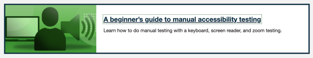
The focus design for cards is doing two things:
- It follows the same pattern as the dotted outline for links in the navigation bar, so it cues the user that it’s a link.
- The double indicator approach makes it clearer to the user where they are on the page.
These are different components with different styling. By changing the focus indicator design for different components, we are able to cue our users on what element they are about to click on.
Summary
Navigating a website without focus indicators for keyboard users, is like trying to navigate with an invisible cursor. Here are our key takeaways on focus indicators:
- Keyboard users: From those with mobility or visual disabilities to seasoned web navigators, keyboard users need focus indicators to get where they need to go.
- The 3:1 rule: Your focus indicator must have at least a 3:1 contrast ratio against the background and from their unfocused state.
- The 2px guideline: Aim for a minimum of 2px thickness to ensure the indicator stays visible. When using insets, aim for more to compensate for the outline taking up space in the element.
- Context is king: The best indicators are designed for the job they perform. Try different indicators for different elements to cue your readers on what they are clicking.
Now that you know some of the design basics, go out and test your site’s focus indicators!
Happy tabbing!