In this video, you will how sometimes developers accidentally break keyboard navigation with outline: none. You will learn how you can restore it while maintaining your site’s aesthetic.
For more information, see our blog on this topic.
Transcript
Have you ever tried to move your mouse, you wiggle it everywhere, but you can’t find it? It’s a total navigation nightmare.
For keyboard users, that ‘cursor’ is the focus indicator. It’s the outline or highlight that tells you exactly where you are on the page as you Tab through.
On the right is an example of someone tabbing through a navigation menu with the focus indicator as a guide. For people with motor disabilities or low vision, these indicators are the only way to see where they are on a page while using a keyboard.
Today, we’re going to fix a ‘broken’ site live and show you how to design focus states that are both accessible and beautiful.
For more information on focus indicators, see our resources linked below.
Demo one: The “invisible cursor”
Let’s start on an example with the focus indicators disabled.
On screen is a sample website. I am pressing Tab and I know it’s working because the screen moves, but I have no idea where my focus is. Therefore, I don’t know what I’m going to click or activate.
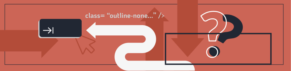
So, why does this happen? Usually, it’s because of a global reset. Developers often use CSS like outline: none to remove default focus indicators. Then, it’s never replaced with custom focus indicator styles: leaving keyboard users stranded.
Demo two: The standard fix
The quickest fix is to bring back the browser defaults. I’m going to go into my CSS and remove that outline: none. I’ll delete that code, the browser default indicators will kick in, and magically my focus indicators appear.
Now we’re back in business. As I Tab through the website, we can see the focus indicators move between elements.
But here’s the problem: the default blue ring doesn’t always meet the required 3:1 contrast ratio against every background, nor does it meet size recommendations, which is why the focus indicator seems to disappear on certain parts of the page like the green buttons on the cards.
Demo three: The custom fix
Next, let me show you three tricks to making your focus indicators more accessible. We’ll start with something a little more specific by explaining how to use insets to prevent your indicators from being clipped. Then, I’ll show you how to use insets to create two-tone indicators, and finally, we’ll discuss designing different focus indicators for different elements on your website.
The inset shadow trick
The first trick I want to show you is how to handle components that have overflow: hidden like these cards with rounded corners. If I put a normal focus indicator on this card the overflow:hidden code ‘clips’ it, and it disappears. You can barely see the indicator in the example around the corners”
One way to fix this is by adding box-shadow: inset; into the CSS. That brings the box within the barriers of the overflow: hidden. With that simple fix, we can see the indicator around the card.
Let’s look at how we might jazz up this code in our example website. I used a navy outline with our inset code, but I also added a light blue background, and I outlined the button on the card at the same time. The reason I highlight the button and the card at the same time is because the button is the main action of the element, so tabbing past every card to get to the button is a needless extra step.
The two-tone ring trick
The next trick I want to show you is the color sandwich method for focus indicators. Having a two tone indicator works well for content that changes colors, like carousels of images, or, like with the navy blue sides of our screen, where we have both dark and light elements.
With our card on the dark side of the screen, a light indicator would disappear in the card’s gray and a dark indicator would disappear into the blue background. Therefore, I created a sandwich of two colors for our dark card.
For this example, I added the code to our card:
box-shadow:
inset 0 0 0 4px white,
inset 0 0 0 8px black;
The result is a double-bordered ring that stands out on both the light and dark sections of the page.
You can even swap that black for your brand’s darkest navy or charcoal. As long as one layer is light and the other is dark, you get an indicator that works with most changing backgrounds.
Designing for the job trick
The next trick I want to show you is designing your focus indicators for their “job” so to speak. For example, you don’t have to design two tone focus indicators for all of your elements. You might only choose them when they are necessary. You can also cue your users by using different focus indicators for different elements like links vs buttons or form fields.
Let’s go back to our sample website. To signal that two elements have different jobs, I style the buttons with solid rings. Then, I style the paragraph links with a high-contrast, bold underline with a glow instead of an outline.
Takeaways
We went from navigating with an invisible cursor to having a high-contrast navigation map. Here is your Focus Design Checklist for your next project:
- Never remove the focus without a replacement.
- Know the limits of browser defaults: Sometimes the default focus indicators do not meet contrast or size recommendations.
- Use insets with overflow: hidden: You can use box-shadows to keep indicators from getting clipped by containers.
- Use the color sandwich: To survive background changes, use two tone indicators
- Design for the job: Make different elements feel distinct, and use your brand colors to make accessibility a seamless part of your aesthetic.
If you found this tutorial helpful, head over to the blog for the full technical breakdown. And do me a favor: go tab through your own website right now. Can you find your focus indicator?