Summary: Real world example on the Empty Link Error.
You can review what this means technically and the impact inside of our Icon dictionary. Today I am only looking at this from the perspective of a common Empty Link found on a higher ed website from our Higher Ed in 4k project.
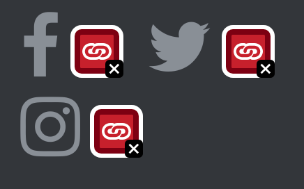
Example Icons flagged as empty link


In these common examples found on a college website font icons are used instead of text as part of the design.
The HTML before we make any changes:
<a href="/search-site">
   <i class="fa fa-search"></i>
</a>
WAVE has flagged this an accessibility error of Empty Link because the link doesn’t have any text content. Without any text this can be confusing for screen reader users. In this specific example these are font icons, a screen reader user could be read the link url or the content of the pseudo element :before which is “\f002”. \f002 doesn’t mean search to me either.
For font icons because they are a font and not really an image you can’t add an alt tag. It is worth considering adding the text visually next to icons as they aren’t always as clear to users as we think. In the case of the social icons I think it is pretty clear what they are and the pattern is used quite often. In this case you can add visually hidden content.
Solution
We want to both add text to be read by a screen reader and make sure that the content added via css isn’t read.
updated html
<a href="/search-site">
   <i class="fa fa-search" aria-hidden="true"></i>
   <span class="sr-only">Search</span>
</a>
If you were using Bootstrap you don’t need to do anything else, if not you will need to add some CSS to hide the label visually:
.sr-only{
   position:absolute;
   left:-10000px;
   top:auto;
   width:1px;
   height:1px;
   overflow:hidden;
}
With this change this is no longer flagged by WAVE or Pope Tech as an error and the search icon is now accessible to screen reader users.
Notice that I added a span and hid it visually with the content of “search” for a screen reader. In the social media icons example I would simpley change this to Facebook or Instagram etc. I also added aria-hidden=”true” to the <i> element so it won’t be read by a screen reader.
Important things to consider
Keep in mind that having hidden content isn’t always a good solution. There needs to be a visual understanding of what the content and links is for sighted users as well as the programmatic one for screen reader users. Also these example icons clearly have contrast error issues as well that would need to be addressed separately.
Tired of testing pages one at a time?
Pope Tech can get you up and running with usable web accessibility data in just a few minutes.
Email Newsletter
Want to receive emails with accessibility content similar to this article?
If you subscribe, we will email you web accessibility insights or things we learn a few times a month. You can unsubscribe at any time.
