This update included a full update to the interface to be more consistent and user friendly. It includes many little updates and some bigger ones such as being responsive. Below are a few of the bigger items. No major flow changes were made with this update.
Feedback from Pope Tech’s Community implemented:
- UI Update
- Responsive/Mobile Friendly interface
- Co-branding for affiliates
- Make Results Details Table Sortable
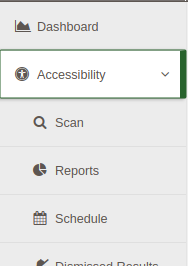
- Group view interface improvements
- Scan Details view interface improvements
- 1 Click Dismiss
- Accessibility improvements
Various issues fixed:
- Deleting website with pages
- deleting user with dismissed results
- Line of code jumping/results
- Pages with many dismissed results scan processing time
- Pages with specific js heavy widgets scan processing time
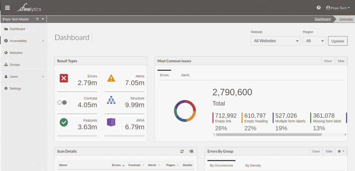
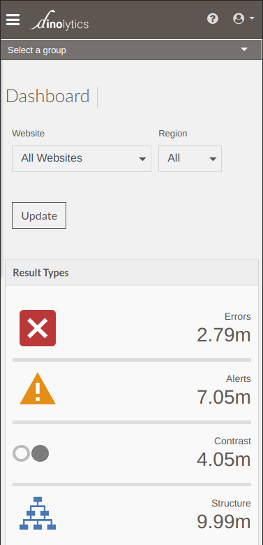
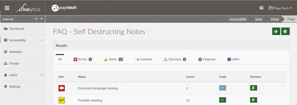
UI Update
The UI update polished all views inside of the platform. The colors have been standardized to increase contrast and be more consistent with focus and hover states on all elements. Buttons that are less important have been made visually less in emphasized.
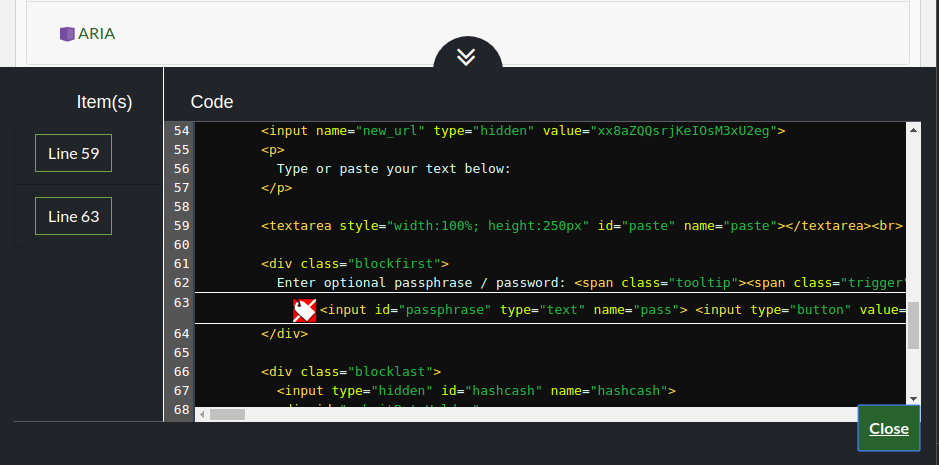
Small changes have been made to functionality such as on the group screen opening the group edit widget when the group is selected. Updates were made to improve keyboard navigation throughout the app, for example the Code View is now easier to navigate via keyboard and has better contrast in the code.
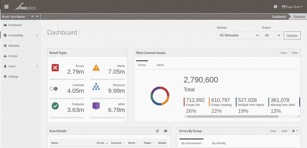
Responsive/Mobile Friendly Interface
You might wonder why you want to use a scanning platform on a phone, we thought so at first. The main goal of responsive was for smaller laptop screens and to be more accessible for users when they zoom in but we have found ourselves doing things on phones as well.
Along with this we worked to maximize space at all sizes for what you are working on while keeping an open comfortable feel. This update standardized things like pagination and longer website columns that sometimes took away space on laptops.
Co-branding for affiliates
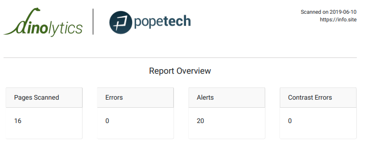
Our affiliates can now request co-branding be turned on. This will allow the logo in the top next to the Pope Tech logo in both the platform and the PDF and HTML report options.