With the new version of WAVE launching, I thought it would be a good time to share some tips and features of WAVE that I use all the time.
WAVE was my gateway to learning about web accessibility. As a front end developer who was never trained in web accessibility, it was a great tool for me to learn and get real-time feedback as I improved the websites I worked on.
Today I use WAVE on almost a daily basis to do things such as get a feel of where a site is at from an automated standpoint, help me manually test websites, check my headers on blog posts (such as this one), alt attribute testing, and to check contrast of potential design changes.
This isn’t a comprehensive feature set of WAVE or demo on how to use it, but tips and features I have found useful.
Every result has a reference
Every result type in WAVE has a Reference/documentation which includes what it means and how to fix it. You can view this reference 2 different ways:
- From the details panel activate the grey i (More Information) icon that is after the results.
- From a result icon tooltip overlayed in the content activate the Reference link.
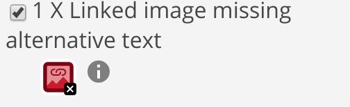
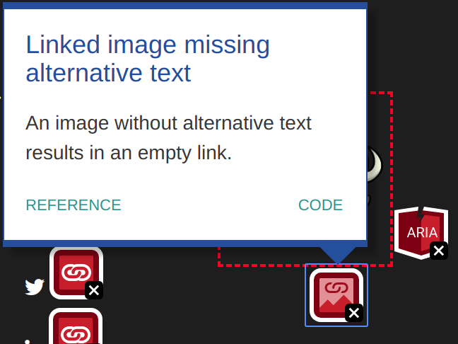
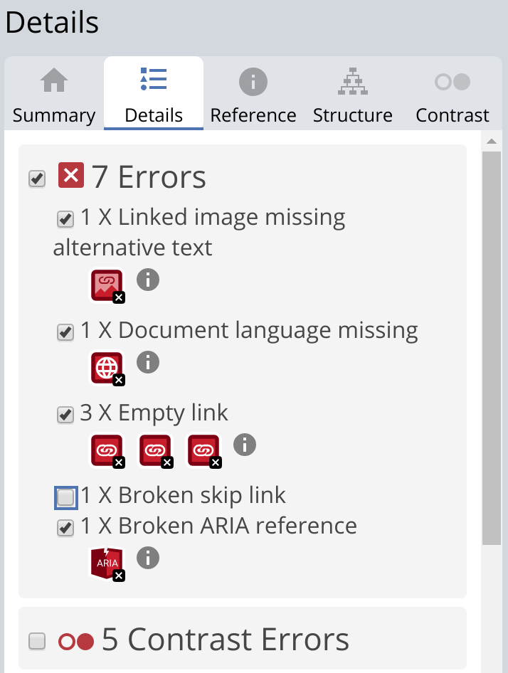
For each result you can see what it means, why it matters, how to fix it, the algorithm in plain English and the related standards or guidelines. In this example of a linked image missing alternative text, WAVE instructs us to, “Add appropriate alternative text that presents the content of the image and/or the function of the link.” This is flagged as an error by WAVE as it always has an end user impact to screen reader users.
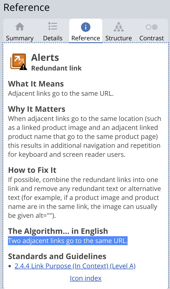
Redundant links for example are an alert in WAVE because there are use cases where it is accptable but it does have a end user impact for screen reader users. The Algorithm tells you why WAVE flagged the item, this example, “Two adjacent links to to the same URL.” and the Why it Matters sections gives more detail on the end user impact.
Turning styles off/on
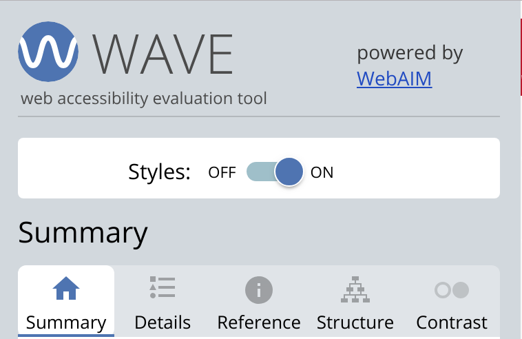
By default WAVE shows you your website with WAVE icons injected into your content and a WAVE toolbar on the left. Turning off the styles is very helpful when there are many WAVE icons or if what WAVE is evaluating is behind something. For example if you have content in a dropdown menu or a modal that is visually hidden WAVE will still evaluate it, but when you try to view that result it won’t show as your sites CSS is hiding it. Turn off the styles and you can now view what it is.
With styles on:
With styles off:
Turning styles off is also helpful to see the actual order of items on your website. This is the order that screen readers will read your content.
While evaluating a page you can turn tests off and on
Inside of the details panel in the WAVE toolbar you can turn off specific rules or even entire categories. For example you could start at the top and review every WAVE result and uncheck them as you fix them, document the issues, or verify they are correct. This type of a process will take you well beyond what an automated tool can test. While WAVE is great as an automated tester, it can help you do much more as you use a flow such as this.
Verifying alt attributes
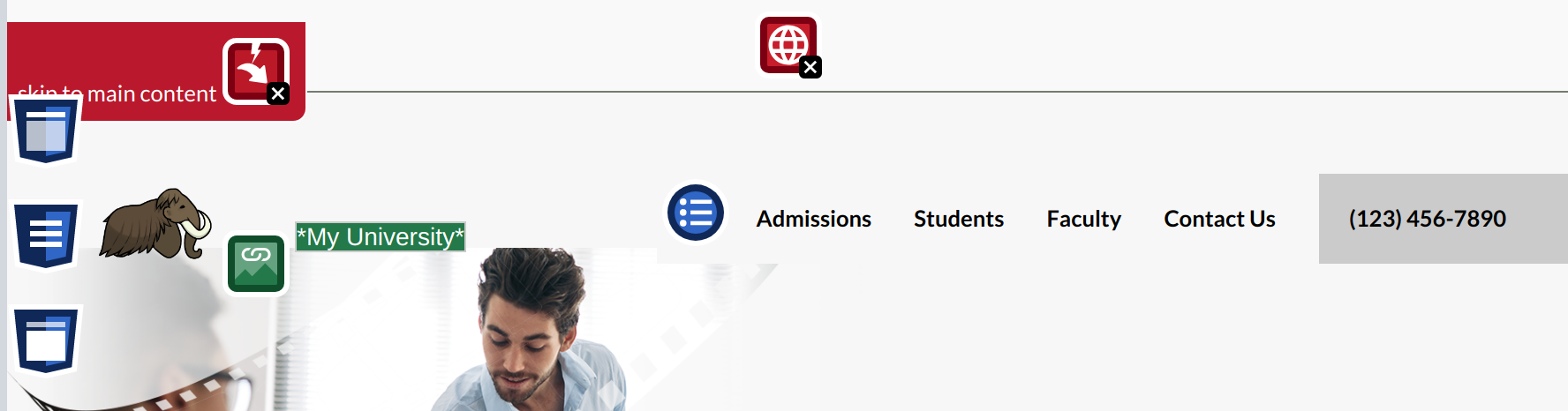
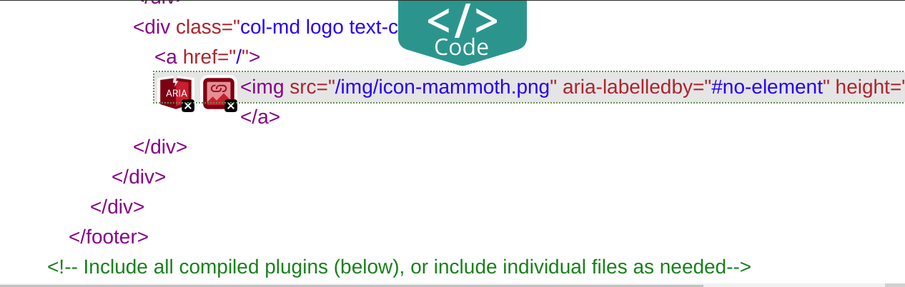
Another potential use case is unchecking all categories except for features to visually see and evaluate the alt attributes of your images. WAVE allows you to verify your alt attributes without looking at the code.
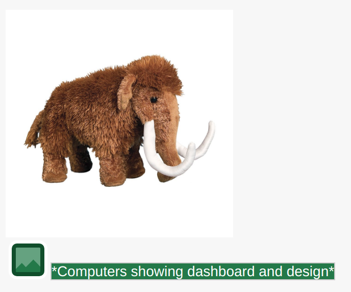
In this example the alt attribute says, “Computers showing dashboard and design” but the image is of a mammoth stuffed animal. In this case the alt attribute is worse than not even having one. It will also show you all images that have alt=””, should that image actually have an alt attribute or is it really decorative?
The Contrast panel
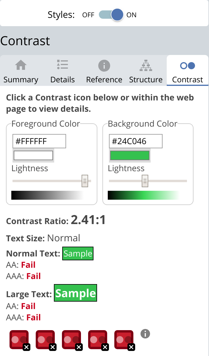
Contrast errors can be seen like all other WAVE results inside of the details panel and in the visual view. You can view the contrast values and ratio inside of the Contrast Panel. Activating one of the Low Contrast icons will update these values for that element.
You can also test changing the colors of the elements on the fly by using the color pickers for foreground and background colors. On Mac you can use the eye-dropper tool in the color picker to select and test colors from the web page (including images).
Desaturate the page
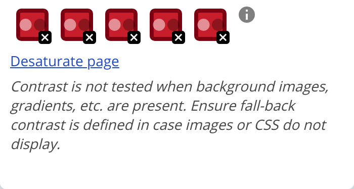
An often overlooked tool inside of WAVE is the desaturate page function found in the contrast panel. This desaturates the page to give you a good feel on how much you are relying on color.
Don’t ignore the structure panel!
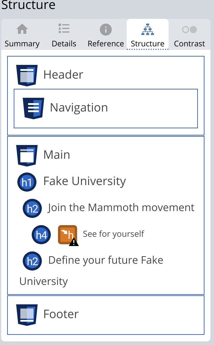
With the latest WAVE update the structure panel now not only shows the heading structure but also the the html regions of the website with the nested headings. Regions and headings are used by screen reader users to navigate to different areas of your website.
This view can be a great test to use before you publish a blog post. Should that really be a h2 or did you just want bigger text? In this example it jumps from an h2 to a h4 which is flagged as an alert, WAVE knows there is a very good chance this should be a h3.
If you understand HTML open the code drawer
WAVE has a code drawer that can be accessed from an icon tooltip or at the bottom of the screen there is a green code button. When open, any icon that is activated will jump both the visual page and the code view to the where the issue is.
ARIA all the things…
While you have the Code view open, lets talk about ARIA and WAVE. WAVE gathers everywhere that ARIA is used inside of the ARIA category. If it is a broken ARIA reference it would also show as an error, or if it was suspicious as an alert.
Reviewing the ARIA category is a great way to find common issues. Also check if you even need that ARIA and that it is working as expected to a screen reader. Very often ARIA is pasted from other code and isn’t needed or even working as it should.
Congratulations! No errors were detected!
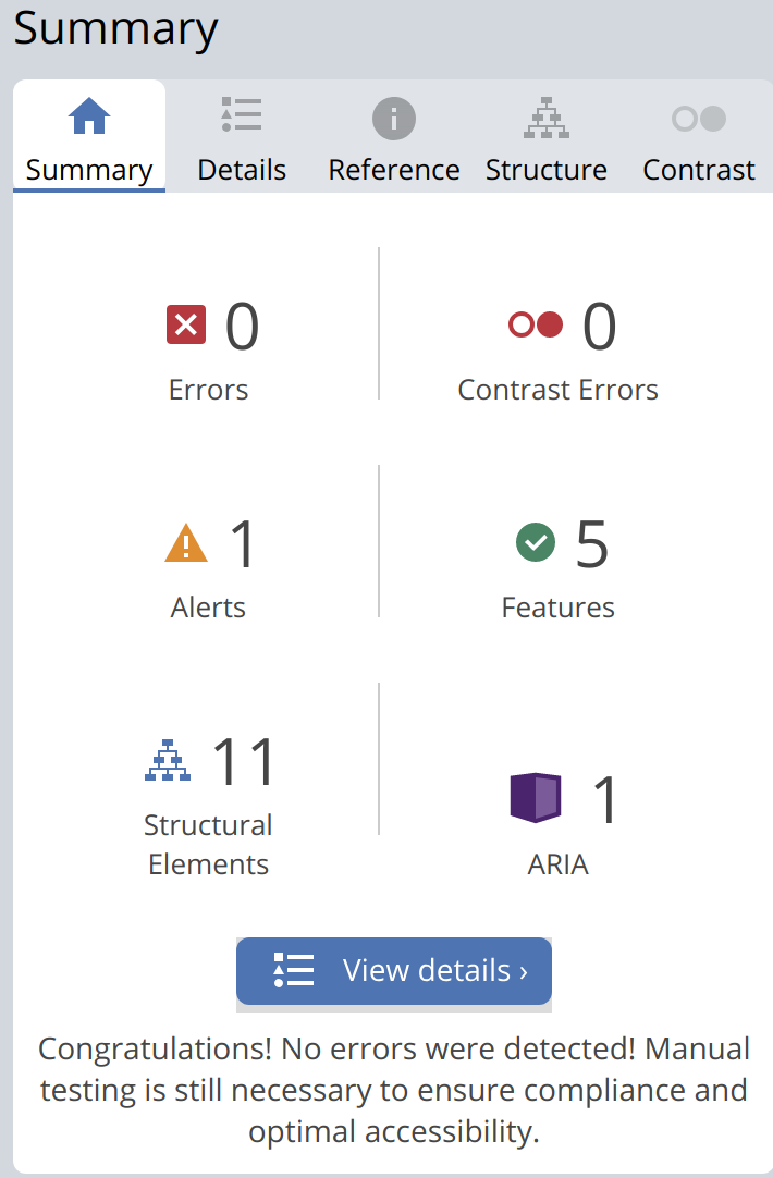
With the update to WAVE if your site has no errors or contrast errors you now get this message, “Congratulations! No errors were detected! Manual testing is still necessary to ensure compliance and optimal accessibility.” Just a reminder that while WAVE can be used to help in manual testing, no errors or contrast errors by itself doesn’t mean your website is accessible. Manual testing such as keyboard and screen reader testing is still required.
Tired of testing pages one at a time?
Pope Tech can get you up and running with usable web accessibility data in just a few minutes.
Email Newsletter
Want to receive emails with accessibility content similar to this article?
If you subscribe, we will email you web accessibility insights or things we learn a few times a month. You can unsubscribe at any time.