Summary: Real world example of the Very Low Contrast Error.
You can review what this means technically and the impact inside of our Icon dictionary. Today I am only looking at this from the perspective of a Very Low Contrast Error found on a higher ed website from our Higher Ed in 4k project.
Contrast Errors strategy
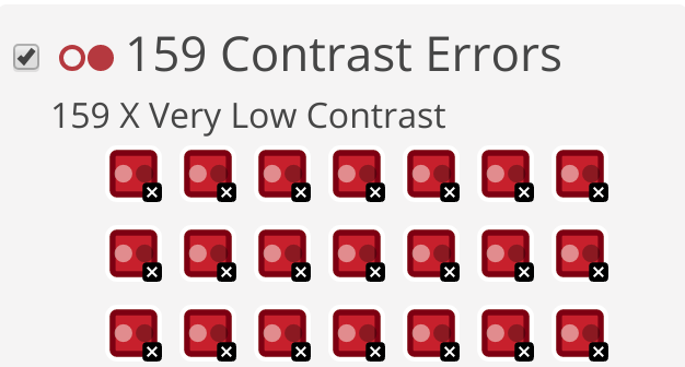
This degrees page on a University website has 159 contrast errors. Usually contrast errors come from the template that was designed. They are by far the most common error we found in the Higher Ed in 4k project. The good news is that often times you can fix thousands of errors with a few lines of CSS. This can take some strategy as you consider links, text, backgrounds, branding colors etc.
Like most web accessibility best time to think about this is as a website is being designed. If you aren’t sure, start now and learn about color contrast requirements on websites.
Example

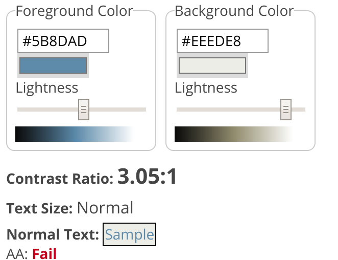
This is a light blue link on a grey background, as we inspect with WAVE we can see the exact values of the link color and the background color.
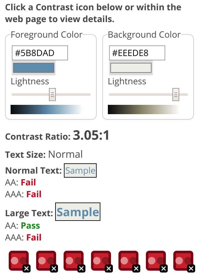
The text color is #5B8DAD and the background color is #EEEDE8. WAVE has let us know that the Contrast Ratio is 3.05:1. WCAG requires 4.5:1.
Solution
To pass the WAVE Error in this instance we simply need to do a combination of making the text darker and or the background lighter. The built in WAVE contrast tools let us slide the color to experiment.
My first thought is do we really need a grey background, by making that white we get a 3.58:1 contrast ratio but it still fails and could be hard to read for some users. I don’t want to only pass, the goal is that it is easy to read in low light areas, different monitors, and for those who are color blind. The blue used for links on this website is just not a good color on light backgrounds, it is too light.
To fix this I decided to leave the background as the light grey but simply slide the slider to darker in WAVE until it the contrast both passed WAVE and was dark enough. If I change the text to be #3A6573 it now has a 5.44:1 contrast ratio and passes WCAG 2 AA.

The color hasn’t changed too much but it is now easier to read and isn’t a WCAG failure. Of course if this was a brand color then you might not be able to change it. In that case there should be a palette of colors inside of the branding guidelines that work well for both light and dark backgrounds. This blue could be saved for dark backgrounds and a darker color could be chosen for links on light backgrounds.
updated CSS
a {
    color: #3A6573;
}
I simply updated one line of CSS and it fixed 140 Contrast Errors on this one page, and would fix thousands across the website.
Links and Color Contrast
There are some extra considerations for Color Contrast and links. Such as what happens when you hover or focus on the link? In this case this website does underline all links so we only have to worry about the contrast of the text and the background. If you don’t underline links you then have to worry about the contrast of the link with the background, and the text around it. It becomes pretty difficult so I always recommend that you underline your content links.
Tired of testing pages one at a time?
Pope Tech can get you up and running with usable web accessibility data in just a few minutes.
Email Newsletter
Want to receive emails with accessibility content similar to this article?
If you subscribe, we will email you web accessibility insights or things we learn a few times a month. You can unsubscribe at any time.