Issues with alternative text are prevalent on websites. WebAIM Million found that over one-third of the images on homepages have detectable issues with alternative text.
Writing alternative text seems straightforward – just add a description to an image. But, as we’ll notice in the examples below, it’s more than that.
In this article, we’ll go through 5 alternative text examples found on real websites. We’ll explain why the example is right or could be better to help you make the best alternative text choices for your own images.
- Example 1: Should these card images have alternative text?
- Example 2: Can a linked image have null alternative text?
- Example 3: Why doesn’t this alternative text accurately describe the image?
- Example 4: Exploring good alternative text and how to make it better
- Example 5: When should an image have long alternative text?
Learn more about alternative text:
Example 1: Should these card images have alternative text?
The scenario
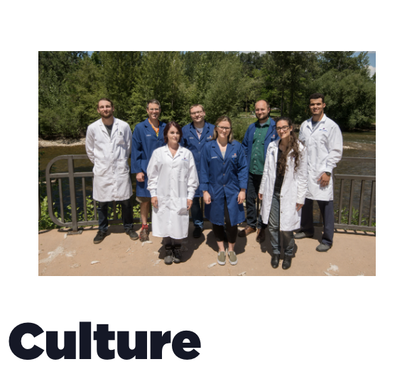
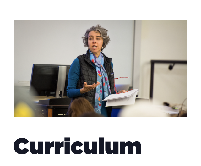
This higher ed website used images to help highlight how they promote student success. First, is a picture of a team of lab workers in their lab coats to represent Culture. Second is someone using a syringe and a machine to represent Research. Lastly, there’s a professor teaching to represent Curriculum.
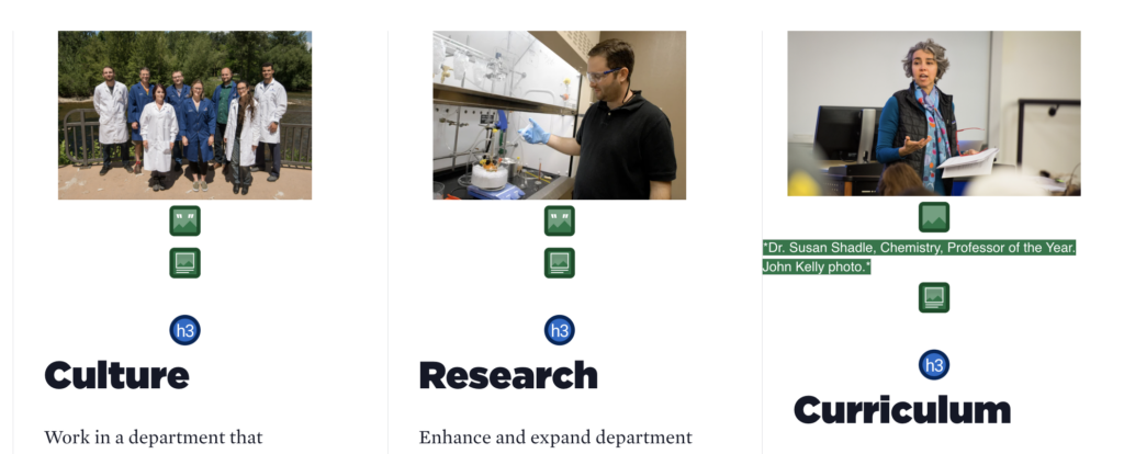
The images for Culture and Research don’t have any alternative text. They just have an empty alt attribute meaning they are decorative images or don’t convey any meaning. The image for Curriculum does have alternative text in the alt attribute.
Empty or null alternative text on Culture and Research images
Let’s first consider if the Culture and Research images actually should have alternative text. To me, these images don’t seem purely decorative. They look like they were intentionally picked to convey content that helps support how this department promotes student success. Let’s ask ourselves these questions to decide if they are decorative images:
- Do these images add needed content?
- Would any information be lost if these images were deleted?
- Would alternative text on these images give meaningful information to a screen reader?
Considering these questions, I’d say these images are informative in this context and need alternative text. For instance, the Culture image is a group of what looks to be student researchers, which helps convey a team and opportunistic culture. Without alternative text, this meaning would be lost.
Because it seems like these images convey information, I would add alternative text to the Culture and Research images. I will say these images could go either way, so it’s up to the page’s author whether these convey content or are just decorative.
Writing alternative text for these images
Now, let’s write alternative text for all three of these images.
For the Culture image, the alternative text could be: Team of 8 student researchers in lab coats.
I’m not exactly sure what the researcher in the Research image is doing. But, for example, if they are preparing culture specimens for testing, its alternative text could be: Researcher preparing culture specimens for testing.

The last image’s current alternative text is: Dr. Susan Shadle, Chemistry. Professor of the Year. John Kelly photo.
This alternative text could be improved because it doesn’t describe what Dr. Shadle is doing in the image. It also gives extra information the image doesn’t convey, which is that they’re the Professor of the Year and the person who took the photo. So, I’d change this alternative text to: Dr. Susan Shadle teaching a class.
Recap
- We decided each image conveyed needed information about how this department promotes student success. So, each image needs alternative text. Remember, these images could go either way and it would ultimately be up to whoever is doing the content.
- We came up with alternative text for the two images that didn’t have any.
- We changed the alternative text for the image that already had it because it didn’t describe what the professor was doing and it had extra information the image didn’t convey.
Example 2: Can a linked image have null alternative text?
The scenario
This higher ed website also has two columns with an image and article title in each. The image and article title are both linked to the article.
The first image is linked and has alternative text. The second image has a linked image missing alternative text error. This means it either has no alt attribute, or it has a null or empty alt attribute (like this alt="").
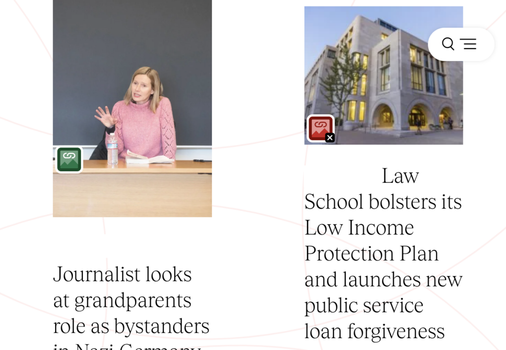
Why the null or empty alt attribute is an error in this situation
A null, or empty, alt attribute tells a screen reader to skip an image because the image is decorative. In this case, even if the image is decorative, there should be alternative text in the alt attribute because the image is its own link to the article.
Since the image is in a separate link than the text below it, it needs alternative text that describes where the linked image goes. Without it, a screen reader user wouldn’t know where this link goes when they navigated to it.
The alternative text I’d add to this linked image is the article title: Law School bolsters its Low Income Protection Plan and launches new public service loan forgiveness.
It’s OK this alternative text doesn’t describe what’s in the linked image because it’s more important it describes the function of the link.
Imagine if the alternative text focused on what the image looked like instead. The alternative text might be: Law school building. This would sound like the link goes to information about the Law school building.
When a linked image can have a null alt attribute
A linked image can have a null alt attribute when the image and text are in the same link. When they are in the same link, the text acts as the alternative text describing where the link goes. This also would get rid of two links right next to each other going to the same place, which adds unnecessary output for a screen reader.
This code shows the image and text in their own links, so the image needs alternative text to describe where the linked image goes.
<a href="https://university.edu/articles/law-school-bolsters-its-low-income-protection-plan">
<img src="/images/building" alt="Law School bolsters its Low Income Protection Plan and launches new public service loan forgiveness.">
</a>

<a href="https://university.edu/articles/law-school-bolsters-its-low-income-protection-plan">
<h2>Law School bolsters its Low Income Protection Plan and launches new public service loan forgiveness</h2>
</a>
This code shows the image and text in one link. Now, the image can have a null alt attribute because the text describes where the link goes.
<a href="https://university.edu/articles/law-school-bolsters-its-low-income-protection-plan">
<img src="/images/building" alt="">
<h2>Law School bolsters its Low Income Protection Plan and launches new public service loan forgiveness</h2>
</a>
Recap
- Linked images that are only the image need alternative text in the
altattribute. The alternative text should describe where the linked image goes. - A linked image doesn’t need alternative text when it’s in the same link as text describing where the link goes. Now, the linked image just needs a null
altattribute.
Example 3: Why doesn’t this alternative text accurately describe the image?
The scenario
This webpage is about donating to the College of Veterinary Medicine. There’s an image of a person in scrubs looking at a puppy. The alternative text for this image is Giving to the College of Veterinary Medicine.
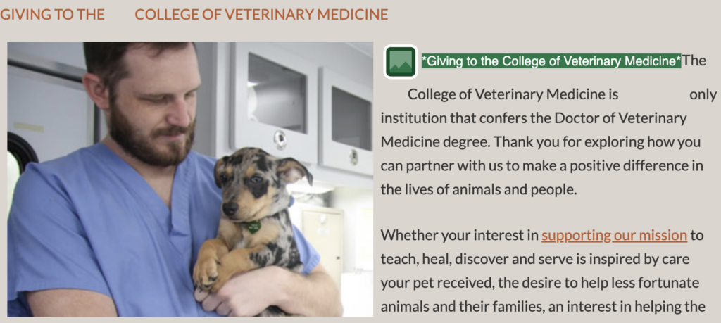
Writing alternative text that accurately describes the image
The alternative text Giving to the College of Veterinary Medicine doesn’t convey what the image is. When writing alternative text, ask yourselves these questions:
- What’s happening in the image?
- What’s the image’s purpose on this page?
- What content is this image conveying that’s important in this context?
Let’s answer each of these questions and see how our alternative text evolves.

First, what’s happening in the image? It’s an image of a person holding a dog. If this image’s alternative text was A person holding a dog, that wouldn’t be wrong. But, by answering the rest of the questions, we can make sure non-visual users get a better description of what this image’s content is.
Next, what’s the image’s purpose on this page? This is a page meant to make you feel like you should donate, and this image is part of that message – it’s meant to make you feel like “aww, this looks like a good veterinary program because look at how they love the animals.”
Lastly, what content is this image conveying that’s important in this context? There’s additional content like the fact that the man is wearing scrubs, they looks affectionate towards the puppy, and the puppy looks worried.
If we put this all together, we get alternative text like this: Veterinary student holding and affectionately looking at a scared puppy. This provides the contents of this image as it relates to the purpose of the page a lot better than A person holding a puppy.
IMPORTANT: The alternative text for the same image can (and probably will change) when the image is used in different contexts because the purpose of the image changes.
Recap
- Try answering these questions when writing alternative text:
- What’s happening in the image?
- What’s the image’s purpose on this page?
- What content is this image conveying that’s important in this context?
- While the alternative text for this image could have been A man holding a puppy, by answering these questions, we were able to write alternative text that better conveyed the image’s content and purpose: Veterinary student holding and affectionately looking at a scared puppy.
- The alternative text for the same image can (and probably will change) when the image is used in different contexts because the purpose of the image changes.
Example 4: Exploring good alternative text and how to make it better
The scenario
Again, we have the three columns. This time with an image on top and a linked button below. Each image has alternative text.
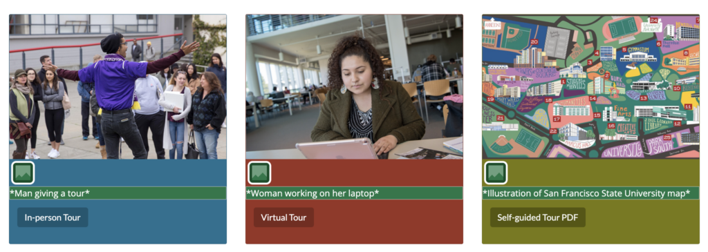
Why this alternative text is good and potential changes
Each image already has good alternative text that succinctly describes the image. But, we’ll explore each to decide if the alternative text could be improved by asking these questions:
- What’s happening in the image?
- What’s the image’s purpose on this page?
- What content is this image conveying that’s important in this context?
Image 1
This image’s alternative text is Man giving a tour. That’s a good description of what’s happening.
It doesn’t have unnecessary content like Man in purple shirt and black beanie giving a tour to about 9 people. Those details aren’t needed in this context.
It also doesn’t have content the image doesn’t convey like 4.0 Senior student giving a tour.
This image’s purpose is to show the in-person tour experience. When we think about that purpose and if there’s additional content that’s important to that purpose, there are three more details that stand out:
- The person giving a tour looks like a student.
- They are standing outside.
- The people on the tour look like potential students with their parents.
To me, all these are important because they explain what the in-person tour experience is like.
So, the new alternative text would be: Student giving a walking-tour to potential students and parents.
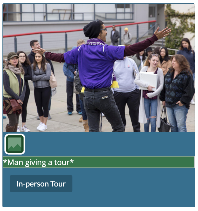
Image 2
The next image’s alternative text is Woman working on her laptop. Again, this alternative text works. It doesn’t have unnecessary content or content that’s not in the image.
But, there are additional details that could be important:
- They’re in a library.
- They look like a student.
Now, I don’t think either of these details needs to be added, and here’s why:
- The context is a virtual tour, so where they are doesn’t really matter.
- Even though they look like a student, this is for a virtual tour that’s for anybody, so it’s not important if they’re a student or not.
The next question might be: is this image decorative? If we took this alternative text away, what content would a non-visual user lose? They could lose the content that a virtual tour can be done on a computer. Someone else might decide that’s implied with Virtual Tour, so it’d be up to the person adding this image.
I’d leave this alternative text how it is.
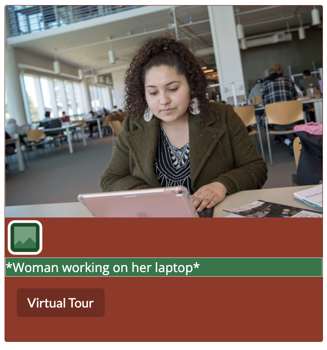
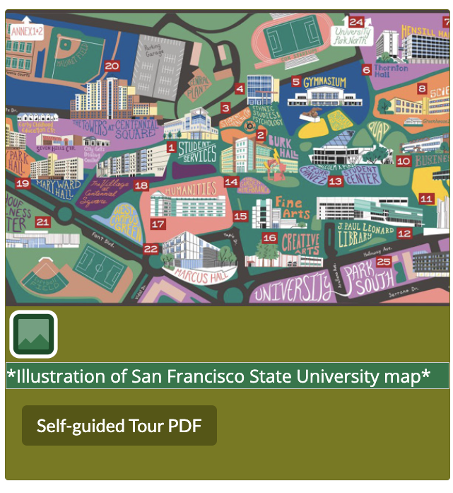
Image 3
The last image’s alternative text is Illustration of San Francisco State University map.
This map shows 24 locations and where they are. To accurately describe it would be a lot of alternative text.
But, is the purpose of this map to help students find where to go? No – the purpose of this map is to have a visually appealing image with the Self-guided Tour PDF link.
So, this image doesn’t need alternative text detailing where everything is. I don’t even think this image needs alternative text at all.
If we took away Illustration of San Francisco State University map, would a non-visual user lose any needed content? No.
I’d remove the alternative text from this image and just have a null alt attribute to signify it’s decorative.
Recap
- The alternative text isn’t wrong for any of these images, but we were able to improve it by asking ourselves these questions:
- What’s happening in the image?
- What’s the image’s purpose on this page?
- What content is this image conveying that’s important in this context?
- We changed the alternative text in the first image to include additional detail the image conveyed because that detail was relevant content that would be helpful to a non-visual user.
- While there were additional details in the second image that could have been added, they weren’t needed information for this context.
- The last image could be considered decorative since removing the alternative text wouldn’t take away any needed content from a non-visual user.
Example 5: When should an image have long alternative text?
The scenario
This image is an outside sculpture that is part of a walk and audio tour. Its alternative text is Tilting arc, which is the title of the sculpture. It has this text and audio on the page:
Tilting Arc is the only kinetic sculpture—a sculpture designed to move—on campus. Made by George Baker, its stainless steel blades continually shift and turn in response to the direction and speed of wind. Baker specialized in large-scale kinetic sculptures and Tilting Arc was the last sculpture he produced before passing away in 1997. Visitors often compare its movements to a dancer’s body or the path of a ship or plane. Despite its design, strong winds have caused damage to Tilting Arc over the years and Ralph Wanlass, one of Baker’s former students, has repaired the piece several times.
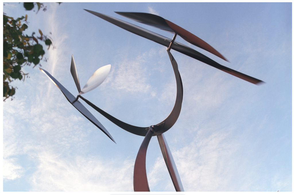
Why there should be long alternative text
Even though the content of the Tilting arc page explains the material of this sculpture, it doesn’t describe what it looks like. Since the image’s purpose is to show what this sculpture looks like, the alternative text should do the same, which will probably result in it being long.
An image should have long alternative text if there’s that much detail that needs to be conveyed for a non-visual user to get the same needed content. That doesn’t mean including every detail – it just means including the details that are needed to get the content that relates to the purpose of the page.
So, I’d change the alternative text from Tilting arc to An 18-ft tall stainless steel sculpture with two legs holding it up. On top of the legs is a horseshoe shape. At the tips of each side of the horseshoe are two blades that spin.
Notice how the alternative text doesn’t describe the sky in the background because that detail isn’t needed. The page’s purpose is the Tilting arc, so I just need to describe the Tilting arc.
Recap
- An image should have long alternative text if there’s that much detail that needs to be conveyed for a non-visual user to get the same needed content.
- Include only the details that are needed to get the content that relates to the purpose of the page.
- This page is about the Tilting arc sculpture. The purpose of the image is to show what that specific sculpture looks like, so it should have detailed alternative text describing what it looks like.
Learn more about writing alternative text: