In this video, we’ll focus on two design strategies for making your data more accessible:
- Analyzing the purpose of your data to pick the data format that meets your goals.
- Creating multiple pathways to the same data, so users have options for accessing your data.
Transcript
Data displays can get complex quickly. There are trends, stories, and individual data points all baked into your data.
Often, data is shown in a static image, complex table, or an inaccessible interactive graph. This means users with disabilities might have difficulty reading the information, or worse, the information is completely unusable to them.
In this video, we’ll focus on two design strategies for making your data more accessible: analyzing the purpose of your data, and creating multiple pathways to the same data.
For more information on accessible charts, graphs, and tables, check out the resources below.
Let’s get started.
Consider the purpose of your data
First, consider the purpose of your data. Ask yourself: What do I want users to understand, and what do I want them to do with this information?
This helps you know which format to use for your data.
For example, if you want to show detail, use a table.
If you want to show comparisons of those details, use a graph.
If you want to rank items, a list will work.
If you want to demonstrate how those items have changed over time, a line graph might work better.
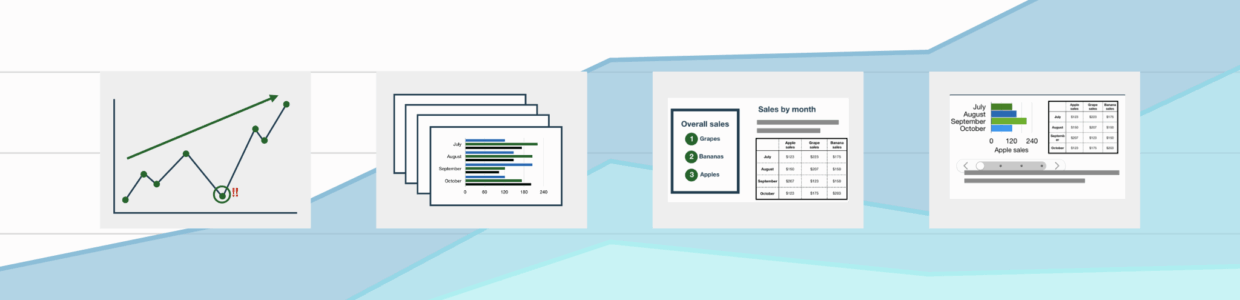
Provide multiple pathways or access points to your data
Our second design consideration for making accessible data displays is providing multiple pathways or access points to your data. This is especially important If your data is in an interactive format or complex.
It means providing or layering different formats for different needs.
Let’s go over two examples to understand this better.
Examples
A blind user navigates the web with a screen reader. The screen reader uses a webpage’s HTML to announce the content. If this user comes across data in a static image or an inaccessible interactive chart or graph, the screen reader wouldn’t be able to announce the information properly.
But, if that same content is accompanied by a table of the data points and a caption explaining key points, the screen reader user has other pathways or access points to the data.
Now, let’s consider a user with a cognitive disability. Perhaps there’s a dense table that is difficult for the user to interact with. If we design this with multiple pathways in mind, instead of starting with a dense table, we rank the data by the most useful information. From there, we could also couple those dense data points with headings and a caption. Now, this user has other entry points to start interacting with the data.
Both these examples highlight design strategies you could use to help users with disabilities interact with your complex data and achieve the goals you have for displaying the data.
But, these are also just better design choices. Providing a caption, table alternative, descriptive headings, or starting with a pared down version is helpful for anyone. People who are intimidated by data, are facing a time-crunch, using smaller screens, have low-bandwidth, and the list goes on, all benefit from these better design choices.
Design strategies to provide multiple pathways
Here are design strategies you can use to provide multiple pathways and access points.
Titles and headings orient the reader to the data’s purpose.
Captions describe the intent and key point.
Summaries are longer and can describe how to interact with the data display and key trends or takeaways.
Using multiple types of data displays, for example, a table and a bar graph, gives people multiple options that suit their needs and goals.
Layering data, or starting with only the essential information first, helps users have an entry point to the information before getting into more detailed data points.
Now that you’ve learned how to choose the best data format for your goals and also consider multiple pathways or access points for users with varying needs, you’re ready to make your complex data more accessible for your users.
Remember to subscribe for more accessibility videos.