
Charts and graphs are powerful tools that help us understand complex information at a glance, so we can easily come to conclusions about that data and make informed decisions. Each data point comes together to communicate a trend or opportunity.
For example, the graph below is on fruit sales. By looking at it, it’s clear that grapes have done the best and blueberries have done the worst.

But, not everyone uses a graph or chart visually. Some users have a screen reader announcing individual data points to them.
No matter how a user interacts with data, the goal is to make sure everyone can perceive the trend or information the data conveys.
Related resources:
- Rather watch the video? Watch Accessible data visualizations (charts and graphs).
- How to make complex data accessible for users with disabilities
In this article, we’ll start with what charts and graphs need to be considered accessible. But, just because it’s accessible, doesn’t mean it’s the best user experience for all types of users. So, we’ll also go over opportunities for creating more usable data visualizations.
- Accessible static data visualizations
- Dynamic data visualizations explained
- Accessible dynamic charts and graphs
- Opportunities for more usable dynamic data visualizations
- Give tabular data
- Introduce the visualization
- Goal-oriented data visualizations
- Filter options
Accessible static data visualizations
Static data visualizations are images of charts and graphs. So, the Fruit Sales chart above is a static graph. There are three strategies to make static images of visualizations more accessible.
Alternative text
The first is with alternative text. The alternative text should describe the visualization’s purpose. That could be one or multiple trends depending on the context.
Let’s go back to our Fruit Sales static graph. The alternative text could be different depending on the purpose of the graph. In these cases, it also makes sense for the alternative text to be longer to make sure the user gets the information they need.
If the purpose is to identify the fruit that’s selling the least, the alternative text could be: Blueberries sold the least at 60 units. They’re 40 units below the next fruit, which is watermelons at 100 units.
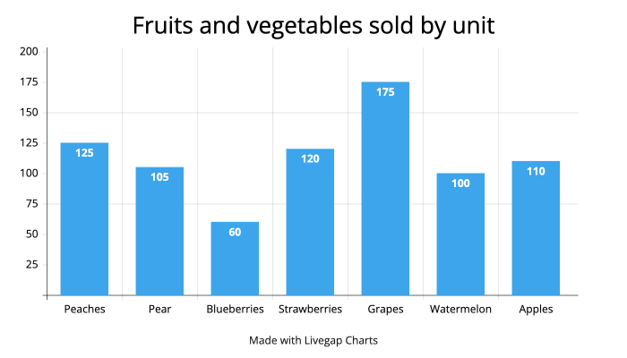
Now let’s pretend the context is just a general overview of sales. The alternative text would change to be something like: Fruit sales bar graph. Sales range from blueberries at 60 units to grapes at 175 units. Peaches, apples, watermelons, pears, and strawberries range from 100 to 120 units.
When the chart or graph has several data points, it’s not realistic to put every point in the alternative text. That’s why it’s important to understand the question you’re trying to answer in the context.
Give tabular data
Alternative text isn’t great at giving every data point. Pairing alternative text with a table of the data means the user now gets the trend and each data point to explore further if they want.
If I were to include the tabular data for the fruit sales, it would be like this:
| Fruit | Units sold |
|---|---|
| Peaches | 125 |
| Apples | 110 |
| Watermelon | 100 |
| Pears | 105 |
| Blueberries | 60 |
| Strawberry | 120 |
| Grapes | 175 |
Color considerations
Lastly, any visual should follow contrast and color use requirements so all types of visual users can properly see it. Contrast and color use requirements for visualizations are:
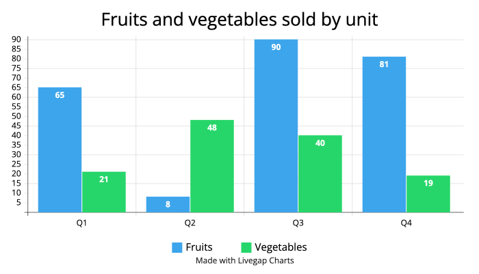
- The contrast between colors in a graphical element are at least a 3:1 ratio. The ratio between the blue and green bars in the graph below is only 1.39:1, so there’s not enough contrast. The bars also need a 3:1 ratio with the white background color.
- Color shouldn’t be the only way to communicate information. For example in the bar graph below, color is the only way to tell which bars are for fruits and which bars are for vegetables. Patterns or text could be added to the bars to add another way to differentiate between them.
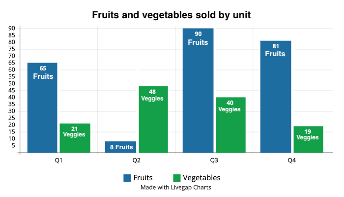
To fix this bar graph, I adjusted the colors so there’s more contrast with each other. I also added white spacing between the bars. Then, the bars only need a 3:1 ratio with white. Lastly, I added text to the bars to differentiate which ones are fruit and which ones are vegetables.
Dynamic data visualizations explained
Dynamic visualizations are a more interactive experience. This means they have more considerations when it comes to accessibility and usability.
Let’s start with what we mean by dynamic. Dynamic data visualizations are charts and graphs that pull in data. They also have some sort of interactions like tool-tips when focusing, selections, or filters.
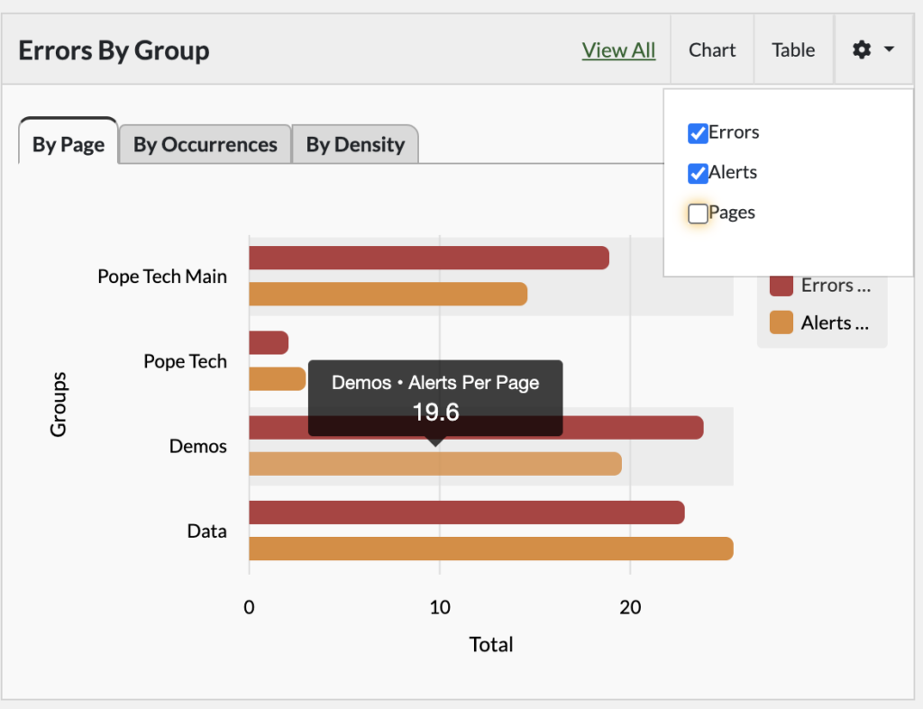
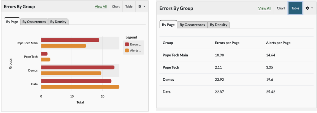
For example in the Errors by Group bar graph below, the visualization updates as the data updates. I can also choose to display Errors, Alerts, or Pages and hover over bars to get the specific data point.
We’ll focus on making dynamic visualizations more accessible and usable in the rest of the article.
Accessible dynamic charts and graphs
Accessible dynamic charts and graphs should follow accessibility color requirements, be navigable using only a keyboard, and consider how a screen reader announces data points.
Color considerations
Just like with static data visualization, dynamic charts and graphs must meet contrast requirements. Review the color considerations above for the requirements.
Keyboard interactions
To be keyboard accessible, a user should be able to interact with every part of the visualization that a mouse user can with only a keyboard.
There isn’t a standard for how a keyboard should interact with a dynamic visualization. But, it should follow typical keyboard interactions like:
- Tab goes through interactive elements like links and buttons.
- Arrow keys navigate through options within an element. For example, options in a filter dropdown box or multiple tabs for different views.
- Spacebar/Enter activates links and buttons or makes a selection.
What a screen reader announces
There isn’t a unique standard for charts when it comes to what a screen reader announces. But, they should follow the same label accessibility standards as other elements.
It’s important to make sure each data point makes sense on its own when announced by a screen reader. This could mean that the y-axis, x-axis, and any legend information are read aloud for each data point.
For example, the line chart below shows the most common desktop screen readers used from December 2010 – September 2019. When Mac’s VoiceOver screen reader focuses on the first data point for the NVDA line, it announces December 2010, 34.8%. NVDA. The y-axis, x-axis, and legend information are all announced for that one point.
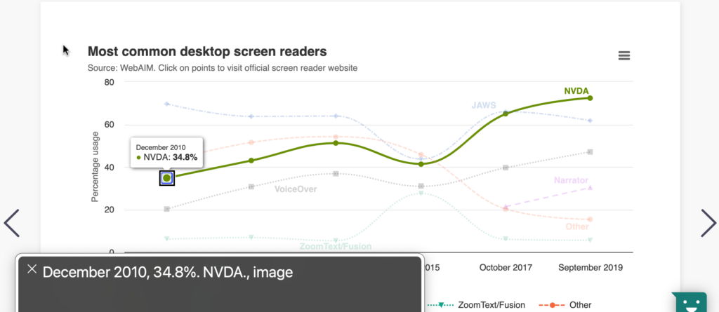
If a user relies on a screen reader to announce the data, they’ll only get one data point at a time. It’s difficult to come to conclusions about the data when only getting one bit at a time, especially if the visualization has several data points. So, even if the screen reader can navigate through it and have each data point announced, it doesn’t mean it’s usable or a similar experience.
Opportunities for more usable dynamic data visualizations
When it comes to data visualizations, a truly accessible experience means the visualization should be understandable and usable by everyone.
These opportunities for usability help users who hear one data point at a time, navigate with a keyboard, or have cognitive disabilities get a better understanding of the data as a whole.
Give tabular data
Like with static visualizations, giving tabular data is also helpful with dynamic charts and graphs. It’s an easy way to give an alternative for viewing the data that could help users with varying disabilities.
For example, each dynamic visualization in Pope Tech also has a table option to view the data.
Introduce the visualization
Introducing a data visualization goes a long way in preparing a user with a disability to interact with it and understand the data as a whole better. Even when a screen reader is getting one data point at a time, a good introduction helps each singular data point make more sense in the larger picture.
Thomas Watkin’s presentation Getting to the Core of Data Visualization Accessibility gives two strategies to introduce a visualization.
HTML headings
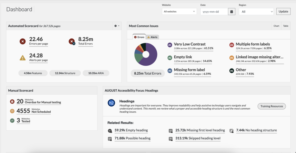
The first strategy is using specific headings on the page with the data visualizations. This makes it so as the user scans the page, either visually or with a screen reader, they’re also getting prepared to view the data. A thoughtful heading structure is especially helpful for screen reader users since they mostly navigate pages using headings.
If the page has multiple data visualizations on it, a good HTML heading structure could be:
- Heading 1: Dashboard title
- Heading 2s: View or widget titles
- Heading 3s: Filter, parameter set, or legend titles
The heading structure can change depending on the situation as long as it’s preparing the user for what they’ll be interacting with.
Here’s an example of Pope Tech’s Dashboard page. The heading 1 is Dashboard, which communicates the page is an overview of information. The heading 2s are the view or widget titles: Automated scorecard, Most common issues, Manual scorecard, and Accessibility Focus. Each of these gives a brief summary of the information in the widget preparing the user to interact with it.
Captions
The next, and arguably most helpful, strategy for introducing users to the data is a caption that includes:
- Graph title
- Chart or graph type
- Goal of visualization (what data is it showing?)
- How to read or navigate it
- Summary of important trends
Yes, that sounds like it will be long, but that’s okay. The goal is to provide clarity – not be brief.
Let’s write a summary for the Errors by Group bar graph.
I’d start with the title, Errors by Group. Next, is the type and goal of the graph, which could be …is a bar graph giving the total errors and alerts per page by group. Now, I can give some information on how it’s structured like …The four groups from top to bottom are Pope Tech Main, Pope Tech, Demos, and Data. Lastly, I’d add a summary of trends.
Altogether, the summary could be:
“Errors by Group” is a bar graph giving the total errors and alerts by group. The four groups from top to bottom are Pope Tech Main, Pope Tech, Demos, and Data. Here are the insights from the group with the most errors per page to the group with the least:
- Demos has the most errors per page at 24. It has 19 alerts per page.
- Data is close behind with 23 errors per page. It has the most alerts per page at 25.
- Pope Tech main has 17 errors per page and 15 alerts per page.
- Pope Tech has the least errors and alerts per page at 3 and 4.
Thomas Watkin goes through two examples that are more complex in the video below (the video below starts at the examples in the presentation):
Autogenerated summaries
These summaries can make it easier to interpret the data when going through one point at a time with a screen reader. The roadblock is they need to be automatically created as the dynamic visualization changes with the data.
Autogenerated summaries aren’t widely spread across the internet as of now. But, could be possible soon.
The first thought is AI could auto-generate summaries. From the data, AI could write a summary using Watkin’s anatomy or a similar one. It’s important to consider if it would need a human-check for accuracy since incorrect summaries would cause more problems for users relying on them.
Another option for autogenerated summaries is conditional logic. A summary created using conditional logic wouldn’t require AI but might not be possible for more complex visualization. Even simple visualizations would need serious thought into the summary’s structure and how it would adjust to accommodate any scenario.
Goal-oriented data visualizations
The next opportunity is designing a goal-oriented data visualization. It’s easy to get excited creating visualizations that rival an art gallery and give people access to every data point possible. But, these won’t be helpful to any user, let alone users with disabilities.
Busy dashboards that might look beautiful with lots of colors, movement, and data points can make it hard for any user to know where to focus. This kind of complexity also means it’s more difficult to make accessible.
Goal-oriented data visualizations are built to answer a business question. When dashboards are made of several views that are goal-oriented, it’s easier to make accessible. Plus, it’s easier for all users to make data-driven decisions.
Filter options
Filters help users organize the data in a way that either helps answer their questions or helps them read it.
For example, Pope Tech’s Issues Over Time view lets users filter by different variables and time periods.
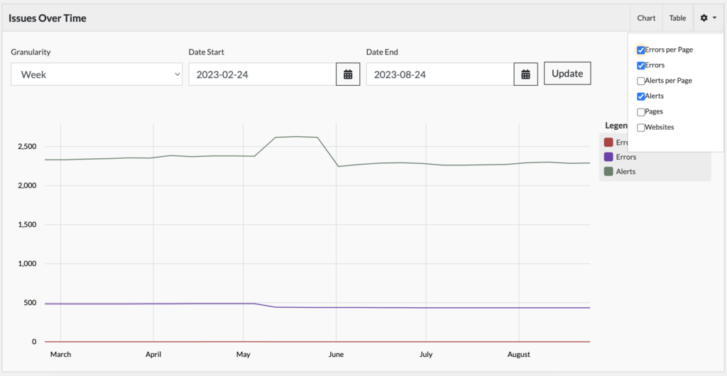
Now a user can customize their view to help them understand and navigate the data better.
Everything coming together
Data visualizations are meant to convey trends based on multiple data points coming together. When a user can only hear one data point at a time, it’s difficult to pick up on these trends.
To help all users experience a dynamic data visualization similarly, they must consider both accessible interfaces and strategies to make it more usable.
A data visualization that uses color properly and is keyboard and screen reader accessible still might not be a similar experience for non-sighted users.
But, when we also provide tabular data, introduce the information with headers and summaries, and design goal-oriented views with filters, everything can come together to make a more accessible and usable experience for all types of users.
Check out the Tables and Lists monthly focus for more articles and videos.