How you present data shapes how people understand it and ultimately act on it. Simple data can often be conveyed in a straightforward list or table, but complex data needs more. Sharing data requires careful consideration to ensure it is accessible to users with disabilities.
From an accessibility standpoint, your data decisions result in making your data more than understandable, but usable and meaningful for people with diverse needs.
Before putting complex data into tables, charts, or visualizations, go through these three steps to make sure you use the right display for your goals, while also considering the needs of a diverse audience.
- Start with the purpose of your data
- Understand your audience
- Design for multiple pathways of understanding
Watch the video version of this content, or learn more about accessible data types:
1. Start with the purpose of your data
Before thinking about displays or building visualizations, ask yourself: What do I want users to understand, what do I want them to do with that understanding? Your purpose might be to persuade, inform, or motivate.
By focusing on what you want users to do with the data, you can then choose the displays that best fit that goal.
Choosing between lists, graphs, and tables
| Goal | Example | Good Display(s) | Why / Notes |
|---|---|---|---|
| Show steps | Help employees follow a process | Ordered List | Easy to follow sequentially; assistive technology friendly |
| Define terms | Explain key terminology | Definition List or Table | Definition List for quick web reading; tables for comparison or detailed definitions |
| Present detailed data | Provide exact sales data | Table | Most precise; assistive technology friendly |
| Compare values | Compare competitors’ prices | Bar Graph | Side-by-side bars make comparisons quicker; harder to know exact numbers; not accessible if only a static image or if interaction isn’t coded accessibly |
| Rank items | Order products based on performance | Ordered List, Table, or Graph | Lists for simplicity; tables or graphs for detailed rankings |
| Show part-to-whole relationships | Show percentage of earnings | Pie Chart | Good for visual learners; accessibility issues if static image or if interaction isn’t coded accessibly |
| Show change over time | Track progress | Line Graph | Line graph illustrates trends; accessibility issues if static image or if interaction isn’t coded accessibly |
Your goals help guide which display to use, and if you have simple data that is in accessible HTML, you might be done.
But, if your data is in a graph, chart, complex table, or some other visualization, knowing your purpose isn’t the whole story. You need to take additional steps to understand how people interact with your data to make sure it’s accessible.
2. Understand your audience
With your communication goal in place, the next step is to think carefully about who will use your data and how they will engage with it. You cannot know every user’s abilities or limitations, but you can design knowing that people with a range of needs, including various disabilities, situational limitations, and device preferences, will access your content.
The “average” user
Designing for the “average” user often leads to assumptions such as users being able-bodied, neurotypical, or using a desktop. The truth is, there is no “average” user, especially when it comes to analyzing and absorbing complex data.
There are users with disabilities who rely on accessible design choices to even access the content. For example, when a website doesn’t use semantic HTML, screen readers can’t convey the content in a meaningful way. This can leave blind users with incomplete or unusable information. Similarly, if data isn’t broken into clear sections with highlighted insights, people with learning disabilities may not be able to find an entry point. Without these basic considerations, some users can’t engage with your data at all.
Others with situational or temporary limitations, like users skimming for key points under pressure or those using mobile devices, benefit from design choices that make information easier to navigate and understand.
If we design for the “average” user, we miss opportunities to make our data consumable by more people. Instead, the goal is to design inclusively.You can assume your audience includes people with diverse needs and make specific design choices so more people can use and act on your data. Goodbye to the “average user” and hello to intentional design choices that serve the specific needs of people.
Understand how different users access the internet
Designing for a broad audience can feel abstract. Here are three examples of people with disabilities to help you understand how your design decisions can support their access.
These examples are not exhaustive but provide a practical starting point for designing accessible data.
Maria, the blind data analyst
How Maria Navigates Data:
Maria uses a screen reader and a braille output device to navigate tables. She listens as her screen reader announces the header row and column for each data cell, allowing her to interpret complex datasets without seeing them.
Challenges & Design Considerations:
- Tables, charts, or layouts without semantic markup or clear structure are hard to interpret.
- Visual-only cues, like color or hover effects, are inaccessible.
- Providing semantic HTML, descriptive captions, and text summaries ensures data is usable.
Devon, the graduate student with ADHD
How Devon Navigates Data:
Devon often skims dense reports while multitasking or under time pressure. She relies on clear entry points and visual cues to find the most important information quickly.
Challenges & Design Considerations:
- Busy layouts, dense text, or poorly labeled charts make navigation overwhelming.
- Breaking content into small, clearly labeled sections, using plain language, and highlighting key insights helps maintain focus.
Leonard, the retired engineer with Parkinson’s
How Leonard Navigates Data:
Leonard relies on keyboard navigation and alternative input devices to interact with data. He needs ways to access content that don’t rely on clicking with a mouse.
Challenges & Design Considerations:
- Small click/tap targets, timed interactions, or inconsistent navigation make data frustrating to understand and use.
- Logical tab order, larger interactive areas, avoidance of timed actions, and support for voice control improve accessibility.
Designing for broader accessibility
These profiles don’t represent every possible user or need. Instead, they highlight concrete ways that accessibility features help real people interact with data. By addressing needs like these, you not only support disabled users but also improve usability for a wider audience without needing to anticipate every situation.
3. Design for multiple pathways of understanding
A key strategy for making complex data accessible to people with disabilities is providing multiple pathways for engagement. Designing for multiple pathways means providing the same information in different formats to meet diverse needs.
For example:
- A caption with a data visual is great for users referencing the data at a glance or users with cognitive disabilities.
- A table of the same data in a visualization might work better for assistive technology or users who need detailed data points.
Offering multiple ways to access the same data helps a broader range of people understand and act on the information.
Progressive disclosure: presenting information in layers
Progressive disclosure shows essential details first and reveals more as needed. This layering strategy supports users with disabilities by allowing them to access information at their own pace and level of detail. This approach
- Balances competing needs across different user groups.
- Presents key information upfront while giving other users access to more detail.
Applying progressive disclosure based on purpose and audience:
- Purpose: Decide what is “essential” based on your goals. What do you want users to take away from the data? Identify what information, if any, might be needed.
- Audience: Consider who your users are and how you can design layers that are accessible for people with disabilities.
Progressive disclosure toolbox
There are two key ways to layer content for accessibility:
- Text elements: Titles, captions, and summaries act as signposts, helping users orient themselves and understand context.
- Data displays: Charts, graphs, and tables can give multiple ways to explore the same information.
Think of these elements as tools in a toolbox, layering information for different users, and creating multiple pathways to understanding.
Using text elements
| Feature | Purpose | How It Helps Progressive Disclosure | Accessibility Tips |
|---|---|---|---|
| Title / Heading | Orient the user | Establishes what the data is and how it’s structured | Use proper heading hierarchy (<h1>–<h4>) |
| Caption | Describe and highlight intent | Names the figure, frames the “big idea,” and calls out key patterns or goals | Place adjacent to visual; keep concise but self-contained |
| Summary | Provide a standalone digest | Offers a fuller overview of trends, relationships, and takeaways; can replace the chart if needed | Place before or after chart; use plain language; ensure it can stand alone |
| Tooltip / Info Tip | Define terms or add micro-context | Explains details, definitions, or highlights at point of need | Must be keyboard- and screen reader-accessible |
| Footnote | Add transparency | Provides source info, caveats, and methods | Link to sources or expand inline for context |
Combining text and data displays
Text and data displays can reinforce one another. For instance:
- Graph only → Visual learners benefit, but can be inaccessible to assistive technology users if not built accessibly.
- Graph + Table → Precise, compatible with assistive tech, but can be dense.
- Graph + Caption → Clarifies meaning, accessible, but lacks granular data.
- Graph + Caption + Table → maximally inclusive, but may overwhelm some users.
Providing multiple pathways ensures that users with disabilities can access complex data in ways that suit their needs while also improving usability for users without disabilities.
Tips for managing complexity when layering content
More layers increase accessibility, but they can also create clutter. To prevent complexity from becoming its own barrier:
- Use headings and whitespace to visually separate captions, tables, and charts.
- Allow users to expand or collapse detailed captions, tables, or footnotes.
- Consider interactive elements only if they’re fully accessible by keyboard and screen reader.
- Provide user-adjustable display settings (contrast, text size, color themes) to accommodate diverse sensory and cognitive needs.
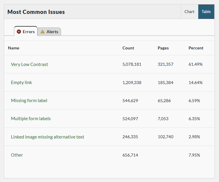
Case study: Pope Tech dashboard
Let’s review these strategies in action with a real-world example: Pope Tech’s Web Platform dashboard, which tracks website accessibility.
The Scenario: Display webpage accessibility results in both summary and detailed views to help users track accessibility issues.
Audience: Accessibility experts, new users under time pressure, and users with varying disabilities.
Multiple pathways to the data
- Users start with a high-level summary of webpage errors and alerts on their Dashboard. It has multiple types of data displays.
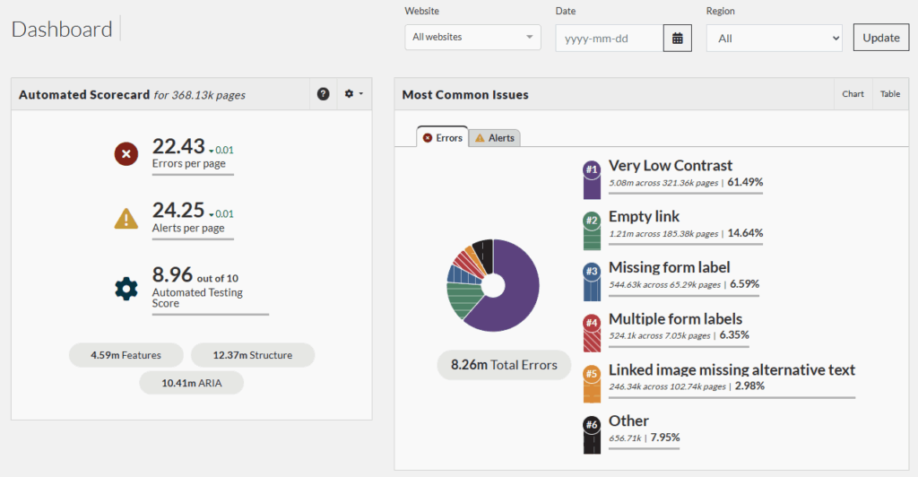
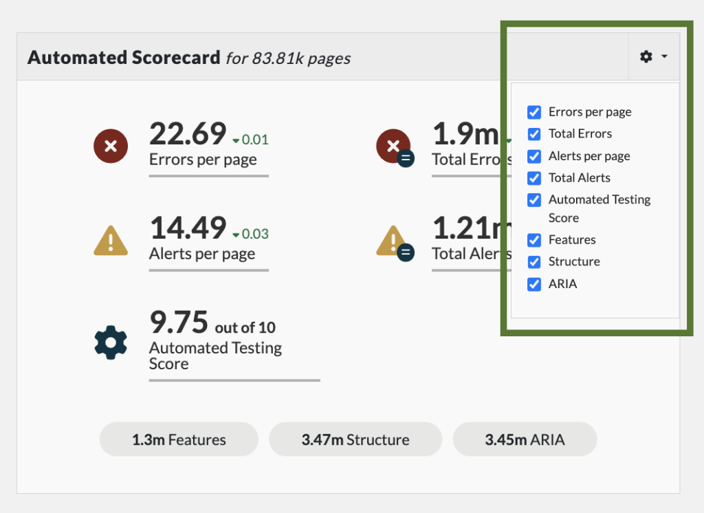
- Users can customize which details show up in their automated score card by clicking on the setting icon.
- Data displays through a semantically coded pie chart. Because of this, the pie chart is screen reader friendly and can be accessed through keyboard commands.
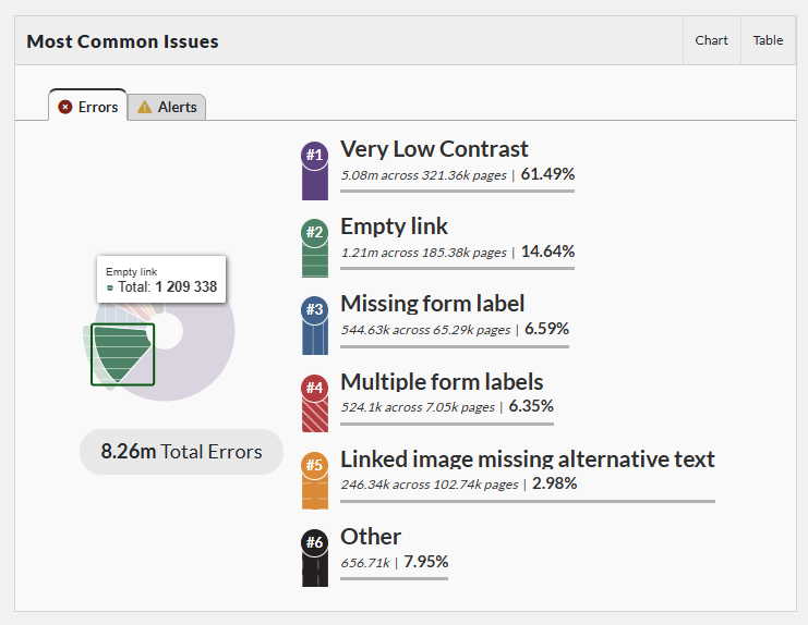
- The same information also appears in a paired data table, giving access to the detailed data behind the visuals.
Design strategies for complex data
The Pope Tech dashboard demonstrates why starting with purpose is essential. Throughout design and revision, we continually return to this guiding question: Does this help users view their accessibility results at the level of detail they need?
By designing for users with a wide range of abilities and experience levels, including those who use assistive technology, we resist favoring an “average” user. Doing so might privilege experts while excluding people with less experience or different access needs.
Laying information through progressive disclosure allows the dashboard to:
- Start at a high conceptual level.
- Drill down into additional pages and details as needed.
- Enable every user to act on the results of their automated scans at the level of depth that makes sense for them.
This layered approach makes the data usable and actionable for more people, regardless of experience level or access needs.
Bringing it all together
Good accessibility design is clear, flexible, and respectful. To make data accessible for people with disabilities:
- Start with your purpose: Know what your users should learn or do.
- Consider your audience: Design for diverse abilities and contexts without assuming an “average” user.
- Provide layered access to information: Use progressive disclosure and offer multiple pathways to reach the same data.
These steps create usable, actionable, and inclusive data for the broadest range of users.