Summary: My experience of testing and remediating web accessibility issues on 8 small client websites with screenshots and examples.
The first day Pope Tech had a working interface in our scanning platform I couldn’t wait to jump in and scan our own websites to see what accessibility gremlins we would find. These sites were touched by over a dozen different people over 5 years. There were issues for sure, our home page was pretty good as we had used WAVE and done accessibility manual audits but the deeper you went the more issues we found. I worked on them and remediated over a 1,000 errors and contrast errors in less than 2 hours. It was like a game to fix the errors and rescan and go again until those numbers dropped to 0. Of course an automated tool can’t catch everything, closer to 30% of issues are identified but it does help with the low hanging fruit and brought other issues to my attention. Along with the errors I was also able to decrease the alerts (possible issues that need a manual review) and a few other issues I found on the keyboard as I worked on the sites.
From this experience and feedback from our alpha and beta partners we made improvements to our scanning platform and today all of our internal websites are scanned weekly or monthly to help alert us to possible regressions. For example I knew immediately that we didn’t want to limit in any way users from rescanning their pages. That would deprive them of the high that I experienced to watch the issues decrease immediately. I ended up rescanning some sites 6 times in that 2 hours. We also added to our roadmap the ability to easily rescan just the web pages that are reflected on any specific report. This will allow you to look at a specific type of error, fix the issues and just rescan any pages that had that error.
I decided to share and do an experiment where we do the same thing for some of our existing clients
Setting the stage for the experiment
At Pope Tech we have built, maintained, and supported 100s of websites, so we have lots of guinea pigs. For this I selected 8 micro websites that we both created at one point and are actively managed by one of our teams. None of these organizations had web accessibility on their radar or most likely even knew what it means. All of the sites were created before our developers had official web accessibility training and none have ever been scanned before. After I post this I will be contacting each of them with a little intro into web accessibility, a report of their progress and the option, if they are interested, for free scanning going forward. Sound fun?
Setting the baseline with an initial Web Accessibility scan
First step I added the 8 websites to the scanning platform, set it to crawl and scan them to get an initial baseline. I let it scan a few times over a few weeks.
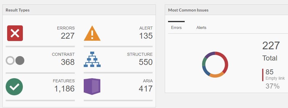
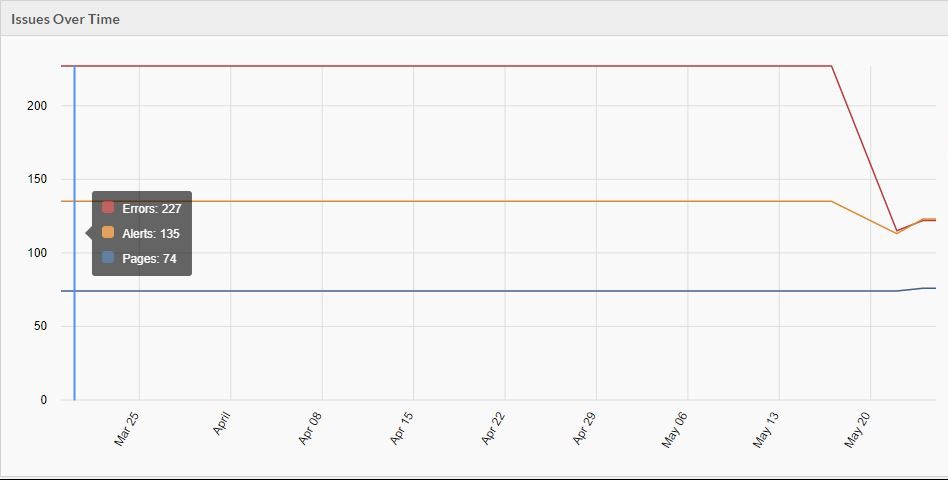
Initially the group of sites had the following results:
- Errors – 227
- Contrast Errors – 368
- Alerts – 135
- Pages – 74
- Most common error: Empty Link
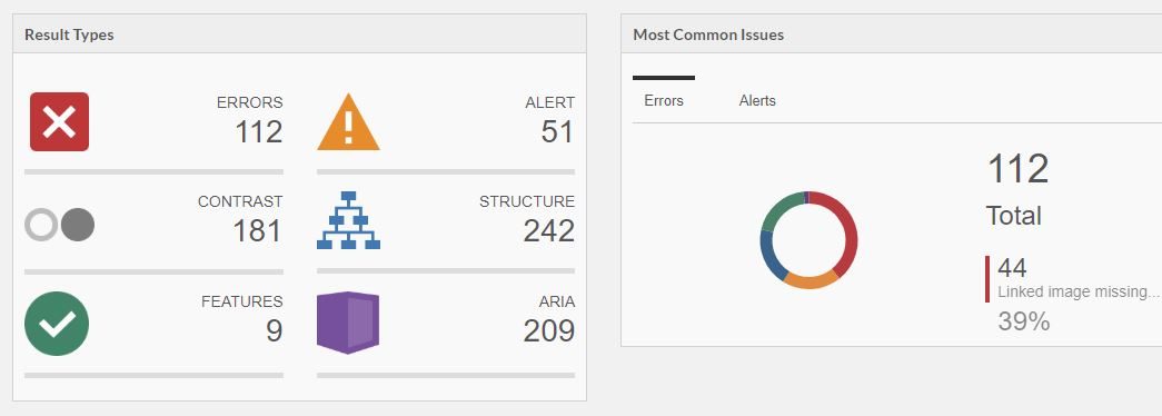
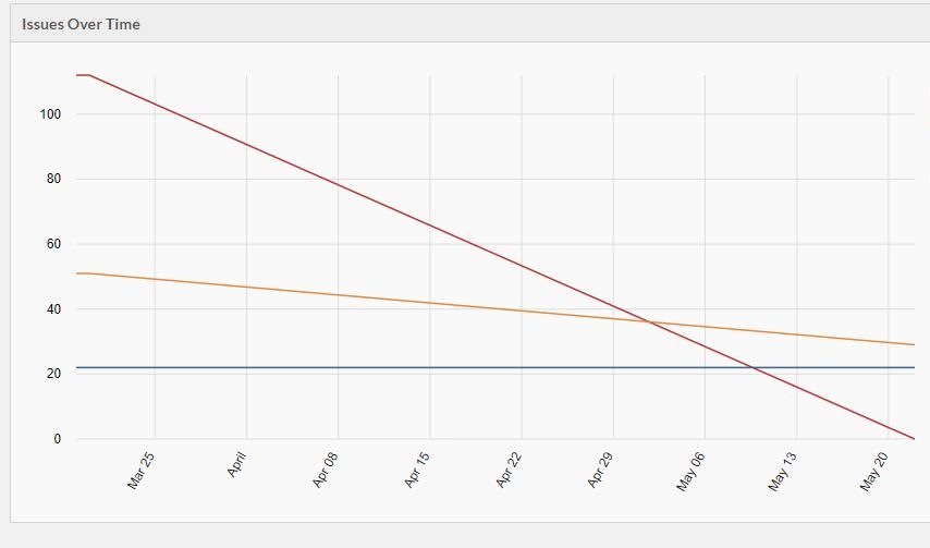
I started by going to the site with the most errors from the data set. I am going to call this Website A. Website A started with the following results before remediation:
- Errors – 112
- Contrast Errors – 181
- Alerts – 51
- Pages – 22
- Most common error: Linked image missing alternative text
Remediating template errors
The first step I took was to drill down to the most common error, which was linked image missing alternative text. As I drilled down I realized quickly this was a template error. There were 2 of these on every page. Drilling further down into WAVE I discovered where these images were to determine if I should add alt=”” or add alternative text inside the alt tag.
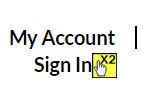
I also found an alert on that page that was in the header that was in fact an accessibility issue (an unnessary redundant link). It was two links to a portal right next to each other going to the exact same place. One was My account and the other was sign in. The client had required both even though they went to the same place. In this case because both were small and saying, “My Account Sign in” actually makes sense I combined them into one link.
Here was the code before:
<div class="col-md-5 account">
  <i class="fa fa-user" aria-hidden="true"></i>
  <a class="my-account" href="https://cool.portal">My Account</a>
  <a class="sign-in" href="https://cool.portal">Sign In</a>
</div>
And the code after:
<div class="col-md-5 account">
  <a href="https://cool.portal">
    <i class="fa fa-user" aria-hidden="true"></i>
    <span class="my-account">My Account</span>
    <span class="sign-in">Sign In</span>
  </a>
</div>
Visually nothing changed.
After going through this process (which took about 20 minutes), I then rescanned. Below were my results:
- Errors: 2
- Contrast Errors: 181
- Alerts: 51
- Most common error: Empty Heading
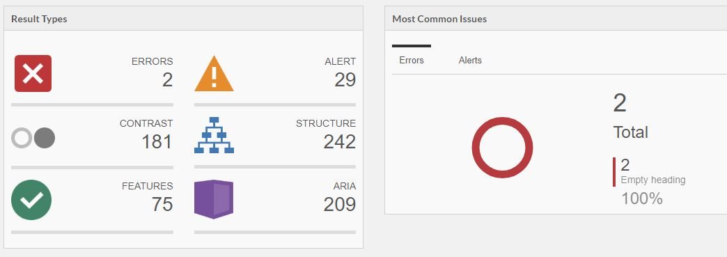
I fixed the 2 final errors empty heading errors where someone had pasted in content.
The over time chart for Website A looked pretty cool after this. The red top line is errors, middle orange is alerts and bottom blue is pages. The pages of course stayed the same with errors hitting 0 and alerts decreasing.
The group of all 8 websites over time chart also had a significant decrease in errors and alerts
Following the same pattern
After this I then went to the next site with the most errors and followed the same pattern on each site. First, I would identify the template issues and fix them and then come back for one off issues. While on pages I would also look at the alerts and see if they should be fixed as well. I would rescan to verify until all the errors were fixed (except for a few introduced by an external package I made a note to circle back with later). For this experiment I didn’t work on contrast errors as that would actually affect the design of the sites and I would need to talk to the clients first. When I did our own sites I followed the same pattern on contrast errors.
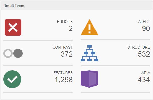
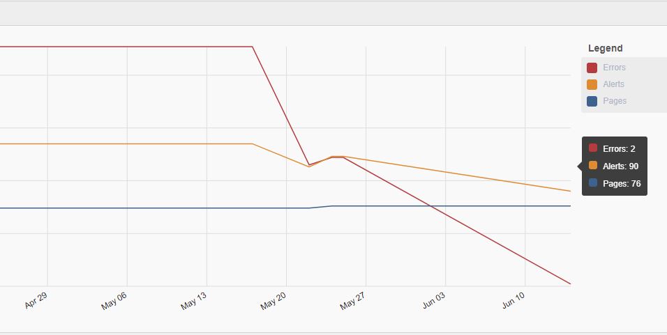
After following this pattern for the other 7 websites in the group I had the following results:
- Errors: 2
- Contrast Errors: 372
- Alerts: 90
- Pages: 76 (2 pages were added on 1 website in the time period)
The group over time graph was awesome now with errors trending down to almost 0 and alerts decreasing significantly. Pages slightly increased.
It was fun to see the improvement and following the pattern I did on the first one was pretty quick to do overall.
Other Items that stuck out to me
There were quite a few issues caused by font icons, or where a developer had copied something from a different site and now it wasn’t correct syntax. There were also lots of positive things in the sites that were done really well. The alerts section I find very interesting, when you run WAVE on one page there are alerts specific to that one page but seeing all the alerts across a lot of pages is very insightful.
A few other interesting things the scanning platform brought to my attention:
- Broken skip link on one template (ouch!). There was a typo on the html ID
- empty links that were copied from something else and were wrapping things that weren’t meant to be links
- Document language missing
- One of the main logos was missing an alt tag, it functions as the home link as well. Beyond web accessibility this isn’t great for SEO either.
This was a fun experiment for me. I took excitement from fun seeing the progress and using the platform extend the reach of WAVE to scan and review results on multiple websites all with varying templates and histories.
One thing to always keep in mind is that an automated tool can’t catch everything, this is just a good start. A more complete pattern that goes beyond this experiment that I found useful is the following:
- Scan with an automated tool such as our scanning platform
- Focus first on the template for greatest impact
- Remediate errors
- Remediate Contrast Errors
- Remediate template alerts that are in fact issues
- Identify any issues that are outside of your immediate control and decide if something else can be used and document the best course of action (I created a ticket so we wouldn’t forget it)
- Rescan and start with the issues with the greatest impact whether this is the type of issue or number of occurrence
- As you are working on pages take note of any issues you notice manually
- Focus first on the template for greatest impact
- Test with a keyboard
- Make sure you can intuitively navigate through the page with a keyboard and that you can visually know where you are at all times.
- Focus on the template, general content flow and any unique flows
- You should be able to follow all links and submit and fill out forms without using the mouse (look out for validation gotchas on forms)
- Test with a screen reader
- If you aren’t sure on this WebAIM has a great article on how to use a screen reader that will help you get started with NVDA, an open source screen reader available on Windows. In the related Resources they also have tutorials for other screen readers.
- Obviously if you have thousands of pages you can’t test everything manually with a screen reader. You can test the template and some high traffic pages or flows.
- Create a cadence with an automated tool
- Set up a recurring scan (we generally do monthly) that will alert you to accessibility issues added across the team or by content editors. Accessibility isn’t one and done, it is a process and there can be regressions as new features and things are added. When new issues are found of course fix them but also give those areas a high priority for your manual testing.
I have found this process useful in our web accessibility efforts.
The experiment I did here was simplified. It was 8 code bases and 8 unique templates but they were simple sites and it was a small amount of total pages. That being said if those 8 templates were used across 2 million pages it would have been similar effort for the template issues.
All progress is good progress and knowing is half the battle
If you have a million pages and 20 developers and 300 content editors it obviously won’t be as simple as my experiment, but if you are reading this you have the ability to improve or influence web accessibility at your organization no matter what your role is. It could be remediation like this example or as simple as learning about, talking about it and increasing awareness.
Web Accessibility has many benefits from compliance, market differential, customer base, to helping make peoples lives better. It can seem daunting but as long as we are moving and in the right direction it is a win. Even if we can’t do everything today, in web accessibility all progress is good progress and knowing is half the battle.