Summary: To review why ambiguous links like “Click Here” and “Read More” present problems for accessibility, usability, and SEO.
What are Ambiguous Links?
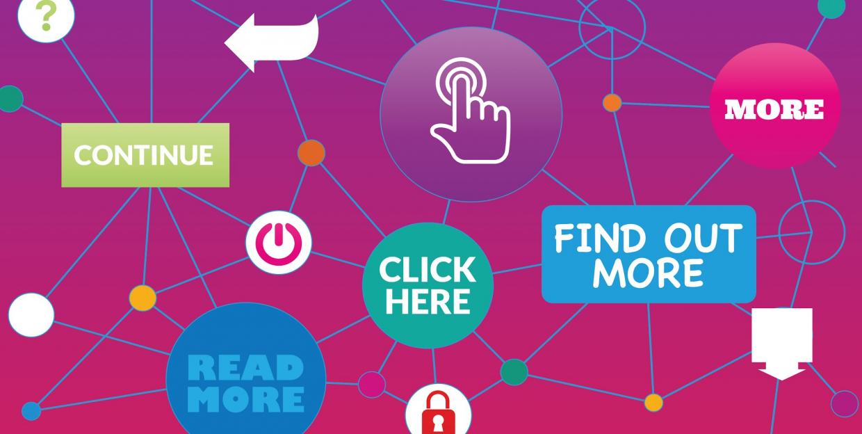
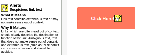
An ambiguous link is a link where its purpose cannot be determined by an examination of the link outside of its surrounding web content (its context). In other words, the link text when viewed on its own should make sense and be informative to the user. Links like “Click Here,” “Read More,” “more,” “here,” and “continue” are all to varying degrees ambiguous links. It should be understood that ambiguity is assessed on a continuum, with degrees of different degrees of ambiguity.
Ideally, the goal of creating quality link text should be to provide sufficient information that the user would know the purpose of the link, or what might happen if they activated the link. Because of the way that Assistive Technologies can be used to navigate web pages, ambiguous links, especially when navigated to out of context, often pose problems for accessibility.
Accessibility Issues Related to Ambiguous Links
Ambiguous links are flagged by Web Accessibility Scanners for a number of reasons, including: (1) they can be problematic for users with Assistive Technology; and (2) their wording often implies a specific type of user engagement with the web page that might not represent all users and could be impossible for some users.
Ambiguous Links Pose Problems for Assistive Technology
To understand why ambiguous links pose problems for Assistive Technologies, it is important to understand how screen readers interact with links.
WEbAIM’s article, Links and Hypertext, identifies the following important points on how screen readers access links:
- “Screen readers generally inform users that a piece of text or graphic is a link. Most screen readers say ‘link’ before each link.”
- “Screen reader users often navigate from link to link, skipping the text in between.”
- “Screen reader users sometimes obtain an alphabetically-organized list of links.”
A user navigating with a screen reader might only hear “Link, click here, “Link, click here,” “Link, here,” “Link, learn more,” “Link, more,” “Link, read more,” “Link, read more.” (Note: I intentionally added more of these ambiguous links than was needed to provide a small, alphabetically-sorted, text-based example of the experience of someone using a screen reader who might have to listen to a string of links like this.) Outside of the context of the rest of the content on the web page, the purpose of these links would be unclear to any user. A user with a screen reader viewing the ambiguous text link may not be able to determine what might happen if they activated an out-of-context, “click here” link.
Because of the ambiguity of the links, a screen reader user navigating the page by links would not have equivalent experience to those directly accessing the content. This usage of ambiguous text in links could render segments of the content, web pages, and perhaps even whole websites inaccessible to users with Assistive Technology. This is the key reason that Web Accessibility Scanners will flag ambiguous links for inspection and potential remediation. Besides posing problems for individuals using Assistive Technologies to navigate, the wording of ambiguous links often makes unwarranted, and often inaccurate, assumptions about how users engage with the content.
Mechanical-based, Ambiguous Links Make Unwarranted Assumptions
“Click Here,” and “Read More” are increasingly becoming inaccurate descriptors of how users engage with web content. These terms are explicit statements of the mechanics or fixed ways the users are expected to engage with the link and linked content. Specifically, they are informing the users that they should be “clicking on” and “reading” the content. But in today’s world of changing technologies is it wise to make assumptions about how users are engaging with digital content?
Many users, and not just users with disabilities, are increasingly engaging with web content without using a mouse or a keyboard (no clicking involved). Similarly, many users today do not directly read the content. Screen readers, smartphones, or voice controlled speakers (like Alexa, Echo, or Google Voice) are increasingly serving up web content to users without them ever directly reading content, let alone, “clicking” and “Reading More.”
The technologies have already moved past “clicking” and “reading.” As we design websites and curate content, if we want our content to be relevant and accessible, perhaps we too should move on from using those mechanical-based terms as well. This argument should, on its own, be enough to of a reason to justify changing how we word these ambiguous, mechanical-based links. But if that isn’t enough of a reason, there is a human element to consider in all of this as well.
The Human Side of “Click More” (An Accessibility Issue)
Using language that assumes how users engage with the content is an accessibility issue. Think about how the wording of web pages might come across to people who physically can’t “click here” or might not be able to see well enough to “read more.” We can go one step further: Imagine you had a disability that prevented you from using a mouse or a keyboard, and you were constantly seeing “Click Here,” “Click Here.” Each “Click Here” would serve as a subtle reminder that this was not designed for you.
Yes, users adapt. And it is likely that some of them don’t even think twice about the words like “click here” or how they have adapted. They have just come to expect this type of language as part of the internet experience. But, at some level, I think how we word things does matter. In the end, this issue comes down to a personal question, a human question: “Am I considering the experience of users with differing devices, abilities, and backgrounds?”
In general, using descriptive links, ones that are concise and precise, is going to be an improvement in accessibility. Additionally, more descriptive links that contain precise and concise information about the purpose of the link benefits web usability and SEO.
Ambiguous Links are Problematic for Usability
Web usability, simply defined, is the ease of use of a website. Usability includes how information is presented, the lack of ambiguity, and the placement of important items. Usability also includes the idea that the content works in various devices and browsers. Creating more robust, usable websites and web content benefit users in general.
Links are fundamental to the Internet and Web page
Links are one of the fundamental elements that make up what we call the web or the internet. This web of digital connections that we call websites and the internet is only possible because of the links created between content, web pages, and websites. Even the name of the basic coding language of the web, Hypertext Markup Language (HTML), draws attention to the primacy of the hyperlink (or the link as we are calling it in this article). This makes consideration of the quality of the links an important issue for usability.
Links as a Call to Action
In a well-designed website, all links, including navigation links, links to additional information, and especially links that are a call to action, should be part of the funnel that guides the users towards specific actions. There should be a purpose behind the creation of the website and its links.
Ambiguous links, especially ones that are designed to move the user along the action funnel, can reduce the overall ability of a website to accomplish its purpose (a usability issue). A user presented with “click here,” “learn more,” or “read more” might wonder what will happen when they click on the link. Will some hidden content open up on the same page? Will they be redirected to another page on the same website? Or, will they be redirected to a whole new website altogether? Ambiguous links often fail to provide clarity of purpose for all users. Similarly as pointed out by Anthony T in his article Why your Links Should Never Say “Click Here”, using the words “click here” directs the users focus off the content and on to own their actions. Both issues are problematic for creating a clean, smooth pathway to guide users towards the desired objective.
Thus a link, which is intended to be a call to action, if used improperly, can distract users, increase uncertainty, and draw attention (if even momentarily) from the overall purpose of the web page or website.
The World Wide Web Consortium (W3C) gave the following recommendations to Webmasters, “when calling the user to action use brief but meaningful link text that: provides some information when read out of context[,] explains what the link offers[,] doesn’t talk about mechanics[, and] is not a verb phrase.” (W3C, Don’t use ‘click here’ as link text; bracket text added).
Just looking at the following link examples, it is easy to see how the quality of the call to action improves the more one moves away from the mechanics of clicking:
-
- Click here
- To enroll in the training, click here
- Click here to enroll in the training
- Enroll in the Training
When we work with clients to design websites, we find ourselves coming back to core questions for them: “What is the goal of the web page?” and “What do you want the user to do?” We frequently observe that websites that trend towards using ambiguous links often lack clarity about the overall purpose of their site. We have found it helpful to begin designing websites and web pages with the users’ journey in mind. Or worded another way, design the links first (the call to actions) and then work backward from there. This helps improve not only clarity for the user but also improve the functionality of the website.
Here are some examples of links that we have found might be improvements over “click here” or some of the other ambiguous links:
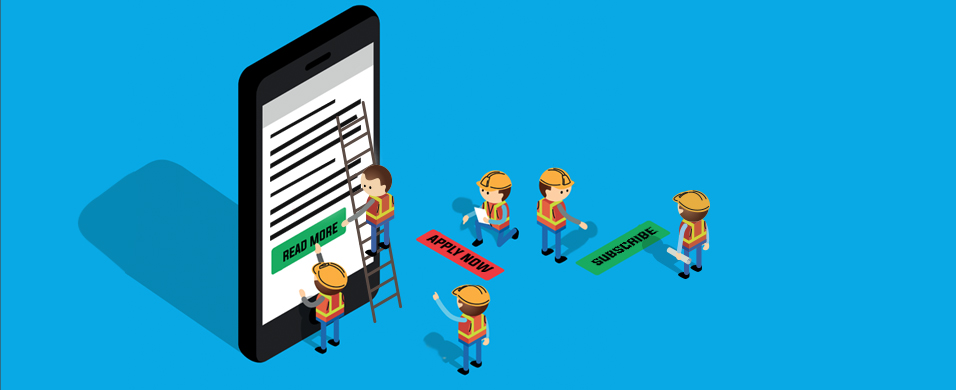
- Request a consultation
- Contact us
- Read a case study
- Try for 15 days
- Download a template
- View full calendar
- Apply now
Not only are these better call to actions than just click here, but they are also better for accessibility. Try reading the above list and adding the word “Link” in front of each action. Often actions that improve usability also improve accessibility.
Improving Link Quality Can Improve SEO
Think about how Google and other search engines access web content. They use crawlers that don’t see, don’t hear, and don’t use a mouse. That means that whatever structural and content strategies implement to make websites more accessible to Assistive Technology is likely going to increase readability for SEO.
It should also be noted that Google recommends using descriptive texts that avoid “generic anchor text like ‘page’, ‘article’, or ‘click here’.” If Google recommends it on their web page called, “Search Engine Optimization (SEO) Starter Guide,” it might be worth it to pay attention.
Conclusion
What if the same, if not better, web content could be provided to all users without using ambiguous links? That is what designing with accessibility in mind is challenging those who design the websites and those who provide content to consider.
Click here to… I mean, join the conversation on Twitter