Quick summary
Not all HTML elements have accessibility built into them, so ARIA is used to add that accessibility.
ARIA can actually make a website less accessible when used incorrectly. In fact, the number one rule of ARIA is to not use ARIA. This just means if there’s an HTML element or attribute that’ll get you the behavior you’re looking for, then just use that HTML element or attribute.
So, if you’re copying and pasting HTML or doing any coding, pay special attention to ARIA to make sure it’s used correctly.
In this article, you’ll learn:
Rather watch a video on ARIA? Watch What ARIA is and its impact on accessibility (YouTube).
Visit July Accessibility Focus: ARIA for more articles and video resources.
What everyone should know
ARIA, or Accessible Rich Internet Applications, is HTML used to make webpages more accessible. Not all HTML elements have accessibility built into them, so ARIA is used to add that accessibility.
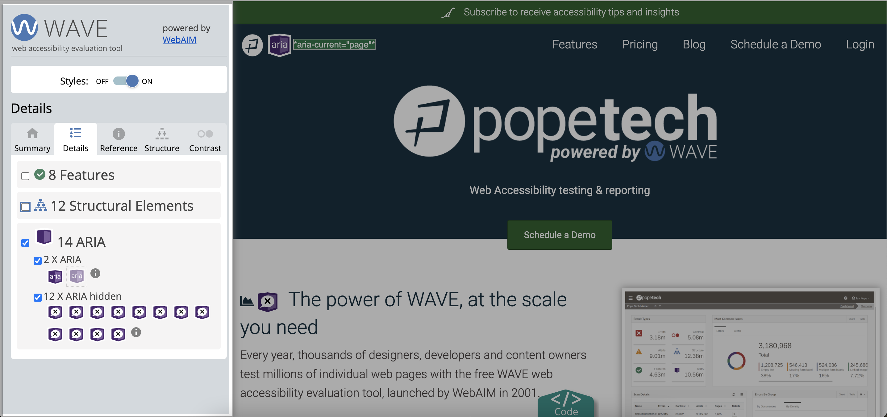
In fact, WebAIM’s web accessibility evaluation tool, WAVE, has an entire category dedicated to showing you where ARIA is on a website. That’s because using ARIA incorrectly can actually make a website less accessible, so it’s important anyone editing HTML is familiar with ARIA.
Wait! Before you keep going…
At this point, you know what ARIA is, and you know that incorrect ARIA can actually make your website less accessible. So, if you don’t work with HTML, you’re done! You have the ARIA basics you need.
If you build websites or work with HTML, keep going to learn more about ARIA, the impact of using ARIA incorrectly, and common ARIA problems and how to fix them.
Introduction to ARIA for people editing HTML
Let’s start with an example of how ARIA is used. Then, we’ll go over the number one rule of ARIA. To end this introduction, we’ll show you how incorrect ARIA impacts user’s with disabilities.
Example of how ARIA can make a website more accessible
Here’s an example of how ARIA is used to make a page more accessible. In the HTML below and the accompanying image of the web page, there are two navigations using the nav HTML element. Without any ARIA added, assistive technology, like a screen reader, would announce both as “navigations” because of the HTML nav element.
But, the aria-label attribute renames the element. Now, the screen reader would announce “User Menu” for the top navigation and “Main Menu” for the left navigation. The assistive technology user can now differentiate between the two menus.
<nav aria-label="User Menu" class="top-bar-right navbar">
...
</nav>
...
<nav aria-label="Main Menu" id="left-sidebar" class="left-sidebar">
</nav>
Another example is to make widgets more accessible. Review Create an accessible tree view widget using ARIA for an example.
The number one rule of ARIA
There are actually five rules when it comes to using ARIA. The first rule may sound funny, but it’s don’t use ARIA. This rule really means if there’s a native HTML element or attribute that’ll get you the behavior you’re looking for, then just use the HTML element or attribute.
For example, ARIA is often used incorrectly when people make buttons from divs or links. Instead, the native HTML <button> element should’ve been used.
To see a more detailed example of this rule in action, check out the button example below.
Impact of using ARIA incorrectly
ARIA requires HTML knowledge to use it correctly. If it is added haphazardly or just copy and pasted in, it can cause significant problems for users with disabilities.
Watch the video below to see how incorrect ARIA affects users using a screen reader.
Biggest developer pitfall when it comes to ARIA
We mentioned this above, but it’s worth saying again before we dive into the examples. The biggest developer pitfall when it comes to ARIA is adding it haphazardly or just copying and pasting it from other code.
The saying to code by is, “No ARIA is better than bad ARIA.” In fact, the WebAIM million survey found that home pages with ARIA averaged 41% more accessibility errors. The moral of the story is if ARIA is used incorrectly, it can actually make your site less accessible.
So, if you don’t know what the ARIA role, state, or property does, or how it will work with your specific website, don’t use it, or research and test it before using it.
Learn how to review your website’s ARIA using the WAVE extension.
Let’s get into the examples.
Buttons
A div or a href can be assigned the ARIA role="button". Assigning this role doesn’t add any functionality to the button.
All it does is make the screen reader announce that it’s a button. A screen reader user would then expect the button to activate when they select spacebar or enter.
For example, in the code below, a Print button is made using a div element. The div has the ARIA role=button, but adding this ARIA doesn’t make the button function how it needs to in order to be accessible.
<div role="button" id="action">Print Page</div>For more information, check out MDN’s button role article or MDN’s HTML button element article.
Common problem with ARIA button
ARIA is often used incorrectly when people assign role="button" to divs or a href. Instead, the native HTML <button> element should’ve been used.
For the div print button above to be accessible, the developer has to add javascript to give the functionality a true button has, which is to activate when a keyboard user selects spacebar or enter.
That’s a lot of work to get a div to function as a button. Especially when the HTML <button> element is already programmed to be selected when a keyboard user selects spacebar or enter.
So, the solution here is don’t use ARIA. Instead, if you have a button, use the <button> element. Now, a screen reader user knows it’s a button and can access it using a keyboard without any extra work on the developer’s part. Here’s what the new code would look like:
<button type="button">Print</button>Watch our ARIA impact video above to see how incorrect use of role="button" affects a screen reader user.
Expanded
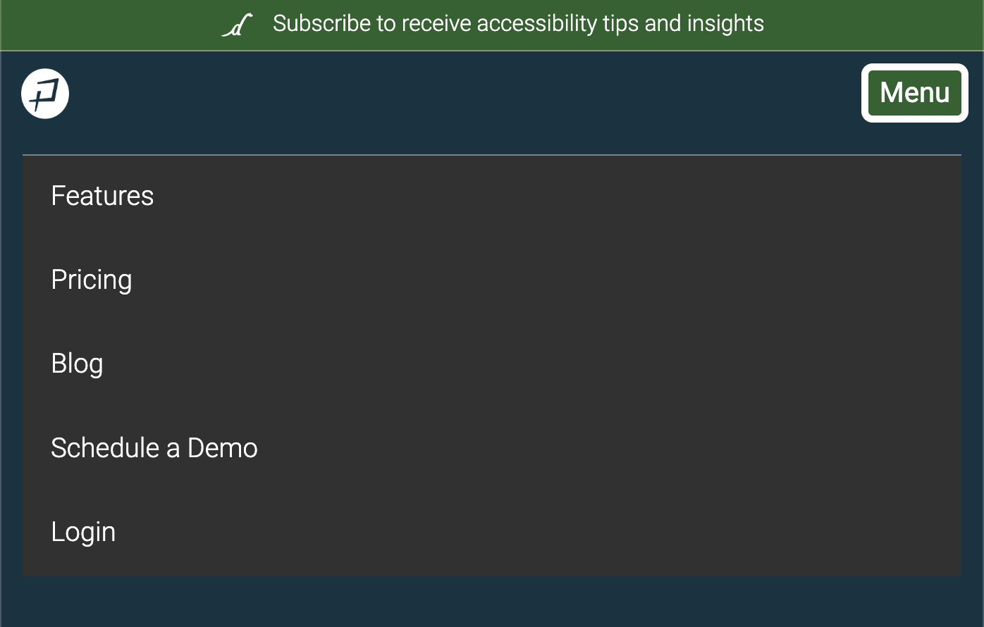
aria-expanded tells assistive technology users when something like a navigation or accordion is collapsed or expanded. When it’s expanded, they can access the content inside.
For example, in the code below, aria-expanded="false" means the navigation menu is closed and aria-expanded="true" means it’s opened.
<button type="button" class="navbar-toggler collapsed" data-bs-toggle="collapse" data-bs-target="#main-nav-collapse" aria-expanded="false" aria-controls="main-nav-collapse">Menu</button><button type="button" class="navbar-toggler" data-bs-toggle="collapse" data-bs-target="#main-nav-collapse" aria-expanded="true" aria-controls="main-nav-collapse">Menu</button>
For more information, check out MDN’s aria-expanded article.
Common problem with ARIA expanded
The common problem with ARIA expanded is when code is copied and pasted, and ARIA expanded is mistakenly set to the opposite value. For example, when a navigation is closed aria-expanded="true" and when it’s open aria-expanded="false".
What’s tricky about this is the navigation or accordion works as normal with a mouse. The only way you’d know there’s an error is if you were testing with a screen reader. So, if you see aria-expanded in your code, make sure the value is set correctly for each state of the button or toggle.
Hidden
Using aria-hidden="true" will remove an element from the accessibility API, which means assistive technology like screen readers won’t announce it. But, it’ll still be visible to visual users. For example, in the code below, a decorative icon is hidden.
<i class="fas fa-chart-area" aria-hidden="true"></i>For more information, check out MDN’s aria-hidden article.
Common problem with ARIA hidden
Unfortunately, it’s common for aria-hidden="true" to be copied and pasted over from code or be added without knowing what it does. This ends up hiding elements that assistive technology should have access to. And, because the element still works with a mouse, the problem is rarely found.
If your website has aria-hidden="true" instances make sure the content should be hidden from assistive technology users.
Watch our ARIA impact video above to see how incorrect use of aria-hidden effects a screen reader user.
Labels
aria-label renames the element. As we saw above, a screen reader would announce an HTML <nav> element as “nav.” But, if the <nav> element has aria-label="Primary Navigation", the screen reader announces it as “Primary Navigation.”
<nav aria-label="Primary Navigation" class="left-sidebar"></nav>For more information, check out MDN’s aria-label article.
Common problems with ARIA label
We went over a good use of aria-label above. But, there’s a common aria-label error when it comes to forms.
This HTML form uses labels and has ARIA that isn’t needed.
 <form action="/action_page.php">
    <label for="fname" aria-label="First name">First Name</label>
    <input type="text" id="fname" name="firstname" placeholder="Your name..">

    <label for="email" aria-label="Last name">Email</label>
    <input type="email" id="email" name="email" placeholder="Your email..">
    <input type="submit" value="Submit">
  </form>
Because this form has an HTML label for each input, we actually don’t need aria-label. Assistive technology will use the label text.
So, the problems we often see are:
- Even though
aria-labelisn’t needed, it’s still used. - The
aria-labelis wrong like the email input above, which hasaria-label="Last name".
It’s common for the wrong aria-label to get assigned because the code was copied and pasted and then changed. The issue isn’t caught because, visually, everything looks okay. Now, assistive technology users think that field is their last name instead of email, which completely breaks the interaction.
If your code has aria-label instances, make sure it’s not duplicating content or that the label is what should be read by assistive technologies.
Watch our ARIA impact video above to see how incorrect use of aria-hidden effects a screen reader user.
Tabindex
Each webpage has a native keyboard navigation, which is made up of focusable elements like links, buttons, and form fields. A keyboard user can tab through the focusable elements in the order they appear in the HTML, so it’s important the HTML structure matches the visual structure.
Any HTML element can have the ARIA tabindex attribute added to it. Tabindex defines what elements are focusable, the order they are tabbed, or completely hides the element from being accessed by a keyboard.
For more information on how tabindex works, check out MDN’s tabindex article or WebAIM’s keyboard accessibility article.
Common tabindex problem
The common problems with tabindex are:
- Accidentally making important content inaccessible by a keyboard when trying to create a custom tabindex.
- Adding headings and other non-focusable items using tabindex. While this might be done with good intentions, it makes the page less accessible because it now doesn’t work how someone using a keyboard would expect the page to work.
Here’s an example page with a bad tabindex. You can tab through the content to experience what it’s like. The code is also available at the bottom of the page.
Key takeaways
- Not all HTML elements have accessibility built into them, so ARIA is used to add accessibility.
- There are five rules when it comes to using ARIA.
- The first rule is don’t use ARIA, which just means if you can use a native HTML element or attribute to get the behavior you’re looking for, then just use the HTML element or attribute.
- Using ARIA incorrectly can actually make your website less accessible. Remember, “no ARIA is better than bad ARIA.”
How to start making HTML with ARIA accessible on your website
This activity is made for websites. It’s not made for Canvas courses because Canvas courses typically shouldn’t use ARIA.
For this activity, you’ll focus on two ARIA errors plus all the ARIA results.
Here are steps to fix existing ARIA plus questions to consider to make a plan on how to create accessible content going forward.
Fix existing inaccessible ARIA content
- Use the Pope Tech Platform or free WAVE extension tool to find the ARIA alerts listed above.
- Pope Tech Platform – From your Dashboard, drill down to the ARIA errors and results.
- WAVE extension tool (free) – Test four pages on a website you contribute to.
- Fix any Broken ARIA menus or references.
- Go through the other ARIA instances and determine if they are accessible.
- Make an achievable goal depending on how many ARIA instances need to be fixed and share that goal with your team or office.
- Schedule a monthly accessibility check-in (even if it’s just you) to celebrate progress and remove blockers.
Create accessible ARIA content
Identify who regularly works in HTML and make a plan with them on how to make any new HTML accessible going forward. Some questions to consider:
- Do the people who work in HTML need additional information about ARIA to make sure it’s correct?
- Will they use Pope Tech or WebAIM’s evaluation tool as part of their own QA process?
Visit July Accessibility Focus: ARIA for more articles and video resources.

 Broken ARIA menu
 Broken ARIA reference
 ARIA
ARIA ARIA alert or live region
 ARIA button
 ARIA description
 ARIA expanded
 ARIA hidden
 ARIA label
 ARIA menu
 ARIA popup
 ARIA tabindex