A tree view is an interactive list of items users can collapse, expand, and select. For example, a common tree view is your computer’s folder structure. Folders can collapse and expand, or open and close, to find more folders or files.
There are two parts to making a tree view interaction accessible. First, there are certain keyboard navigation requirements. Second, ARIA roles, states, and properties must be used correctly so assistive technology can interact with the tree view.
In this article, we’ll review how to make a tree view accessible by going over:
- Considerations before coding a tree view widget
- Terms used to describe the tree view
- Keyboard interactions
- What ARIA roles, states, and properties to use
- A tree view widget example
Considerations before coding a tree view widget
Before coding your own tree view widget, here are some functionality considerations.
Is a tree view the right decision?
Make sure to determine whether a tree view widget is the right decision for your situation. Tree view widgets are good at showing an interactive view of hierarchical information.
If your items have nested list items, it’s important to show the connection of those items to their parent and children items, and there’s a lot of information that would benefit from being opened and collapsed, then a tree view is probably a good choice. Otherwise, a regular list could work.
Selected state vs focus
There’s a difference between an element in focus and a selected element. Keyboard users rely on focus as their pointer showing them where they’re navigating. So, as they navigate to different elements in the tree view, their focus shows where they are. A selected state only activates when a user selects a tree view element.
The programmatic difference is the element in focus has document.activeElement where a selected element has aria-selected="true“.
Here are some design considerations:
- The visual focus indicator must always be visible.
- The selected state must be visually distinct from the focus indicator.
Multi select vs single select
Multi select in a tree view widget means a user can select multiple items at once. Single select means a user can only select one item at a time.
When using single select, you could use selection follows focus. Selection follows focus means the element in focus is also the element selected. This can help or hurt accessibility depending on the situation.
To help decide the best option for your situation, review Deciding When to Make Selection Automatically Follow Focus.
Select all and un-select all
If selecting and un-selecting all options would be useful, use separate buttons for these actions. Separating them helps accessibility.
Terms
- Node: An item in a tree.
- Root node: The first node. It has no parent nodes.
- Parent node: Has nodes nested under it. It can be expanded and collapsed.
- Child node: A node nested under another node.
- End node: Node that has no child nodes. It cannot be expanded anymore.
- Open node: Expanded parent node.
- Closed node: Collapsed parent node.
Keyboard interactions
You’ll create the keyboard interactions using JavaScript.
These keyboard interactions are for a vertical tree view. If it’s a horizontal tree view, replace down-arrow with right-arrow and up-arrow with left-arrow.
Keyboard interactions for single and multi select trees
- When the tree gets focus:
- Focus is set on the first node.
- If a node is selected before the tree has focus, focus is set on the selected node.
- For multi-select trees: If multiple nodes are selected before the tree has focus, focus is set on the first selected node.
- Right arrow
- Opens a closed node. The focus doesn’t move.
- If node is open, moves focus to the first child node.
- Left arrow
- Closes an open node.
- Moves focus from an end or closed node to its parent node.
- Down/Up Arrow: Moves focus to the next/previous node that is focusable. Doesn’t open or close nodes.
- Home: Moves focus to the first node in the tree. Doesn’t open or close nodes.
- End: Moves focus to the last node in the tree. Doesn’t open or close nodes.
- Enter: activates a node – performs the default action.
- For parent nodes, a default action could be to open or close the node.
- In single-select trees where selection doesn’t follow focus, the default action usually selects the focused node.
- We recommend type-ahead or a search to jump to specific nodes for all trees, but especially trees with more than 7 root nodes.
- Type a character: focus moves to the next node that starts with that character.
- Type multiple characters in a row: focus moves to the next node that starts with that string of characters.
- *: Expands all the siblings on the same level as the current node.
Multi select tree keyboard interactions
A multi select tree needs ways for keyboard users to select multiple nodes at once. There are two selection models to consider. The recommended model doesn’t require the user to hold a modifier key while moving focus, so it’s easier to navigate without losing selected nodes. The alternative selection model would be a keyboard user has to hold a modifier key or else they’d lose selected nodes.
Here’s the keyboard interactions for the recommended keyboard selection model:
- Space: Toggles the selection state of the node in focus.
- Optional keyboard interactions:
- Shift + Down/Up Arrow: Moves focus to and toggles the selection state of the next/previous node.
- Shift + Space: Select nodes from the most recently selected node to the current node.
- Control + Shift + Home: Selects the focused node and all nodes up to the first node.
- Control + Shift + End: Selects the focused node and all nodes to the last node.
- Control + A: Selects or unselects all nodes in the tree.
What ARIA roles, states, and properties to use
Here are all the ARIA roles, states, and properties to make your tree view accessible.
- All tree nodes are in an element with role tree.
- Each element that’s a tree node has role treeitem.
- Each root node is contained in the element with role
treeor referenced by an aria-owns property set on thetreeelement. - Each parent node contains or owns an element with role group.
- Each child node is contained in or owned by an element with role group that is contained in or owned by the node that serves as the parent of that child.
- Each element with role
treeitemthat serves as a parent node has aria-expanded set tofalsewhen the node is in a closed state and set totruewhen the node is in an open state. End nodes don’t have thearia-expandedattribute. If they had it, assistive technology would describe them as parent nodes, which would be confusing. - If a multi select tree, the element with role
treehas aria-multiselectable set totrue. - aria-selected or aria-checked indicates the selection state of each selectable node:
- It’s recommended to use either
aria-selectedORaria-checkedfor a single widget. Don’t specify both for any nodes. - If any nodes are selected, each selected node has either aria-selected or aria-checked set to
true. - No more than one node is selected at a time if the element with role
treedoes not have aria-multiselectable set totrue. - All nodes that are selectable but not selected have either aria-selected or aria-checked set to
false. - If the tree has nodes that are not selectable, neither aria-selected nor aria-checked is on those nodes.
- Remember, the selected state is distinct from focus except in trees where selection follows focus.
- It’s recommended to use either
- The element with role
treehas either a visible label referenced by aria-labelledby or a value specified for aria-label. - If the complete set of available nodes is not present in the DOM due to dynamic loading as the user moves focus in or scrolls the tree, each node has aria-level, aria-setsize, and aria-posinset specified.
- If aria-owns is set on the tree container to include elements that are not DOM children of the container, those elements will appear in the reading order in the sequence they are referenced and after any items that are DOM children. Scripts that manage focus need to make sure the visual focus order matches this assistive technology reading order.
- If the
treeelement is horizontally oriented, it has aria-orientation set tohorizontal. The default value ofaria-orientationfor a tree isvertical.
For more on the tree view pattern, review W3C’s Tree View Pattern.
A tree view widget example
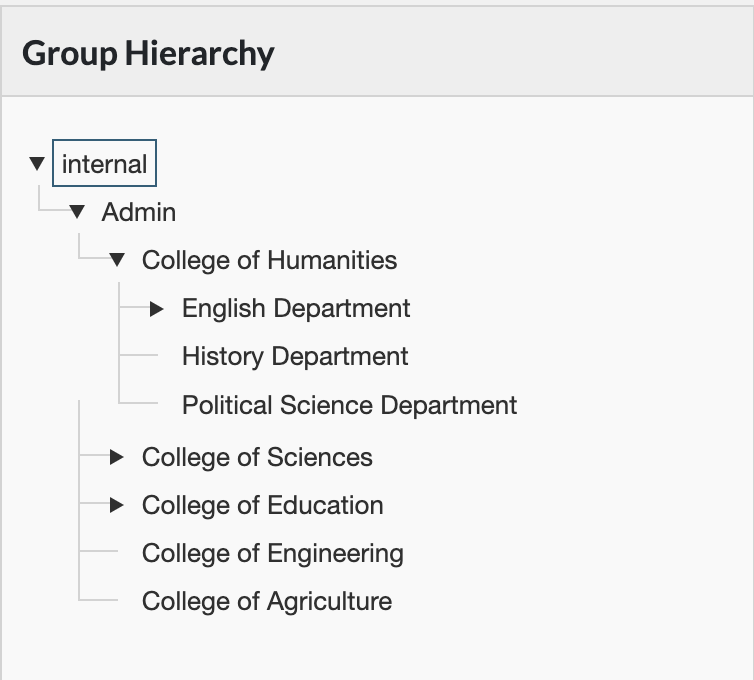
Pope Tech’s web accessibility platform uses a tree view to display groups.
It’s a single select tree where focus and select are separate (it’s not selection follows focus).
Keyboard interactions example
This video demos the keyboard interactions and focus used in Pope Tech’s group tree:
ARIA implemented
Here’s how Pope Tech’s group widget uses ARIA.
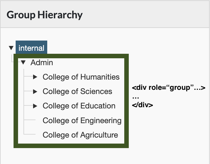
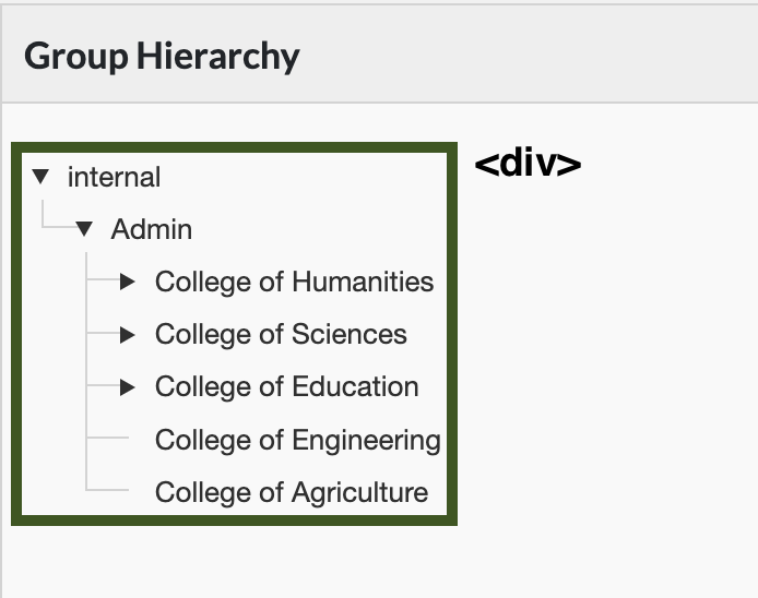
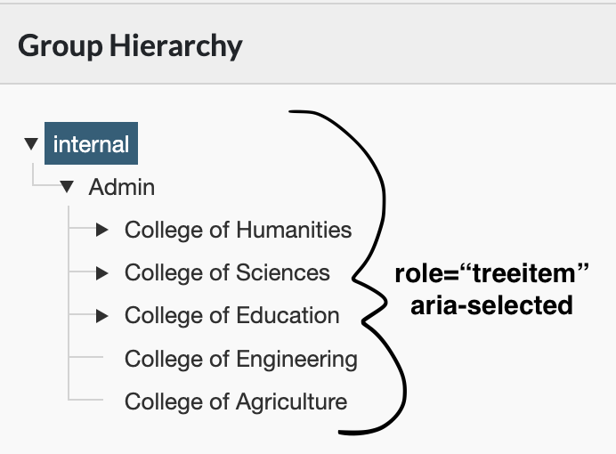
There’s a div around the tree with ARIA role="tree".
Each node has role="treeitem" and aria-selected. Because we use Angular JS making the complete set of nodes unavailable to the DOM, each node also has aria-level, aria-setsize, and aria-posinset specified.
Each parent node has aria-expanded. It toggles between false and true when the parent is collapsed and expanded.
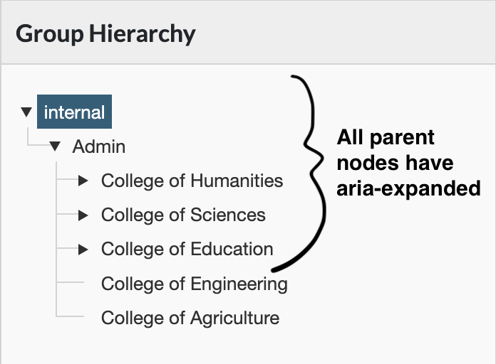
Each parent node has a div with role="group" nested under it. For example, the Admin child group nested under Internal has div role="group".