Updated:

Accessibility contrast requirements explained and how to fix 5 common low-contrast issues

The contrast of this text with the background behind it makes it so you can read it. The contrast of colors in a graph visually represents the data, so you can understand it better. In fact, the contrast between colors is a large part of how we perceive content.

Contrast is powerful for visual users, which is why there are specific accessibility guidelines regarding how we use color on the web. That way more users, especially users with low vision or color blindness, can read text, understand graphs and charts, and get the meaning color can bring to a design.

In this article, you’ll learn:

We’ll end with an activity to fix current contrast issues and start embedding contrast accessibility requirements into your design process.


What are contrast and contrast ratios?

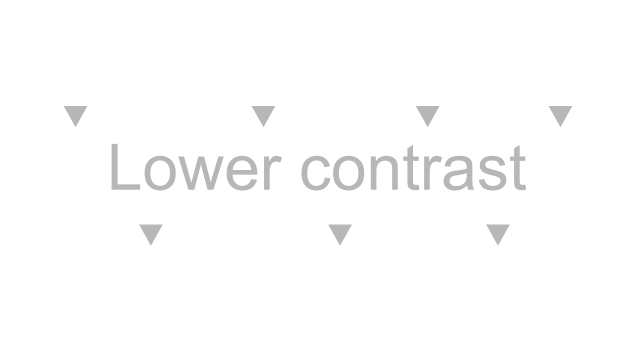
Contrast is the difference between the perceived brightness of two colors. For example, if the background color is white and the foreground color is a light-grey, this would be a lower contrast.

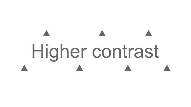
But, if the background color is white and the foreground color is a dark-grey, this would be a higher contrast or difference between the two colors.

Low contrast example
High contrast example

The contrast ratio is how the difference between the two colors is measured. The ratio can range from 1:1, which would be the same color for the foreground and background, to 21:1, which would be black and white for either the foreground or background.

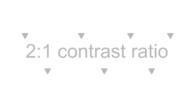
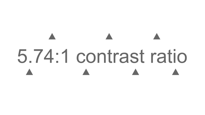
For example, the contrast ratio for the light grey foreground and white background below would be 2:1, and the contrast ratio for the dark grey foreground and white background would be 5.74:1.

Low contrast example
High contrast example

Back to top

Who is affected by low contrast issues?

Just from the examples above, it’s clear that contrast matters for everyone. Good contrast makes it easier for everyone to read the text and distinguish graphical elements.

But, what might just be difficult to read for a visual user could be unreadable to a user with contrast sensitivity due to low vision or color blindness.

Check out these numbers to understand how many people are affected by contrast sensitivity and could face a barrier in accessing content if contrast accessibility guidelines aren’t met:

This means millions of people can face a barrier by a seemingly simple design choice. Or, if we flip that and say the design choice is informed by contrast accessibility guidelines, millions of people can read the text and see visuals clearly.

You can also check out W3C’s short description of how Lee, an online shopper with color blindness, is affected by color issues, or watch W3C’s perspective video to learn more about how good contrast helps contrast-sensitive users:

The different contrast requirements explained with examples

Designers and developers have the power to affect millions of people if we just know contrast accessibility guidelines. These guidelines don’t have to be limiting. Our own designer had this to say:

“Designing with color contrast in mind can make your design more user-friendly. When designing, I keep higher contrast in mind, and then I double-check it with WebAIM’s color contrast checker.

Creating a style guide or design system that aligns with contrast guidelines also means everyone knows accessible color choices for elements like headings, links, and buttons.”

Knowing these contrast requirements empowers designers to create more user-friendly designs and set the team up for success with reusable elements that are accessible.

With that in mind, let’s review the four different WCAG 2.0 success criteria that reference a contrast ratio requirement.

We’ll explain each one with exactly what you would need to do and examples.

Success Criterion 1.4.3 Contrast (Minimum) and Success Criterion 1.4.6 Contrast (Enhanced)

We’ll cover Success Criterion (SC) 1.4.3 Contrast (Minimum) and SC 1.4.6 Contrast (Enhanced) together because they both cover the contrast of text with its background color.

Unfortunately, WebAIM million found low contrast text on 83.9% of the million website homepages that were tested, so low contrast text is a common issue on websites. Let’s go over how you can avoid this starting with the difference between these two success criteria.

Difference between SC 1.4.3 Contrast (Minimum) and SC 1.4.6 Contrast (Enhanced)

SC 1.4.3 Contrast (Minimum) is just for Level AA while SC 1.4.6 Contrast (Enhanced) is for Level AAA.

Level A, Level AA, and Level AAA are accessibility levels a website can claim. Most websites go for Level AA, so most websites follow SC 1.4.3 Contrast (Minimum).

Now, let’s get into the nitty-gritty requirements for each of these starting with SC 1.4.3 Contrast (Minimum).

SC 1.4.3 Contrast (Minimum) requirements

These requirements will meet Level AA compliance:

  • Text smaller than 18 point or 14 point bold has a contrast ratio of at least 4.5:1 with the background color.
  • Text 18 point or 14 point bold or larger has a contrast ratio of at least 3:1 with the background color.
  • This includes text on images that are needed to navigate or understand the content.
  • Logos or brand-name text has no contrast requirement.

For more information, read W3C’s SC 1.4.3 Contrast (Minimum).

SC 1.4.6 Contrast (Enhanced) requirements

The SC 1.4.6 Contrast (Enhanced) requirements are just more strict; hence, “enhanced.” Again, these are for Level AAA and most websites will aim for Level AA.

  • Text smaller than 18 point or 14 point bold has a contrast ratio of at least 7:1 with the background color.
  • Text 18 point or 14 point bold or larger has a contrast ratio of at least 4.5:1 with the background color.
  • This includes text on images that are needed to navigate or understand the content.
  • Logos or brand-name text has no contrast requirement.

For more information, read W3C’s SC 1.4.6 Contrast (Enhanced).

Example

Here’s an example of these requirements in action. The text you’re reading right now is 15 pt, so it needs a contrast ratio of at least 4.5:1 to meet SC 1.43 Contrast (Minimum) or 7:1 to meet SC 1.4.6 Contrast (Enhanced).

The contrast ratio this text has with its background is 14.72:1, so it would meet the requirements for either.

Depending on whether your website is going for Level AA or AAA, you’ll follow these requirements for choosing your website’s body and heading text color.

Success Criterion 1.4.11 Non-text Contrast

The SCs above cover the requirements for text, and this next criterion has contrast requirements for visual presentations.

First, let’s define what falls under a visual presentation:

  • User interface components. These include buttons, icons, and focus indicator outlines. Really, anything used to navigate a website or application.
  • Graphical objects. These include parts of graphics required to understand the content. For example, infographics, charts, or graphs.

Now, here’s the requirement for these: there needs to be a contrast ratio of 3:1 against adjacent colors. This makes sense because if we want all visual users to be able to distinguish between the colors of graphics, there needs to be a high enough contrast between the colors.

For more information, read W3C’s SC 1.4.11 Non-text Contrast.

Examples

So, what does this requirement look like in real life? Let’s look at some examples.

Here are three grey social media icons against a light grey background. There are a couple contrast ratios as play here.

  • First, there’s the contrast ratio between the icon and the dark grey circle.
  • Second, there’s the contrast ratio between the dark grey circle and the light grey background color.
3 social media icons. The social media icon is a light grey icon in a dark grey circle.

Each of these needs a 3:1 contrast ratio because this is a user interface component and those are the adjacent colors.

The color contrast ratio for both the icon and dark grey circle and the dark grey circle and light grey background is 6.38:1, so both meet the requirement.

Let’s keep going with this same example. Here are the same social media icons, but one now has a dark blue circle because that’s the hover color. This blue circle and the light grey icon and background also need at least a 3:1 contrast ratio.

The color contrast ratio is now 12.76:1 for both, so again, it meets the requirement.

Let’s look at one other use case – a pie chart. This pie chart is a visualization of how many points each team made and is an example of poor contrast. Let’s break it down to understand why this pie chart doesn’t meet contrast ratio requirements.

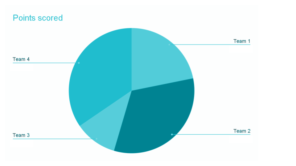
First, let’s go back to our contrast requirements for text. The light blue text of the “Points scored” title only has a contrast ratio of 2.03:1. It needs a contrast ratio of at least 4.5:1 to be accessible.

Now, let’s focus on the pie chart itself. There are four pieces of the pie chart and each one is a different color of blue.

The highest contrast ratio between two of the pie pieces is between team 3 and team 2, and it’s only 2:1. Each piece of the pie needs a contrast ratio of 3:1 with the colors next to it. That way, users with contrast sensitivity can distinguish between the different pie pieces.

We’ll go over how to fix this exact chart in the How to fix 3 common low contrast issues section below.

Success Criterion 1.4.1 Use of Color

The last SC that has to do with color and impacts contrast ratio requirements is SC 1.4.1 Use of Color. This criterion states:

Color is not used as the only visual means of conveying information, indicating an action, prompting a response, or distinguishing a visual element.

This SC has other implications on how color is used, but we’re going to focus on two ways it applies to color contrast.

Use of color in graphs and charts

To start, let’s go back to our pie chart example. This chart currently only uses color to tell users how many points each team scored – it doesn’t have any alternative way of getting the information like a value label with each team’s percentage of points scored.

Pie chart with four pieces. Each piece is a different color blue.

This affects the contrast requirement because without the value label, color is the only way to get the information. Since it’s the only way, it needs to meet the 3:1 contrast requirement for graphical objects.

The next way this SC affects contrast is the contrast of links that are NOT underlined.

For example, this screenshot is from a company’s support website. There is a blue link that is not underlined. This blue link is only using color to convey that this is a link.

If we dig into the sufficient techniques to pass this SC, then we find the contrast ratio requirement for links that are not underlined. The technique states:

Use a contrast ratio of 3:1 with surrounding text and provide additional visual cues on focus for links or controls where color alone is used to identify them.

This means that links without an underline must meet all of these requirements:

  • They must have a contrast ratio of 3:1 with the color of the surrounding body text.
  • They still have to meet SC 1.4.3 Contrast (Minimum) and have a ratio of 4.5:1 with the background color.
  • They have to have an underline or other visual cue when a user hovers over the link.

To avoid this altogether, we suggest underlining your links. Links that are underlined (like the links in this article) don’t have additional contrast requirements.

For more information, read W3C’s SC 1.4.1 Use of Color or W3C’s non-underlined links contrast ratio technique.

Example

Now, let’s look at an example of how this would affect the color of a non-underlined link.

Let’s apply this to the blue link from the support website.

The blue link and the dark-grey body text have a contrast ratio of 2.5:1. This means it doesn’t meet the requirement to have a 3:1 contrast ratio with the surrounding body text’s color.

But, the blue link and the white background have a contrast ratio of 5.04:1, so it does meet SC 1.4.3 Contrast (Minimum).

Lastly, the link is underlined on hover.

This non-underlined link wouldn’t meet accessibility guidelines because it didn’t have enough contrast between the link text color and the surrounding body text color.

Back to top

Tools to check contrast

Now that we know more about the contrast requirements, let’s go over the tools you can use to check your own website and designs for contrast accessibility.

WebAIM’s contrast checkers and Colorzilla extension

WebAIM has two contrast checker tools. The first checks color contrast for normal text size, large text size, graphical objects, and user interface components. The second checks color contrast for links.

Both these tools work by entering the colors’ hex codes, and then the tool calculates the contrast ratio and whether it passes or fails.

The hex code is a 6-digit number each color has. To get the color from a webpage, you can use the Colorzilla extension. You could also get the hex code from your design software.

To use these tools, follow these steps or watch the video below:

  1. Install the Colorzilla extension.
  2. Open either WebAIM’s Color Contrast Checker or Link Contrast Checker depending on what you’re checking.
  3. Navigate to the page you want to pick the colors from.
  4. Select the Colorzilla extension and pick the color on the page. It will copy the color.
  5. Paste the color in either WebAIM’s Color Contrast Checker or Link Contrast Checker.
  6. Go back to the page, select the Colorzilla extension, and pick the next color.
  7. Paste this color in either WebAIM’s Color Contrast Checker or Link Contrast Checker. If you’re testing a link, you’ll need to do this one more time.

Now, you’ll see the contrast ratios and if your color combination passes or fails.

Watch the video below to learn how to use WebAIM’s contrast checkers and ColorZilla to find and fix contrast issues.

WebAIM’s WAVE extension

WebAIM’s WAVE extension tests webpages for accessibility issues including low contrast text or CSS icons. It cannot test the contrast in image files or of text with an image or gradient background.

This tool also has a contrast tab where you can select any colors and it will give you their contrast ratio or desaturate the page of all colors. Desaturating the page can help you decide if you’re relying only on color to convey any information.

To use this tool, follow these steps or watch the video below:

  1. Install the WebAIM WAVE extension.
  2. Navigate to the page you want to test or pick the colors from.
  3. Select the WAVE extension.
  4. Check the Details tab for any low contrast errors. Click on the icon to see where the error is on the page.
  5. Select the Contrast tab.
  6. Select any of the low contrast errors at the bottom to see the foreground and background color. Then, use the sliders to explore different options that would pass the ratio requirement.
  7. To pick a color on the page, you can select the color swatch to use your browser’s color picker and pick a color from the page. Then, use the sliders to explore different options.
  8. Select Desaturate page to remove all the colors and see your page in grayscale.

Watch this video to learn how to use WebAIM’s WAVE extension to check contrast.

Chrome Inspect

The last tool is Chrome’s Inspect. This tool will tell you the contrast ratio between the text color and its background color.

To use Chrome Inspect, follow these steps or watch the video below:

  1. Navigate to the text you want to check, right-click, and select Inspect. This will bring up the Elements Inspect tab, which has the HTML for the page.
  2. Make sure you have the text HTML element selected in the Elements tab.
  3. Either to the right or below the HTML is the CSS for the selected HTML element. Look through this until you find the CSS for the color of the text.
  4. Select the color swatch for the text color to see the contrast ratio.
  5. Select the dropdown arrow to see more information including if this contrast ratio passes Level AA and AAA and lines in the color selector to show what colors would pass.

Watch the video below to learn how to use Chrome Inspect to check text color contrast.

Back to top

How to fix 5 common low contrast issues

We’re going to fix 5 common low contrast issues by using examples found on real websites.

Low contrast text in a website’s template

The most common low contrast issues are low contrast text, buttons, and icons, so we’re going to start with fixing a text low contrast issue.

Whenever you’re fixing a low contrast problem, the first step is deciding what type of element you’re working with. Then, you’ll know the contrast ratio requirement you’re aiming for.

For example, text has these requirements:

  • Text smaller than 18 point or 14 point bold has a contrast ratio of at least 4.5:1 with the background color.
  • Text 18 point or 14 point bold or larger has a contrast ratio of at least 3:1 with the background color.

Now that we know the requirements, let’s look at our text example.

This government website has cards for its news articles. The cards have the publish date for the article. The publish date text is light grey (#7C7C7C) text with a white background, and its contrast ratio is 4.17:1. Since it’s normal-sized text, it needs to be at least 4.5:1.

How to fix

To fix this, I first need to decide what the updated color will be. I’m going to use the Chrome Inspect tool to do this. Once I open the color picker tool in Chrome Inspect, it confirms the contrast ratio is too low at 4.17:1.

Chrome Inspect color picker tool. At the top is a color selector panel. Then there's the hex code for the color. Followed by the contrast ratio information.

I’m going to use the color picker tool to select a new color that is at least 4.5:1 by selecting a color below the top line in the color picker. All the colors under the first line will pass Level AA.

The updated color and contrast ratio are:

  • Light grey text is now #6B6B6B
  • The new contrast ratio is 5.36:1.

Now, I need to update the website with the new text color. Issues like text or link color are usually in a website’s template. A website’s template decides what a website looks like. For example, the text color, size, and font.

So, to fix this, the few lines of CSS code that determine the text color for the article publish date would need to be updated.

Low contrast icons in a website’s template

Next, let’s fix a low contrast button on another government website. We’ll start by reviewing the contrast requirements for graphical objects. The contrast ratio requirement is: graphical objects and user interface components need a contrast ratio of 3:1 with adjacent colors.

Now that we know the requirement, let’s look at our example. This is a blue button on a darker blue background. Here are the details:

  • The blue button is #1550ED and the dark blue background is #112642.
  • The contrast ratio between these two colors is 2.46:1, which is less than the required 3:1.

How to fix

To fix this, I’m going to use WebAIM’s Color Contrast Checker to find a new button color option.

After adjusting the slider for the button color, the new color is a little lighter at #3365F0, and the new contrast ratio is 3.08:1.

Here is the button before the change and the button after the change.

Now that we have an updated color option, again, we need to adjust the CSS styling for this button in the code to really fix it.

Low contrast, non-underlined links in a website’s template

In this next example, we’ll go back to text, but this time, it’s link text that isn’t underlined.

Links that aren’t underlined have these contrast requirements to meet Level AA:

  • Link text color and body text color must have a contrast ratio of 3:1.
  • Link text color and background color must have a contrast ratio of 4.5:1.

Now that we have the requirements in mind, let’s break down this example of a low contrast link. We looked at these links earlier. Now, we’re going to fix them using WebAIM’s Link Contrast Checker.

Here are the contrast ratios for the blue link:

  • The blue (#0070C9) link and the dark-grey (#333333) text surrounding it has a contrast ratio of 2.5:1, which is lower than the required 3:1, so it fails.
  • The blue link and the white background have a contrast ratio of 5.04:1, which is higher than the required 4.5:1, so it passes.

How to fix

One way to fix this is to decide to underline all links, which is what we’d suggest. Then, they don’t have any additional contrast ratio requirements.

If you want to keep the links not underlined, the colors would need to be adjusted. You might think just the blue link color needs to be changed to meet the 3:1 requirement. But, if I use the Link Contrast Checker’s sliders to change the blue link color to a blue that meets the 3:1 requirement, then my link-to-background ratio becomes 4.09:1, which is lower than the required 4.5:1.

This means I would need to adjust both the link and body text colors. After playing around with sliders, here are the new colors and contrast ratios:

  • The blue link would now be slightly darker (#0076D6).
  • The dark-grey text would also be slightly darker (#2B2B2B).
  • The link-to-body text ratio is now 3:07:1.
  • The link-to-background ratio is now 4.6:1.

Now, we’ve found one accessible color combination option. But, the problem isn’t fixed yet.

To fix this, the few lines of CSS code that determine the text and link color or whether the link is underlined would need to be updated.

Low contrast pie chart

The next common low contrast issue we’ll fix is a low contrast pie chart. Let’s take a moment to remember a couple of SC that would apply.

  • First, we are fixing a graphical object, so the contrast requirement is 3:1 with adjacent colors.
  • Second, this pie chart currently only uses color to convey information. This is important because there are actually other ways to fix this graphic besides changing the color.

To start, let’s break down the issues with the pie chart:

  • The light blue text of the “Points scored title” only has a contrast ratio of 2.03:1, which is lower than the required 4.5:1 for normal-sized text.
  • The contrast ratio between the pie pieces’ colors is lower than 3:1 AND color is the only way to tell how many points each team scored. This means you have to be able to distinguish between these low contrast colors to get the information.
Pie chart with four pieces. Each piece is a different color blue.

How to fix

We are going to fix both of these issues starting with the text. To fix the text, I’m going to use the Colorzilla extension to copy the color of the text and background into WebAIM’s Color Contrast Checker. You could also get the Hex code from the design tool that was used.

Next, I’ll use the sliders to find a color that meets the 4.5:1 requirement. Once I have a color I like, I can change the text color in the design tool.

Now let’s fix the pie chart. There are several ways to do this:

  1. Add a white outline around each piece of the pie. Then, each piece only has to meet a 3:1 contrast ratio with the color white, which is easier.
  2. Adjust each color making sure there is a 3:1 ratio with the colors next to each piece. For example, Team 2’s piece needs to have a 3:1 ratio with Team 3 and Team 1.
  3. Add a label with the percentage of points each team scored so the color isn’t the only way to read the chart.
  4. Add a different pattern to each piece of the pie chart, so the patterns differentiate each piece instead of only color.

We’re going to fix it by adding a white outline around each piece of the pie and adding the percentages. You could do one or the other. Most of the blue colors still didn’t have a 3:1 contrast ratio with white, so we also adjusted the pie piece colors to be darker.

Here’s the pie chart before and after.

Pie chart with four pieces. Each piece is a different color blue.
Pie chart with accessible contrast ratios and labels for each of the four pieces.

If you’re interested in learning more about how graphs and charts can be adjusted to be accessible, check out this case study where Google’s data visualization team made a complex visualization accessible or W3C’s Understanding Success Criterion 1.4.11 Non-text contrast examples.

Low contrast text on image

In this last issue, we are working with text. The Level AA contrast requirements for text, including text on images, are:

  • Text smaller than 18 point or 14 point bold has a contrast ratio of at least 4.5:1 with the background color.
  • Text 18 point or 14 point bold or larger has a contrast ratio of at least 3:1 with the background color.

Now, let’s review our example issue. This is a banner image from a university homepage. The text at the top is smaller than 18 point or 14 point bold, so it needs a contrast ratio of at least 4.5:1 with the background.

University banner image with text and background. The background is an image of a building with trees and there's a slight overlay that gets darker toward the bottom of the banner.

Let’s take a closer look at the normal-sized text at the top because it’s the text with the issue. The overlay that gets darker as we go to the bottom of the image isn’t dark enough at the top making this text difficult to read.

When an image has a gradient or a background image with different colors like this one, we suggest:

  • Testing the lightest parts to see if they are accessible.
  • Test the lightest parts at different screen sizes, which means zooming in on your computer screen. Often text might be positioned in a way that works on desktop, but it fails mobile because of the way the text or images adjusts on a mobile screen size.

I used the Colorzilla extension and WebAIM’s Color Contrast Checker to find the contrast ratios on a desktop screen. Here are three spots I tested for this banner image:

  • The white text with the lighter green of the tree is 4.42:1.
  • The white text with the brick building is 4.65:1.
  • The white text with the white window is 2.44:1.

So, there are multiple parts of this background that when paired with the text don’t meet the 4.5:1 contrast requirement.

How to fix

There are a few different ways to fix this. You could:

  1. Adjust the overlay so it’s darker at the top.
  2. Move the smaller text down so its background is the darker overlay already there.
  3. Pick a different image.

Once you’ve adjusted it, check the contrast again using the lightest part of the background on both a desktop screen size and mobile screen size.

Through these examples, hopefully, you’ve noticed your simple but informed, design choices can mean reading text or understanding an image to millions of users.

Back to top

Fix current contrast issues and design with contrast in mind going forward

You know more about the different requirements and the tools you can use to find the contrast ratio, so you’re ready to apply it to your own website.

Below is a plan to fix current contrast issues and strategies to design with contrast accessibility requirements going forward.

Fix current issues

Follow these steps to fix existing contrast issues:

  1. Identify any contrast errors in your content using Pope Tech’s website scanning tool or the Canvas Accessibility Guide. If you don’t have these tools, you can use WebAIM’s free WAVE extension tool.
  2. Review the contrast errors and determine if any could be fixed at the website template level. For example, fixing the color of the body text could fix that issue on every page.
  3. Review the design of your website and look for design elements that should be checked. For example, does your website use a banner image with text? Or, do you use a lot of gradients with text? Or, do you have charts or graphs that should be checked?
  4. Now that you have an idea of the contrast issues, prioritize the template-level issues first. Then, fix other issues you found based on the content’s priority.
  5. Make an achievable goal and share that goal with your team or office.
  6. BONUS: If you don’t have one already, schedule a monthly accessibility check-in (even if it’s just you) to celebrate progress and remove blockers.

Design with contrast in mind going forward

To really design to contrast accessibility requirements, they need to be built into your design system. When your organization’s color palette and font guidelines start with accessibility, then you just think about it once and everyone can properly use colors and fonts based on those guidelines.

If you’re starting your design system from scratch, think about contrast accessibility requirements as you design the color palette. If you’re examining a current design system, still start with the color palette and find the issues. You can build suggested changes and guidelines from there.

Here are some other questions to consider:

  • Do you use project management software? Could “check design for contrast accessibility requirements” be added to all design tasks?
  • Do all designers and developers know contrast accessibility requirements and the tools to check contrast ratios?
  • Can you templatize certain graphics to reduce contrast errors? For example, a template for banner images with text or graphics.

By following these steps, you’re on your way to more accessible content.

Back to top

More resources

Check out November’s Monthly Topic: Color contrast for more resources.

Key takeaways

  • Contrast is the difference between two colors. The contrast ratio is how that difference is measured.
  • WCAG 2.0 guidelines have four specific contrast ratio requirements.
    1. Text smaller than 18 point or 14 point bold has a contrast ratio of at least 4.5:1 with the background color.
    2. Text 18 point or 14 point bold or larger has a contrast ratio of at least 3:1 with the background color.
    3. Graphical objects and user interface components need a contrast ratio of 3:1 with adjacent colors.
    4. Non-underlined links must have a 3:1 contrast ratio with the body text and still have 4.5:1 contrast ratio with the background color.
  • Use the Colorzilla extension as a color picker. Then, paste the colors into WebAIM’s Color Contrast Checker or Link Contrast Checker.
  • Use WebAIM’s WAVE extension to find low contrast issues. Find errors in the Details tab and use the color sliders in the Contrast tab.
  • Use Chrome’s Inspect tool to find colors and the contrast ratio.
  • If you have text on an image or gradient, test the contrast using the lightest part of the background.
  • Build contrast accessibility requirements into your design system’s color palette to help everyone meet contrast requirements.

Want to be part of the conversation?

Share questions, feedback, and experiences on Twitter
using #AccessibilityFocus.

Sign up for our newsletter to get emails with accessibility content similar to this article. If you subscribe, we’ll email you web accessibility insights or things we learn a few times a month. You can unsubscribe at any time.


    Check any page for accessibility errors

    Check all your pages at once with Pope Tech. Your web accessibility data is ready in just a few minutes.

    Make accessibility part of content editors’ and developers’ process with WebAIM’s WAVE extension tool.