
Quick summary
Text makes up the entire web. How you write and format your text can make it more readable for everyone and more accessible for people with disabilities.
Some text accessibility issues include underlined text, justified text, and very small text. Each of these is easy to avoid and fix.
In this article, you’ll learn about:
Rather watch the video? Check out our YouTube Text and Links Playlist.
Visit January Accessibility Focus: Links and Text for more articles and video resources.
How does text help accessibility?
Visual users consume most web content by reading text. Poorly formatted text can make it hard for anyone, but especially users with a visual or cognitive disability, to read and understand the content.
Take these paragraphs as an example – which one is easier to read?
This text has more paragraph breaks and shorter sentences.
These techniques make it more readable.
This text has no paragraph breaks making it a wall of text, and it has long sentences that make it hard to read the text.
This text is justified, which puts varying lengths of spaces between words. This can make it more difficult to read the content.
The way we format text can affect its readability, and certain formatting choices can make text inaccessible for people with disabilities.
Text best practices
Making your text more readable helps all users skim and consume your content. It can be especially helpful for people with cognitive disabilities because it will be easier to read the text.
There are two easy-to-follow guidelines any content writer can follow to make their text more readable.
Use more paragraph breaks
The first is to use more paragraph breaks. This is a content chunking strategy. Chunking is a technique UX designers use to help people process content easier.
By using chunking in your own content, you can ease users’ cognitive load, which just means making it easier for users to read or skim the content.
This is why chunking text into more paragraphs works: the little white space between paragraphs gives the reader a little break. It also makes the content more skimmable because the eye can jump from paragraph to paragraph instead of getting lost in lines of text.
The opposite of chunked content would be a wall of text – just think back to the textbooks where you had to re-read lines, and it took a lot of effort (or cognitive load) to read.
We’ll look at an example of how paragraph breaks can improve readability along with the next guideline below.
Use simple language
The second strategy to make content more readable is simplifying the language. Here are 4 ways to simplify your writing:
- Use plain words and avoid jargon. For example, instead of saying “utilize” just say “use.” Or, instead of saying “inquire” use the word “ask.”
- Use short sentences. Write sentences with simple structures instead of adding many subordinate clauses and conjunctions.
- Write in active voice. Active voice sentences are when the subject performs the verb opposed to passive voice where the grammatical subject receives the verb.
Readability tools like Flesch Kincaid Calculators or the Hemingway Editor can help you find unnecessarily complex sentences or words. Keep in mind, that these only consider sentence and word length, so they can be misleading. The end goal isn’t short sentences and words. It’s content that’s easy for your audience to understand. Remember to write for your audience and not just to better your score.
Text readability example
Now, we’re going to take our formatting and simple language guidelines and apply them to some text to see how it becomes more readable.
In the first column, the text has no paragraph breaks and the reading ease score is 30, or a 14th-grade level. The second column includes paragraph breaks with the same reading level. The last column has paragraph breaks and is re-written to a 9th-grade reading level. Which one is easiest to read?
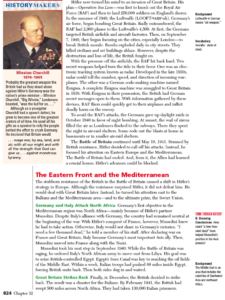
“People with disabilities experience text in many different ways. For some the experience is visual; for some it is auditory; for some it is tactile; for still others it is both visual and auditory. Some users experience great difficulty in recognizing written words yet understand extremely complex and sophisticated documents when the text is read aloud, or when key processes and ideas are illustrated visually or interpreted as sign language.”
“People with disabilities experience text in many different ways.
For some the experience is visual; for some it is auditory; for some it is tactile; for still others it is both visual and auditory.
Some users experience great difficulty in recognizing written words yet understand extremely complex and sophisticated documents when the text is read aloud, or when key processes and ideas are illustrated visually or interpreted as sign language.”
“People with disabilities can experience text differently.
They can experience it visually or through auditory means. They can also consume text through tactile methods, or a combination of these.
Some users will have a hard time recognizing written text.
These same users can understand complex documents when it’s read aloud, key ideas are illustrated, or when it’s communicated through sign language.”

For more on readable text, check out our videos:
Readable fonts
This last guideline is for designers choosing the font for text. The font can directly impact the readability of text. In WebAIM’s Typefaces and Fonts article, they suggest these principles:
- Use simple, familiar, and easily-parsed fonts.
- Avoid character complexity
- Avoid character ambiguity
- Use a limited number of typefaces, fonts, and font variations.
- Consider spacing and weight.
- Ensure sufficient, but not too much, contrast between the text and the background.
- Avoid small font sizes and other anti-patterns.
How to fix 3 common text accessibility issues
Now, let’s review text accessibility issues.
These are 3 common text issues detected by an accessibility checking tool like the WAVE extension or Pope Tech.
Each one can be easy to fix, but it might need to be fixed in the website’s template. That just means that the CSS code would need to be updated and that would fix the issue everywhere it occurred.
 Very small text is difficult to read. To fix it, either increase the size in your content editor or adjust the font size in the CSS.
 Justified text is difficult to read because the varying size of spaces between words. To fix it, remove the justified text styling.
 Underlined text can be mistaken for links. To fix it, remove the underline and choose another way to emphasize the text like bolding.
Key takeaways
- Properly formatted text can make it easier for everyone to read and skim.
- Use paragraph breaks to make white space that chunks up the content. This makes the content more readable for users.
- Use plain words, short sentences, and active voice to make text easy for users to read.
- Avoid using justified text, very small text (less than 10px) and underlined text.
- An easy way to prevent detectable link issues (plus other accessibility issues) is to use the WAVE extension to check for issues during your publishing process.
Make texts accessible in your own content
You know more about text accessibility best practices and detectable accessibility issues, so you’re ready to apply them to your own website.
Below is a plan to fix current text issues and strategies to write with text best practices going forward.
Fix current text issues
These are the accessibility alerts you’ll focus on:
Follow these steps to fix existing text issues:
- Use the Pope Tech Platform or the free WAVE extension tool to find the issues listed above.
- Pope Tech Platform – From your Dashboard, drill down to the heading issues.
- WAVE extension tool (free) – Test four pages on a website or course you contribute to.
- Canvas Accessibility Guide – Test the syllabus, home page, and other pages for one course.
- Review the alerts and determine if any could be fixed at the website template level. For example, fixing small text in the footer could fix that issue on every page.
- Look over the homepage and the three other pages for text readability. Are there walls of text? What is the reading score of some passages of text?
- Now that you have an idea of the text issues, prioritize the template-level issues first. Then, fix other issues you found based on the content’s priority.
- Make an achievable goal and share that goal with your team or office.
- BONUS: If you don’t have one already, schedule a monthly accessibility check-in (even if it’s just you) to celebrate progress and remove blockers.
Prevent text issues going forward
An easy way to prevent text issues (plus other accessibility issues) is to use the WAVE extension to check for issues during your publishing process. Learn what issues to check for as a content writer or developer in our Use the Wave Extension article.
You could also add the text best practices to a list of things to check for when writing content, a content style guide, or editor’s checklist. They include:
- Keep sentences short. Try not to have lines longer than 80 characters, or sentences longer than 30 words.
- Keep paragraphs 1-3 sentences long.
- Keep sentences simple. Use the reading calculator to spot-test your content for the grade level.
By following these steps, you’re on your way to more accessible content.
Visit January Accessibility Focus: Links and Text for more articles and video resources.