Links are what connect online content – they’re everywhere. Since they’re so common, their design and functionality often go unnoticed, especially when it comes to external links. But, as you’ll learn, it’s actually an important design decision.
External links go to pages on different websites. For example, pope.tech to webaim.org. Here’s the important decision – the external link can open in the same tab or in a new tab.
In this article, we’ll go over why most external links should open in the same tab. We’ll also go over how to make external links that open in new tabs more accessible including code snippets.
- Why external links should open in the same tab
- When external links should open in a new tab
- Accessible design and code for external links opening in a new tab
Learn more about link accessibility in A beginner’s guide to link accessibility.
Why external links should open in the same tab
The biggest reason why links should open in the same tab comes down to giving users the choice. If a link is set to open in the same tab, the user always has a choice to open it in a new tab. They can right-click and select “Open Link in new tab” or use control/command and click.
When a link is already programmed to open in a new tab, the user no longer has a choice. The link has to open in a new tab taking the user’s choice away.
Experts from accessibility and usability also agree that most external links should open in the same tab (not a new tab or window).
W3C, the organization that sets web accessibility standards, said:
“In general, it is better not to open new windows and tabs since they can be disorienting for people, especially people who have difficulty perceiving visual content.”
W3C
The same advice continues from the Nielson Norman Group. They found in their user research that “for the most part, always open links in the same browser tab or window.”
Here’s why opening external links in the same browser tab is better for accessibility and overall usability:
- Visual users with low vision sometimes use zoom features to see content. Low-vision users using zoom features can miss the link opening in a new tab if it’s outside their zoomed area.
- Opening a link in a new tab can be disorienting for users with cognitive disabilities.
- When a link opens in a new tab, the user can’t use the back button to return to the previous page, which can be especially frustrating on mobile.
- Links that open in a new tab clutter users’ browser window. This can be difficult for keyboard, screen reader, mouse, and visual users to navigate.
A common reason why people choose to open external links in a new tab busted
A common reason people use to justify opening external links in a new tab is to keep users on their website. This reason is seen as a user retention trick. But, all it does is add to users’ tabs and cognitive load.
If your user wants to leave the webpage, they will, and trying to keep them there can feel like a ploy. On the other hand, if they want to stay on your website, they will. Users can choose to open the link in a new tab.
Setting external links to open in the same tab gives the user that choice and is often the best experience for the user.
When external links should open in a new tab
There are times when links should open in a new tab.
Lose form progress
Often when a user navigates away from a form, they’ll lose unsaved or all their progress. External links that are on the form page or part of the form could open in a new tab, so the user doesn’t lose their progress.
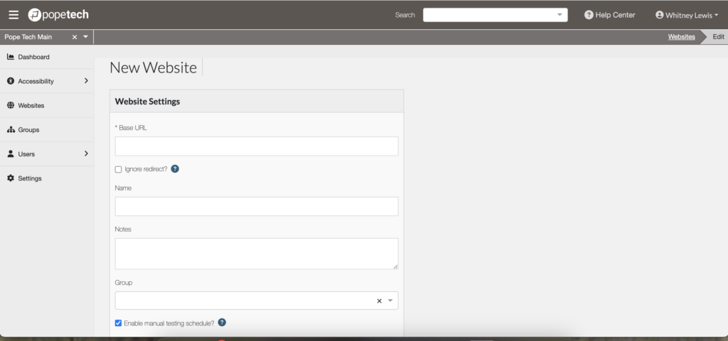
The Pope Tech platform has several forms for new users, websites, permissions, settings, etc. We also occasionally link to content on our blog, which is an external link. To make sure users don’t lose progress on their current workflow, we’ve made all external links open in a new tab. They each have an icon showing it opens in a new tab and visually hidden content that says, “Opens in new tab.”

An alternative solution to opening a link in a new tab
Even though losing form progress is a good reason to open a link in a new tab and there are ways to make that link accessible, there are still alternative solutions that keep the user in the same window without them losing any information.
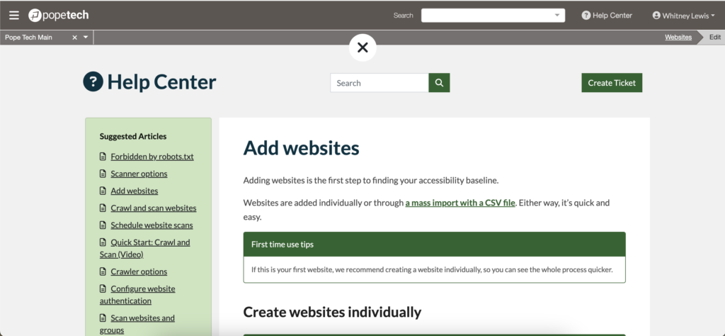
In an intentional effort to limit our external links and keep users in the same tab, we brought all of the Pope Tech help content into the platform. The help article opens in the same window without disrupting any workflows the user is doing. They can easily exit the help article and pick up right where they were.
For example, the user works on adding a new website using the New Website form. They can search for and read the Add Websites help article. Once they’re done, they select the ‘X’ at the top and go straight back to completing the form without losing any information.


Terminate login
Sometimes external links in secured areas (or areas users have to log in to) can terminate a user’s session if they open in the same tab. If this is the case for your online software, then external links could open in a new tab or window so users keep their login active.
For example, university applications often have multiple pages and workflows. External links that take users away from the application could log the user out and cause them to lose progress. These external links could open in a new tab, so it doesn’t disrupt log the user out.
User needs information on both pages
Nielson Norman Group does advise content writers:
“Don’t go overboard with opening links in new browser tabs or windows simply because you think users might need them to display that way for certain cases.”
That said, sometimes opening a link in a new tab or window depends on the situation. If opening the link in a new tab would be helpful to users because they still need information on the current page, then that could justify opening the link in a new tab or window.
If it wouldn’t be helpful to some users or you’re unsure, set the link to open in the same tab. Then, the user has the choice to open it in a new tab if needed.
Accessible design and code for external links opening in a new tab
If you open a link in a new tab or window, give visual and non-visual users a warning that it opens in a new tab.
The easiest way to do this is by simply adding “(opens in new tab)” after an external link that opens in a new tab. For example, A beginner’s guide to link accessibility (opens in new tab).
Another way is to add an “opens in new tab” icon after the link. This icon is becoming more common and if used consistently, can signify to your visual users the link opens in a new tab.

Adding the icon only accommodates visual users. Non-visual users still don’t have any indication that the link opens in a new tab. To accommodate non-visual users, we need to:
- Remove the icon from the accessibility API using aria-hidden=”true”.
- Add “Opens in new tab” text that is visually hidden off the page using CSS. Visual users won’t see it, but screen readers will read it with the link.
Here’s the HTML for a link with an icon and text that is visually hidden off the page. First, is the link and the link’s text. Next is the icon with aria-hidden=”true”. Lastly is the “Opens in new tab” text with the CSS class “visually-hidden”.
<a href="https://blog.pope.tech/2023/03/01/a-beginners-guide-to-manual-  accessibility-testing/" target="_blank">
  A beginner’s guide to manual accessibility testing
  <i aria-hidden="true" class="fa-solid fa-up-right-from-square"></i>
  <span class="visually-hidden">Opens in new tab</span>
</a>
Here is the CSS for the class that hides content off the page.
.visually-hidden {
  position: absolute;
  top: auto;
  overflow: hidden;
  clip: rect(1px 1px 1px 1px); /* IE 6/7 */
  clip: rect(1px, 1px, 1px, 1px);
  width: 1px;
  height: 1px;
  white-space: nowrap;
}
Watch this video to hear Mac’s VoiceOver screen reader announce a link with this code.
If external links that open in a new tab are common on your website, consider adding the visually-hidden CSS and a template for links that open in a new tab that includes the icon and visually-hidden class. Once that’s in place, it’s easy to copy and paste or select that template for those links going forward.
For more articles and resources on accessible links and text check out our Links and Text Monthly Focus.
