Navigations are how users find what they’re looking for. There are best practices to make the navigation more usable for all users and accessible for users with disabilities.
In this article, we’ll go through these best practices and the necessary HTML for top-level navigations and sub-menus so all types of users can navigate your website.
Making your navigation accessible is a great step toward an accessible website. It shows a commitment to all your users. To help you find more accessibility opportunities, try Pope Tech’s Free Plan – up to 15 pages, free for life, and no credit card required. You’ll discover your most common issues and can track your progress as you make your website more accessible.
Accessible top-level (main navigation) best practices
Most websites have a top navigation. For example, usa.gov has seven top-level navigation items.

Simple main navigations make it easier for users to find what they’re looking for. Combine this with accessible HTML and other nav best practices and your navigations are usable for all users.
Keep it simple
When designing the top-level navigation, keep it simple with:
- 5-7 navigation items. Some websites might have less than 5, but any more than 7 makes it overwhelming and difficult for users to find what they’re looking for.
- Concise navigation item names. Keep the text of the items short. One or two words should do the trick. For example, in the usa.gov navigation above, “All topics and services” could be “Topics and services” and “About the U.S. and its government” could be shortened to “About”. Even these small changes help declutter the navigation.

- Don’t use ARIA menu for navigation. A common mistake is setting a navigation to
role="menu". An ARIA menu means users can use the arrow keys to move through the navigation. Typical navigations don’t need this functionality. Plus, most navigations with role set to menu aren’t implemented correctly, which causes confusion for keyboard users. Learn more in Be careful using menu.
HTML structure
To be accessible, the navigation needs a specific structure:
- Provide a skip-to-content link so keyboard users can skip the navigation and go straight to the content. Without this, keyboard users have to tab through the navigation, which can be frustrating. Visit CSS Trick’s How to Create a “Skip to Content” Link for steps and example code.
- Wrap the navigation with an HTML
<nav>element. This tells assistive technology users that this is a navigation. - Use HTML list elements to build the navigation. Assistive technology uses this to announce how many items are in the navigation.
- Indicate the current page. This helps assistive technology users know what page they are on. Use visually hidden text or
aria-current="page".
Here’s example HTML using the nav and list elements to build a top-level navigation:
<nav>

   <ul class="navbar-nav ms-auto">
	<li><a href="/"> aria-current="page" Home</a></li>
	<li><a href="/products">Products</a></li>
	<li><a href="/contact">Contact</a></li>
	<li><a href="/demo">Schedule a Demo</a></li>
   </ul>

</nav>
Pope Tech detects several accessibility results related to navigations including when ARIA-menu is used, when the nav HTML element is used, and broken skip to content links. You can use Pope Tech’s Free Plan – free for life and no credit card required – to check your navigation.
Navigation item statuses
Each specific list item (or navigation element) also needs to convey its status using color, underlining, shape of the menu item, or icons. Avoid just using color since some users can’t see color changes.
The different states you’ll design for are:
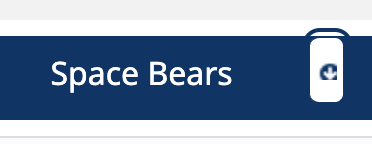
- Default: This is what the navigation items look like when no action has been done yet. It should look like a region of the page the user can interact with. For example, Pope Tech’s navigation is at the top making it look like a separate region, so users know they can select the text to navigate.

- Hover and focus: This is what the navigation item looks like when a user hovers over the item or tabs on it (focuses on it). This helps the user know what item their mouse or focus is on. For example, Pope Tech’s navigation item is underlined and changes color when a user hovers or focuses on it.

- Current: This is what the navigation item looks like when the user is on that page. For example, on Pope Tech’s website, the current styling is the same as the hover and focus. It stays green and underlined.
Label navigations
The last best practice for main navigations is to label it especially if your website or application has more than one navigation. This tells assistive technology the specific name of the navigation, which makes its purpose and content clear.
Label the navigation using either:
- aria-label
- aria-labelledby
<nav aria-label="Primary navigation">
...
</nav>Accessible sub-menu best practices
A lot of websites have sub-menus with their main navigation. For example, one type of sub-menu is a vertical dropdown.
Accessible dropdown sub-menu
Accessible dropdown sub-menus need the following to be accessible:
- Indicate there’s a sub-menu. Use
aria-expanded="false"when the sub-menu is closed andaria-expanded="true"when it’s open. You’ll use Javascript to switch the value as the dropdown opens and closes. - Make the sub-menu keyboard accessible. The dropdown should open when a keyboard user selects enter (not when the focus is on it). If it opens when the focus is on it, the keyboard user has to tab through every sub-menu navigation item to get to the next top-level navigation item.
- Consider top-level navigation item functionality. If the top-level navigation item is a link to a page, then either use a button for the dropdown functionality or add the link to the dropdown list items. The text can’t be a link to a page and the button to open the dropdown.
The video below demonstrates an inaccessible dropdown example. The website has vertical dropdown sub-menus, but they only work on hover. When I tab through the navigation items, the dropdowns don’t appear. Then, when I select Enter, I select the link and go to the page. This dropdown is completely inaccessible for someone using a keyboard.
To be accessible, the dropdown needs to open and close when I select enter, and the top-level link either needs to be added to the sub-menu list or there needs to be a button to open and shut the sub-menu.
Our suggestions for keyboard-accessible dropdown sub-menus
To make a dropdown sub-menu keyboard accessible, our suggestion is to remove opening the dropdown when a user hovers over the item.
Then, you only need to code the navigation item or its dropdown button to open when a user clicks it or selects Enter. This keeps the functionality simple for all types of users.
If you do include hover, review W3C’s Fly-out menu tutorial for hover-specific accessibility considerations.
Static sub-menu options
Dropdown sub-menus aren’t the only sub-menu option. Static sub-menus are another option. These menus or choices show after selecting the top-level navigation item.
They remove the complexities that come with interactive dropdowns and keep the main navigation simple.
Sub-menu that shows after selecting main navigation item
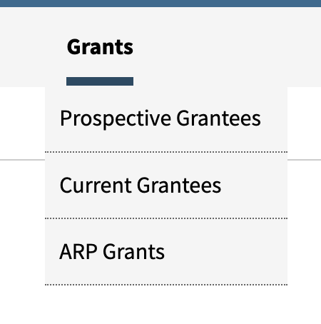
A sub-menu that shows after selecting the main navigation item declutters the main navigation. Once the user gets where they need to go, then they get the sub-menu items plus the landing or main page for that content.
For example, Pope Tech’s webpage doesn’t have any dropdowns – only the main navigation items.

Once a user selects an item, like Websites, the user goes to the Websites landing page and a sub-menu appears with additional pages connected to Websites.

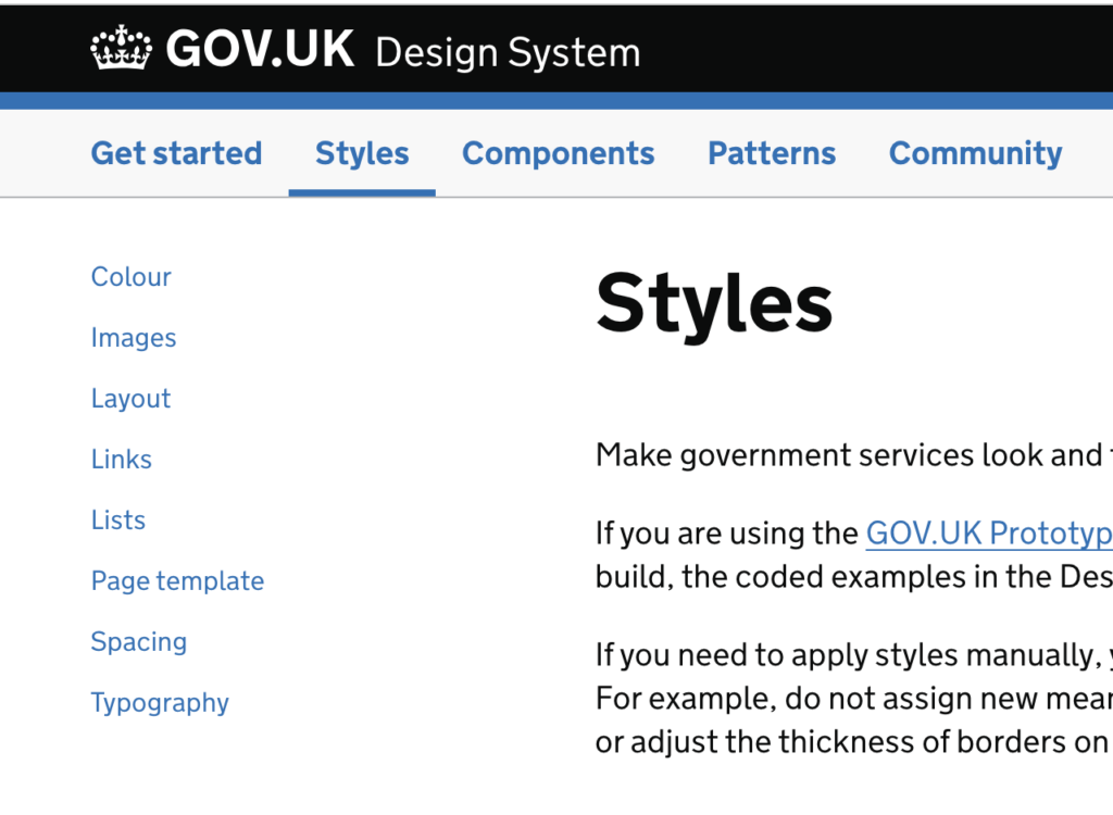
This same idea can be done with a side menu design too. For example, on the UK’s design systems website, the side menu changes depending on the main navigation item that’s selected.
Sub-menus that show after selecting the main navigation item are great for websites that have landing pages for their main navigation pages.
It also helps websites that are trying to declutter their main navigation since they can use the landing page plus the sub-menu that appears to organize content (vs just using a sub-menu).
Landing page of sections
Another type of static sub-menu is a landing page of sections. This declutters the main navigation, but the landing page becomes links to other parts of the website.
For example, gov.uk has a dropdown menu of links.
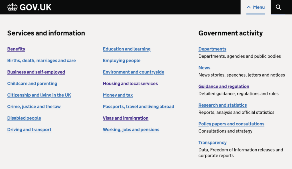
Each of these links goes to a landing page with popular tasks and multiple links with descriptions.
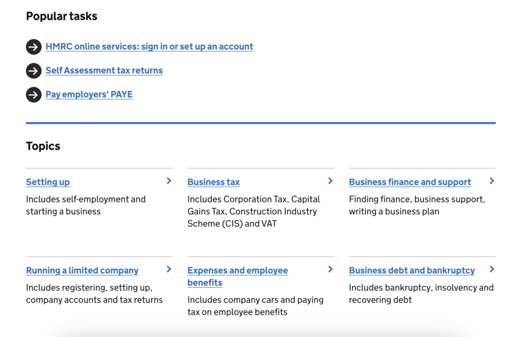
This structure is good for top-level websites (like gov.uk is) with a lot of topics. It helps users easily find the path to what they’re looking for.
Key takeaways
- 5-7 top-level navigation items.
- Concise navigation item names.
- Don’t use ARIA menu for navigation.
- Provide a skip-to-content link so keyboard users can skip the navigation and go straight to the content.
- Wrap the navigation with a <nav> HTML element.
- Use HTML list elements to build the navigation.
- Indicate the current page. Use visually hidden text or aria-current=”page”.
- Convey page status. Avoid just using color since some users can’t see color changes.
- Page statuses are default, hover/focus, and current.
- Label the navigation with aria-label or aria-labelledby.
- Indicate there’s a sub-menu with aria-expanded.
- Make the sub-menu keyboard accessible. The dropdown should open when a keyboard user selects enter (not when the focus is on it).
- If the top-level navigation item is a link to a page, then either use a button for the dropdown functionality or add the link to the dropdown list items.
- To make a dropdown sub-menu keyboard accessible, our suggestion is to remove opening the dropdown when a user hovers over the item.
- Static sub-menus are another option to dropdown menus. Static sub-menus show after selecting the top-level navigation item.
Learn more about navigation accessibility in How to set up an accessible page structure and navigation.