
You ran your contrast check and got the green check, nice work! Checking contrast ratios is one part of color accessibility.
The other part is that color can’t be the only way information is conveyed.
This means that the next step is grayscale testing: removing color by desaturating your website to see if form states, charts, infographics, and links still make sense without color distinctions.
For people with color vision differences, those bright red error borders or color-coded chart lines can blur into the same gray. So even when you pass contrast tests, your design might lose its message. This is where a quick grayscale test can reveal weak spots.
Up next:
- How grayscale testing exposes color reliance
- Three ways to test color reliance
- Designing beyond color
- Color accessibility is about more than contrast
How grayscale testing exposes color reliance
One of the simplest ways to test whether your design relies on color is to look at it in grayscale.
It takes less than a minute, and the results can be surprising.
When you remove color, you’ll quickly see which parts of your design rely on it too heavily.
For example:
- Form errors: Red borders that disappear once color is gone.
- Charts and maps: Lines or regions that suddenly blend together.
- Status messages: Green “success” and red “error” alerts that look identical in grayscale.
- Links and buttons: Calls to action that lose their emphasis without their colorful backgrounds.
Once you’ve been introduced to the idea of color reliance, you’ll notice it more. Take for example this bus route map:

Once this map is desaturated, the color only bus route lines disappear into one gray line.
The grayscale test helps you see your design the way many users do every day, whether because of color vision differences, low-contrast environments, or just a bright sunny screen.
Three ways to test color reliance
You don’t need anything fancy to test whether your design still communicates without color.
Here are three easy methods to test for color reliance.
1. Use WAVE’s “Desaturate page” feature
If you use the WAVE extension, the Contrast tools include a Desaturate page option that removes color for you.
- Install and open the WAVE extension on the page you want to test (or run the page through wave.webaim.org).
- Open the Contrast panel in the extension.
- Click Desaturate page. WAVE will render the page in grayscale right in your browser and give you contrast info alongside.
For a visual example, please see our video on how to use WAVE’s desaturation feature.
2. Use Chrome DevTools (Windows & Mac)
This is an option that uses Chrome’s developer tools. We’ll explain how to find the setting in Google Chrome:
- Open Developer Tools: Right-click anywhere on the page and choose Inspect, or use the shortcut:
- Windows: Ctrl + Shift + I
- Mac: ⌘ + Option + I
- Open the Rendering tab: Click the three vertical dots (⋮) in the DevTools window → More tools → Rendering.
- Emulate vision deficiency: In the Rendering panel, find the Emulate vision deficiencies dropdown.
- Select Grayscale: Choose Achromatopsia (no color). The entire page will render in grayscale so you can immediately spot areas that relied solely on color.
- When you’re done: Revert the dropdown back to No emulation (or close DevTools) to return to color.
For a demonstration, you can watch our video on how to use Chrome DevTools to desaturate a page.
3. Use your operating system color filters (Windows & Mac)
If you want to test grayscale across all apps on a machine, then you will want to turn on the system-level grayscale filter.
- Windows: Settings → Accessibility → Color filters → toggle on Grayscale.
- Mac: System Settings → Accessibility → Display → toggle Color Filters → choose Grayscale.
This simulates a real user environment and is useful for checking how your product feels in everyday use but remember to toggle it off when you’re done.
Designing beyond color
Color should add to the message, not be the whole message.
When color is doing all the talking, it can leave those with color vision disabilities and those in bright atmospheres lost. Be sure to include another pathway to the same information.
Here are a few tried-and-true strategies:
- Add text or icons: Label “error” and “success” states clearly, or pair them with recognizable symbols.
- Use patterns or shapes: Give charts and maps visual variety beyond color. Dotted, dashed, or patterned fills help users distinguish data at a glance.
- Include captions: Include captions for complex data like tables and graphs. For more information on accessible charts and graphs, read How to make charts and graphs more accessible.
- Underline or style links: Don’t rely on color alone. The standard for links is typically an underline, but they should also have color that stands out in grayscale.
- Lean on placement and consistency: Put similar messages in consistent spots. For example, errors below form fields and confirmations above help users know where to look.
When you mix cues, like color, shape, text, and position, you give several pathways to the same information, making your design stronger, more flexible, and more usable for a broader range of people.
Example: Line charts
Line charts are a common place where color reliance can create problems. When multiple lines rely on color alone, they can blur together in grayscale, and the legend may not help.

In this example, patterns are added to each line so that the chart remains readable even when color is removed. Color still adds helpful differentiation, but the patterns ensure that users don’t have to rely solely on hue to interpret the data. This makes the chart more understandable for a wider range of users and conditions, like printouts, black-and-white displays, or color vision differences.

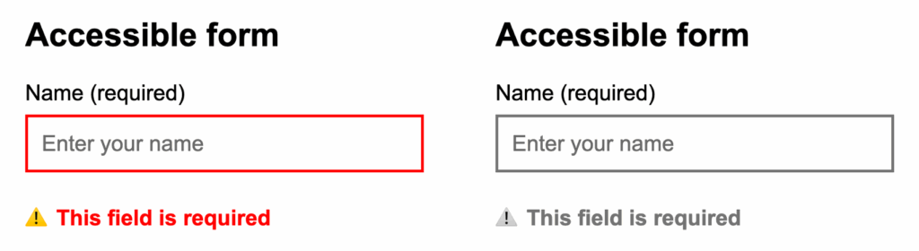
Example: Forms
Another common place where color reliance can create problems is in form validation. When errors are communicated only through a red border, they can disappear in grayscale or be difficult to see for users with color vision differences or in bright environments.
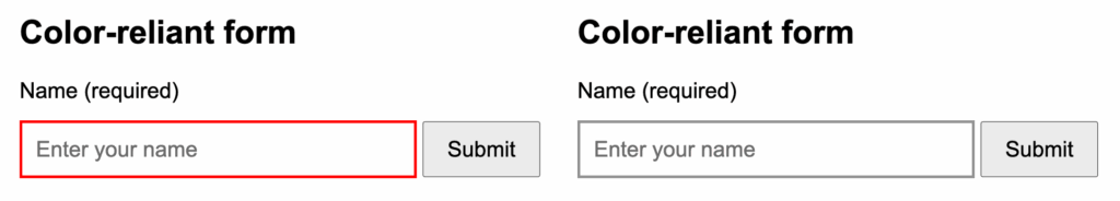
In this example, text and icon cues have been added alongside the red border so that the error state is clearly visible even without color. The red outline still provides helpful emphasis, but users don’t have to rely solely on color to understand the error. This makes the form more resilient and usable in a wider range of conditions.
Color accessibility is about more than contrast
Checking contrast is an important first step. But color accessibility goes further. It’s about making sure meaning still comes through when color isn’t part of the picture.
Now, more people can read and understand the same information, no matter how they see color.