
Quick summary
Forms are essential – they’re how users make a purchase, subscribe to newsletters, set up appointments online, or RSVP to events.
Inaccessible forms mean some of your users aren’t able to complete the form, complete it incorrectly, or have a frustrating experience. In fact, the WebAIM million report found over 1.7 million form fields aren’t properly labeled.
Accessible forms everyone can use need more than semantically correct HTML. They need clear instructions, a clear navigation order, keyboard accessibility, accessible labels associated with one input, and usable and accessible form validation.
Common form accessibility mistakes to avoid are incorrect labels or using CAPTCHA to verify it’s a human completing the form.
In this article, you’ll learn about:
Rather watch a video? Check out our YouTube video Test a form for accessibility checklist and demo.
Up-level your forms with:
- Form accessibility and usability beyond the basics
- Accessible form validation with examples and code
Visit October Accessibility Focus: Forms for more articles and video resources.
What are HTML web forms?
Chances are you’ve used an HTML web form. Whenever you submit your information online for a newsletter, purchase, or survey, you’re entering that information into an HTML web form.
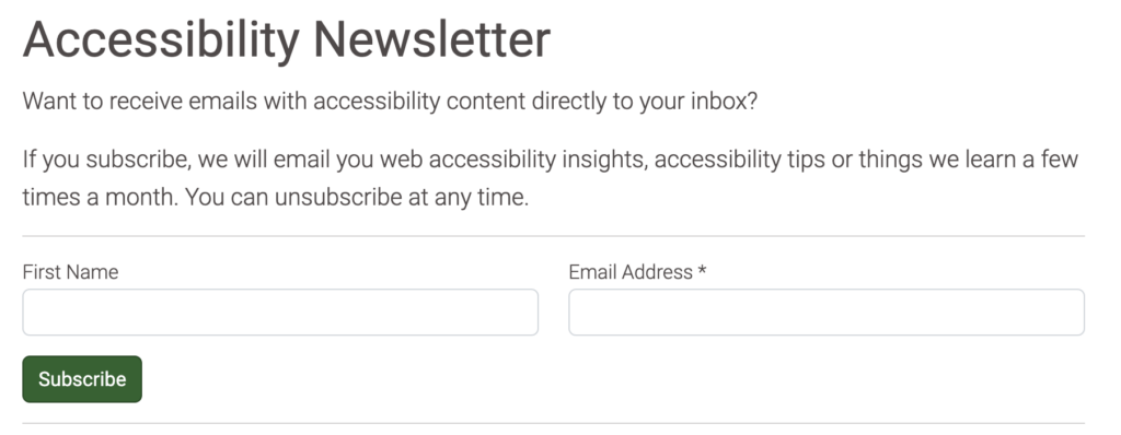
Here’s an example HTML form where users input their name and email address to subscribe to Pope Tech’s newsletter:
HTML basics for web forms
Now, HTML web forms are probably familiar to you, but what might be unfamiliar is the code behind them. Accessible forms have specific code requirements, and this basic understanding will help you understand the code requirements better.
Let’s look at the HTML for a newsletter subscription form, like the one above. We need code like this to make a form:
<form action="[insert URL to send form data to here]">
     <label for="name">First Name</label>
     <input id="name" type="text" name="first_name">

     <label for="email">Email Address *</label>
     <input id="email" type="email" name="email_address" required="">

     <button data-element="submit">Subscribe</button>
</form>
Here are the important things you need to notice about this HTML:
- Each field has a
labelelement and aninput. Thelabelis what is shown by the input field – it tells us what information to enter. Theinputis where the user types or selects information.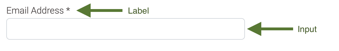
- The label has a
forattribute that matches the input’sidattribute. For example, the first label’sforattribute isfor="name", and theinput‘s id isid="name". - The label is explicitly associated with the input. There are two methods to associate labels and inputs. The first is explicitly associating with the
forandidattributes. We suggest using this way because there are focus benefits. Check out W3C’s Labeling Controls to learn more about both ways.
Learn more about the different form input types in WebAIM’s Creating Accessible Forms.
Let’s take these form basics and learn what else forms need to be accessible.
What makes forms accessible?
Accessible forms don’t just have the right HTML code, they also have clear instructions and navigation.
Here are 5 things accessible forms need:
- Required fields, fields with special formatting, or other unique parts of the form have clear instructions.
- Clear navigation order using just the Tab key to go through the form.
- The entire form can be completed using only a keyboard.
- One accessible label is associated with each input and is readable by screen readers.
- Usable and accessible form validation for form errors (the messages you get if a field is incorrect).
This might sound like a lot, but it’s easy to check your own forms to see how they measure up to this list. We’ll show you how to do this further down in the testing your own forms activity. For now, let’s go over tips on how you can do these 5 things on your own forms.
Clear instructions
Even simple forms like a newsletter sign-up need instructions. They have required fields and certain formatting requirements.
Providing these instructions doesn’t have to be complex. Here are some ways to make sure your forms have clear instructions.
- Provide instructions before the form. If your form has a field that is critical or something people might not be used to completing, give brief instructions before they enter the form.
- Give instructions in the label (not in the placeholder). If the field requires formatting that isn’t obvious, give brief instructions in the label. The placeholder disappears as soon as someone starts typing, which makes it difficult to remember any specific instructions.
- Tell the user exactly what they need to enter. Don’t make the user guess at what you need. Here’s an obvious example: if you want their phone number, then make the label Phone number. Don’t make it something like Contact information because contact information could mean phone, email, or even mailing address.
Clear navigation order using the tab key
Just because you’re able to access each field using the tab key, doesn’t mean it’s in the order that would be best for the user.
Here’s a common example of a form with a First name and then right next to it, a field for the Last name. The natural order to complete the form is first name and then last name. Then, continuing onto any there fields.
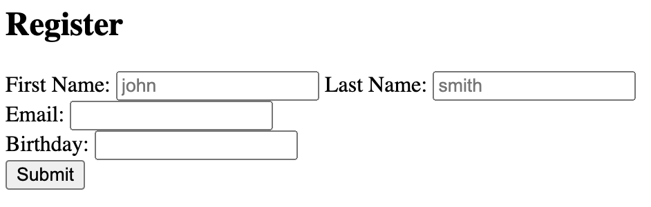
But, if I’m using tab to go through the form, I might start at the First name field, select tab, and get taken to the field right below it, which is email. If I push tab again, I’d keep going down the column to the next field. Finally, I’d get to the adjacent column and the Last name field. This order just doesn’t make sense – it should go First name and then Last name.
Here’s how you can have a tab order that makes sense:
- Use rows strategically to let users tab in the correct order. By default, the tab order goes down a column and then to the next column. To make sure the user can tab from the field in the first column to the field in the second column, put those fields in their own row. Then, put the next fields in their own row. Now, the user will tab through the columns in the row before going to the next one.
- Always test your tab order. Think about what the logical order would be. Then, use the tab key to go through the form and test to make sure the tab order matches the logical order.
Form can be completed using a keyboard
We already started using a keyboard when we tabbed through the form to make sure it was in a logical order. But, a user should be able to complete all the fields using only a keyboard.
Here are some tips to make sure each field can be completed using a keyboard:
- JavaScript doesn’t have keyboard accessibility built into it. If your form uses JavaScript, the JavaScript code needs to have keyboard accessibility built into it. For more information, read MDN’s Keyboard Navigable Javascript widgets.
- Always test your form using a keyboard. Whether your form uses Javascript or not, you should test your form to make sure each field can be completed using only a keyboard. That includes date, dropdowns, sliders, and any other field that is on your form. Check out WebAIM’s Keyboard Testing interactions to help you get started.
Accessible label is readable by screen readers and associated with one input
When it comes to accessible labels, we don’t necessarily mean there has to be an HTML label element in the code – like there was in our example above.
I’ll explain because the terminology can be confusing. There is the accessible label, which is anything that is matched to the HTML input and can be read by a screen reader. Then, there is the HTML label, which is just one type of accessible label.
These are the accessible labels that can be matched to the input field and read by a screen reader:
labelelement – Users see this label, and it’s announced by screen readers. Can be hidden with CSS.ARIA-labelattribute – Only announced by screen readers.ARIA-labeledbyattribute – Only announced by screen readers.titleattribute – Users see this label when they hover over the input, and it’s announced by screen readers.
To learn more about using each of these accessible labels including example code, check out W3C’s labeling controls article.
Now, here are the tips to make sure your accessible label is readable by screen readers and correctly associated with an input:
- Use the HTML label element. We suggest using the HTML
labelelement because, in most cases, a visual label is better for visual users and it’s read by screen readers. It also has focus indicator benefits when using theforandidattributes to explicitly associate the label and input. - If you have a hidden field label, so visual users can’t see it, still use one of the accessible label options, so screen readers still announce it. Don’t just use a placeholder attribute. In some edge cases, a hidden field label is appropriate (like for a search bar).
- Programmatically connect the accessible label with the input. No matter which accessible label is used, it has to be connected to the correct input, so the screen reader announces the label for the right field. W3C’s labeling controls article reviews how to do this for each accessible label.
- Test with a screen reader. Testing with a screen reader catches issues that can’t be automatically detected and is the best way to make sure each label makes sense for assistive technology users. The two free screen reader options are Window’s NVDA and Mac’s VoiceOver.
- Test with WAVE. Testing with WAVE’s extension finds missing accessible labels or accessible labels that aren’t associated correctly.
Usable and accessible form validation
Form validation or form error messages are what tell users when they didn’t complete a required field or completed it incorrectly.
When a user gets a form error, it’s potentially a point of frustration. A well-designed form validation message and flow can change their experience, while also getting you an important sign-up, purchase, or survey response.
Here is how to create usable and accessible form validation:
- Avoid default validation. Browsers (like Chrome, Firefox, etc.) have built-in validation. But, this validation doesn’t give clear instructions, isn’t built to work with assistive technology, and has poor focus indication. Check out Adrian Roselli’s Avoid Default Field Validation for examples and more information.
- Clear error messages. All users benefit from clear instructions about what fields need to be completed or fixed and their required formatting. Form error messages can go above the form and inline with the fields. Learn more about strategies for error messages in WebAIM’s Error Recovery.
- Programmatically tie helper-text. If there are form error messages inline with the fields, make sure they’re programmatically tied to the field, so screen readers announce the helper-text when the user focuses on the field. We suggest doing this by using ARIA-describedby.
- Set focus on the first error message. Focus is the visual highlight around an object that the user is on. If you’re a visual user and select the tab key right now, you’ll see your focus go through the links on this page. After submitting a form incorrectly, the focus should be on the first error message, so the screen reader announces it. Then, the user will know the issue right away.
- Test with a screen reader and keyboard. The best way to make sure your form validation and error messages are clear and easy to access with a screen reader is to test them. The two free screen reader options are Window’s NVDA and Mac’s VoiceOver.
Examples of accessible and inaccessible forms
Here are examples for each of the 5 things an accessible form needs.
Clear instructions examples
Notice in each of these clear instructions examples how clear instructions would help both visual and assistive technology users.
Instructions before the form
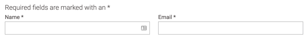
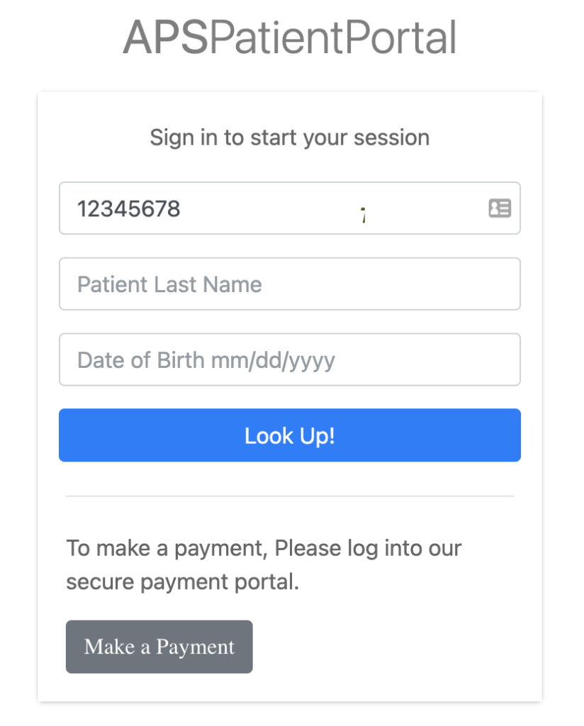
In this example, there are instructions before the form that read Required fields are marked with an *. Now, everyone is clear what the * symbol means in the form.
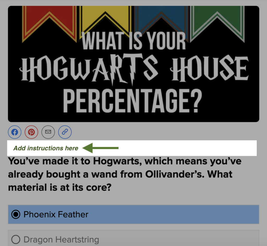
Now, in this form, it would be a lot clearer if there were instructions before the questions start. This is a quiz to find what Hogwarts House you belong to. There is no submit button and it’s not clear if every question is required or not. If you’re unfamiliar with this format, it might be unclear how to submit your results if you missed a question or didn’t want to answer a question.
This could be easily fixed with instructions before the form that said something like Answer each question to learn what house you belong to.
Inline instructions
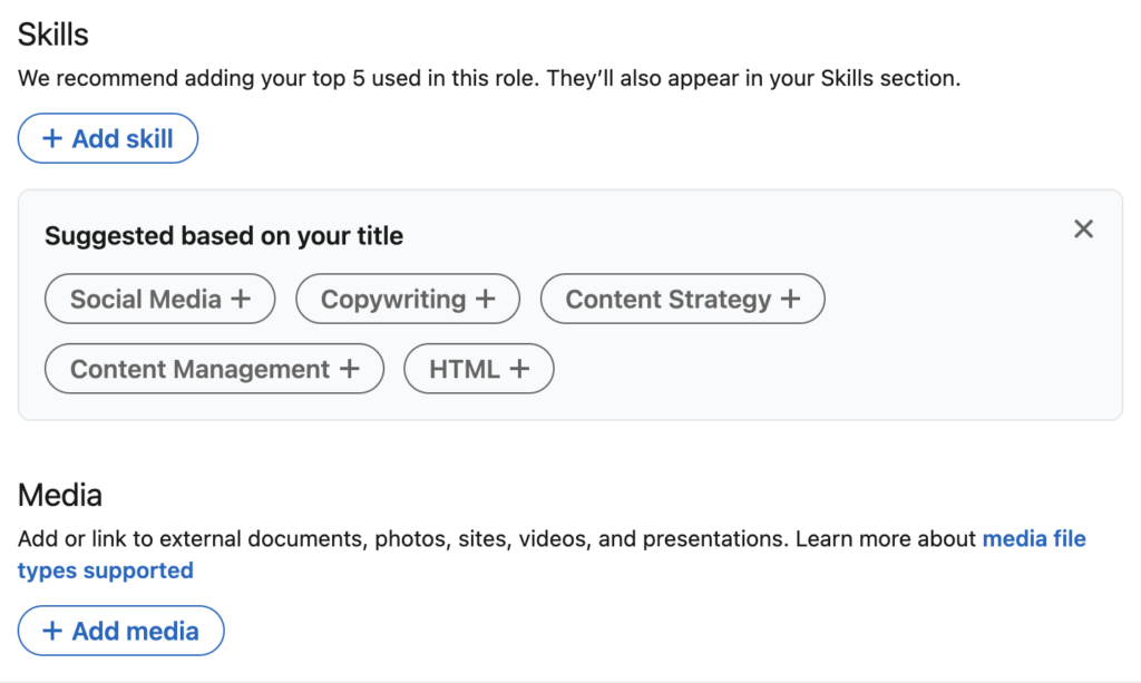
The screenshot below is a form to edit your LinkedIn profile. There are inline instructions throughout on how to best complete the field. For example, the instructions for the Media field are: Add or link to external documents, photos, sites, videos, and presentations. Learn more about media file types supported.
This is helpful because users know what they should upload and can find more information about what file types they could upload.
Clear navigation order using tab example
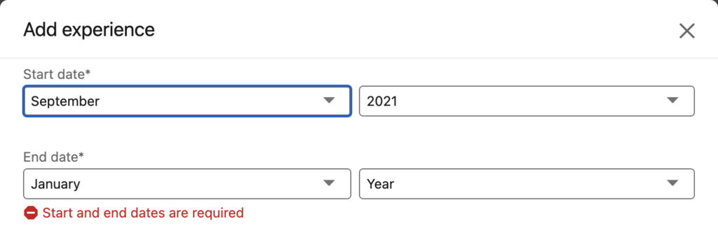
Similar to our example above, this form has fields that are right next to each other. First, there’s the start date month dropdown. To the right, is the start date year dropdown. Then, we have the end date month dropdown, and to the right, the end date year dropdown.
The way a user would complete this is the start date month and then the start date year. Then, they would move on to the end dates.
In this form, the user is able to tab through the form in that order, so everyone can complete it in a way that makes sense. It would need to be fixed if the tab order went from start date month to end date month and then to start date year.
Complete the form using only a keyboard example
Forms that have dropdowns, combo boxes, and custom interactions should still be accessible using a keyboard.
Here is a form being completed only with a keyboard, along with narration explaining what’s happening.
Accessible label examples
In this form example, there are no accessible labels users can see. There are not even hidden labels for a screen reader to announce. There is placeholder text that shows in the field before the user starts typing.
The issue is if the user goes back to the field after typing in it, there’s nothing for the screen reader to announce, so a screen reader user would have to remember what that field was.
Watch this video to listen to a screen reader go through this form with the missing accessible label and then after it’s fixed.
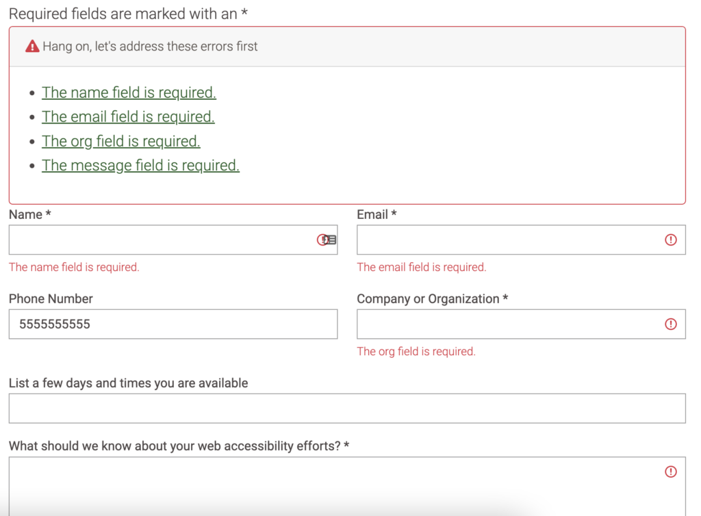
Form validation example
This form is a good example of clear error messages. After a user submits the form incorrectly, the focus goes to the error message above the form, so a screen reader announces the message. Then, there are clear instructions that are linked to the fields that need to be completed. There are also inline instructions that are programmatically connected to the input field, so when the user is on the field, the screen reader announces the helper-text.
Watch this video for a demo of these error messages with a screen reader.
Common form mistakes and how to fix them
Here are common mistakes to look out for if you want an accessible form. We started to cover some of these above, but these happen enough, they need their own spotlight.
A hidden accessible label is wrong or missing
We went over accessible labels above – the accessible label is what the screen reader announces when a user tabs to the input field.
Most of the time, it makes sense to have a visual label using the HTML label element. But, when the input is obvious without a visual label – like a search field – it might make sense to hide the label.
The input field might be obvious visually, but it still needs an accessible label that announces what the input field is for screen reader users.
Oftentimes, because the hidden label is well, hidden, it has a mistake that goes unnoticed unless the form is tested with a screen reader.
How to fix it
To avoid hidden accessible labels that are wrong or missing altogether, quickly go through your form with a screen reader.
If there is an issue, follow these steps to fix it:
- Look at the code to see if any of these accessible label types are there for that field:
labelelement – (this could be hidden with CSS)ARIA-labelattribute – this would be part of theinputHTML.ARIA-labeledbyattribute – this would be part of theinputHTML.titleattribute – this would be part of theinputHTML.
- If there isn’t an accessible label, add one. Learn more in Labeling Controls.
- If there is an accessible label type already, update it if it’s incorrect.
- Once fixed, use a screen reader to test it again.
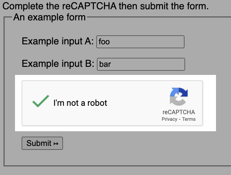
CAPTCHA test is used
Unfortunately, as of now, a CAPTCHA test is not an accessible way to secure your form.
In W3C’s Inaccessibility of CAPTCHA draft note, it says,
“All interactive approaches require users to perform a task believed to be relatively easy for humans but difficult for robots. Unfortunately, the very nature of the interactive task inherently excludes many people with disabilities, resulting in a denial of service to these users.”
So, if your form uses a CAPTCHA test, it is not accessible.
How to fix it
To make the form accessible, you’d have to remove the CAPTCHA. Fortunately, there are other, accessible, ways you can secure your forms. Here are two ways to consider:
- Have a hidden field to catch robots. If that form is completed, the form won’t submit.
- Require users to confirm their email address when signing up for a newsletter.
Learn more about CAPTCHA test accessibility and alternative ways in our article CAPTCHA challenges aren’t accessible, but your website can be accessible and secure.
WAVE label-related errors and alerts
There are six WAVE label-related errors and alerts you can check for by using the free WAVE extension. Each of them has to do with the accessible label either missing or not associated correctly with an input.
The six errors and alerts are:
- Missing form label
- Empty form label
- Multiple form labels
- Orphaned form label
- Select missing label
- Unlabeled form control with title
How to fix it
Since each of these has to do with the label, the steps are similar to fixing a hidden label issue.
- Look at the code to see if any of these accessible label types are there for that field:
labelelement – (this could be hidden with CSS)ARIA-labelattribute – this would be part of theinputHTML.ARIA-labeledbyattribute – this would be part of theinputHTML.titleattribute – this would be part of theinputHTML.
- If there isn’t an accessible label, add one. Learn more in Labeling Controls.
- If there is an accessible label type already, update it to fix the error or alert.
- Once fixed, test with the WAVE extension again to confirm the error or alert is gone.
Key takeaways
- HTML forms use the label element to create the name of the field, and an input element to create the field itself.
- Accessible forms have 5 things:
- Clear instructions about what fields are required or any special formatting for specific fields.
- Clear navigation order using just the Tab key to go through the form.
- The entire form can be completed using only a keyboard.
- Each field has an accessible label that is readable by screen readers and is correctly associated with one input.
- Usable and accessible form validation for form errors (the messages you get if a field is incorrect).
- The accessible label can be hidden to visual users, but it still needs to be announced to screen readers using one of these accessible labels:
- HTML
labelelement ARIA-labelattributeARIA-labeledbyattributetitleattribute
- HTML
Test your forms for accessibility activity
Automated testing only finds issues with a label being associated with an input. It can’t find issues with instructions, navigation, form validation, or if it’s properly read by a screen reader. These should be manually tested.
This activity uses automated and manual testing to make sure you have all five requirements for accessible forms.
Rather watch the video? Check out our YouTube video Test a form for accessibility checklist and demo.
Test your form with automated accessibility testing
These are the accessibility errors and alerts you’ll focus on:
 Empty form label
 Missing form label
 Multiple form labels
 Orphaned form label
 Select missing label
 Unlabeled form control with title
 Fieldset missing legend
 Missing fieldset
Follow these steps to find and fix form issues you find on your own website:
- Use the Pope Tech Platform or the free WAVE extension tool to find the issues listed above.
- Pope Tech Platform – From your Dashboard, drill down to the form issues.
- WAVE extension tool (free) – Test four pages on a website or course you contribute to.
- Fix or document ten label errors.
- If there were more than ten issues, make an achievable goal and share that goal with your team or office.
- BONUS: If you don’t have one already, schedule a monthly accessibility check-in (even if it’s just you) to celebrate progress and remove blockers.
Test your form with manual accessibility testing
Go through each of the questions below. You should be able to answer yes for each one.
- Does your form have required fields? If so, are there instructions at the beginning for what indicates a required field or the word required is on the required input fields?
- Does each field tell the user exactly what information to enter?
- Does your form have any specific formatting or anything that might be unique to your form? If so, are there instructions before the form or on the field?
- Can you get to each field in the right order only using the tab key?
- Can you complete the entire form only using a keyboard? Check out WebAIM’s Keyboard Testing interactions to help you get started.
- When using a screen reader, does each field announce an accurate label? The two free screen reader options are Window’s NVDA and Mac’s VoiceOver.
- If something isn’t completed correctly with your form, are there clear instructions on what the issue is and how to fix it?
- If the form validation instructions are inline the form (right next to the field with the issue), are they read when a screen reader focuses on the field? (If not, this is an issue with programmatically tying them to the field).
- Is the form validation easy to navigate with only a keyboard?
- When using a screen reader, does all the form validation make sense when announced?
Create accessible forms going forward
Consider these questions as you plan how to create accessible forms whenever a new form is made:
- Does whoever is creating forms know how to use the WAVE extension tool, or is training needed? They can find issues with the accessible label using the WAVE extension.
- Do they know how to use one of the free screen readers, so they can manually test forms too? The two free screen reader options are Window’s NVDA and Mac’s VoiceOver.
- Would a manual testing checklist be helpful? If so, consider making the manual testing questions above part of form tasks in your task software or printing it for the people who design, create, or test forms.
Up-level your forms with Form accessibility and usability beyond the basics.
Visit October Accessibility Focus: Forms for more article and video resources.