
Forms are how websites interact with users and can help your organization grow. Think about the forms on your own website or that you use to interact with your favorite companies. For example, login, payment, or event registration forms just to name a few.
Obviously, forms are important to get right. We don’t want a user’s experience to be frustrating or lead to them not being able to complete the form. That can mean the loss of a sale, customer, attendee, or confidence in the organization.
In this article, we’ll briefly go over form functionality that websites often don’t consider. These strategies can make your forms more usable for all users and accessible for users with disabilities.
- Autofill and paste functionality
- Usable and accessible error message pattern
- Usable and accessible date field
- Auto formatting fields
Learn more about form accessibility basics in A beginner’s guide to form accessibility.
Autofill and paste functionality
Let’s start with what we mean by autofill and paste functionality.
Autofill is a browser feature users can turn on. Then, they can save information and use it on forms.
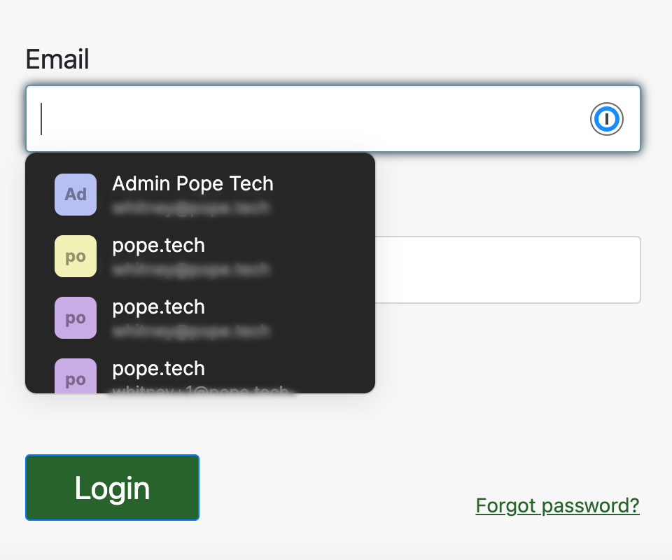
Paste functionally means a user can paste information into an input field – even password fields.
Both of these are ways to meet accessibility requirements. Plus, they make your forms more usable for people with disabilities and people without.
Autofill fields
To meet accessibility requirements, input fields that collect certain types of user information should have a defined autocomplete attribute.
For example, if the field is for a phone number, the autocomplete attribute would equal tel. This tells the browser to complete this field using the user’s saved telephone number.
<label for="phone1">Phone Number</label>
<input type="text" id="phone1" autocomplete="tel" name="phone" value="">
When any user has autofill turned on, it’s a powerful tool that helps them complete forms quicker removing some frustration.
Paste into fields
Similar to auto-filling fields, pasting helps users complete forms and use password managers. It helps meet accessibility requirements by giving users an alternative way to complete a username and password field instead of remembering the credentials (autofill does this too).
Letting users paste into fields is easy – just DON’T add code that stops them from pasting. All input fields let users paste by default.
The code below uses the onpaste attribute to prevent pasting. It also uses the ondrop attribute to prevent dragging and dropping. Lastly, it turns autocomplete off so autocomplete won’t work. This type of code can be problematic for a lot of users.
<input type="text" onpaste="return false;" ondrop="return false;" autocomplete="off" />Usable and accessible error message pattern
We know forms need error messages and user feedback, but it can be difficult to know where to start. The following pattern is a potential starting point for form validation.
- List the errors above the form. Include a title that lets the user know there’s an issue. For example, “Please fix the following errors.” This tells the user there’s an issue. Below that, use a list to organize the errors. Assistive technology announces how many items are in the list so a user now knows how many errors there are.
- Link the errors in the list above the form. Link the list of errors to the input field. This makes it easy for keyboard and assistive technology users to get to the field and fix it.
- Set focus to the title of the list of errors after an unsuccessful submission. Oftentimes, after the form submission is unsuccessful, the focus doesn’t go anywhere helpful. So, a screen reader doesn’t announce anything about the errors.
- Programmatically tie inline error messages to the input field. Helper-text or inline error messages are programmatically tied to input fields using ARIA-describedby. This makes it so screen readers announce the message when the user focuses on the field.
- Error messages tell the user exactly what is needed. Make sure the error message above the form and inline the form tells the user what went wrong. For example, “Email must have an @.” is better than “Complete this field with correct formatting.” Or, “Your phone number must contain 10 numbers” is better than “Match the required formatting.”
Using these strategies together gives the user clear feedback on if there are errors, how many errors there are, exactly what the errors are, and links to jump to them.
Video example
Here’s a video of a form that uses this error message pattern:
Usable and accessible date field
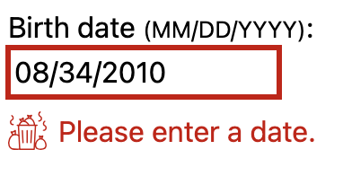
Date fields collect specific dates like a birthday, expiration date, or desired date. It’s important this information is right and formatted correctly for the organization.
Common date field options
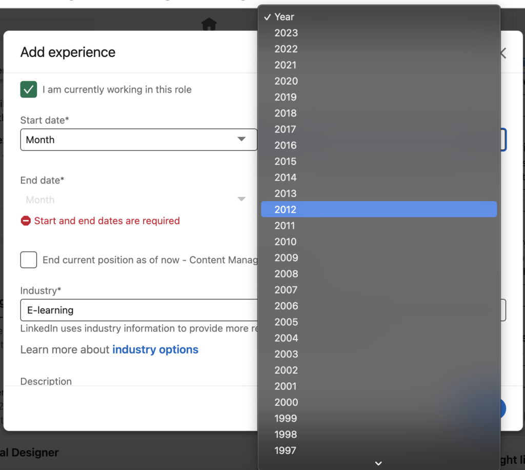
One way forms collect the date is with select fields – one for the month, one for the date, and one for the year. The part that can be frustrating is scrolling through a long list of year options. Imagine having to scroll or use the arrow key to get to a year over 20 options down – it’s just not the best user experience.
There’s also a date input field option. This gives a text field that only takes numbers and actually has the slash formatting. Users can type in the date, or a user can use the calendar date picker.
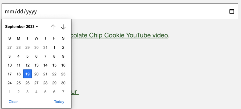
Unfortunately, voice users (users who use speech recognition software) have issues with this input across browsers and it’s not supported by Safari on Mac. For a full report on date input accessibility, review Is input type=”date” ready for use in accessible websites?
More usable and accessible date field alternatives
There are two alternatives to making a date picker that’s a better experience for everyone. The first is to create an accessible date picker with JavaScript and ARIA. Review W3C’s Date Picker Dialog Example for code and details about what’s used to make it accessible.
Another alternative removes the date picker entirely. In Adrian Roselli’s Maybe you don’t need a date picker, there’s an option to input the date in a text field and then use Javascript to generate the inputted date next to the field.
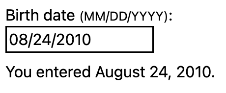
In this option, users get instant feedback on the date they entered helping them know if they’ve entered the correct information. This instant feedback is especially helpful when a user is used to writing a date in a different format (MM/DD/YYYY vs. DD/MM/YYYY). They’ll know right away if the date is what they expected.
If the user enters an invalid date or doesn’t follow the expected format, they’re prompted to try again.
While it’s easy to lean on the HTML date input, it’s not accessible or usable to everyone. If your form requires users to input a date, one of these accessible alternatives lets more users easily complete your form.
Auto formatting fields
Auto formatting is when spacing or characters are added as a user types an input. Input fields don’t do this automatically (besides the date input, which isn’t accessible as of now). It needs additional JavaScript to add the formatting.
For example, the default formatting for a telephone input wouldn’t have any perentheses, dashes, or spacing.

With a little JavaScript, formatting is automatically added as a user types the phone number. Now, there are perentheses around the first three numbers and a dash between the first three numbers and last four.

Formatting can make a difference for visual users because it’s easier to see the groups of numbers. This can limit mistakes making it more usable.
Here’s another example with credit card numbers. This credit card number has no spaces. The amount of numbers can make it difficult to track a mistake.

An easier way for users to see the credit card number is with a space between each block of four numbers.
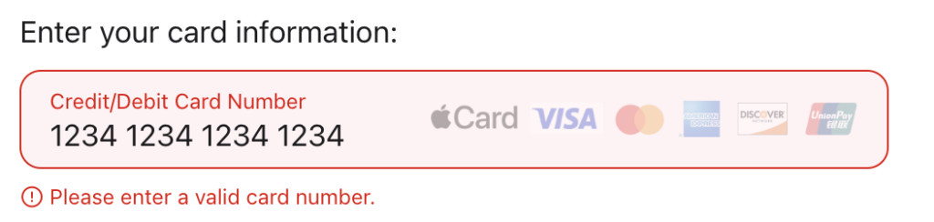
This is a small but powerful way to help your forms be more usable for visual users. Learn how to add formatting to input fields in Form Design: How to Automatically Format User Input.
Check out A beginner’s guide to form accessibility or the Forms monthly focus for more articles and videos.