
Most of the time, an accessible heading structure follows the typical guidelines of starting with an h1, only one h1 on a page, and no skipped headings. But, when we develop websites, it isn’t always that straightforward.
In this article, we’ll tackle some common heading-use questions and how using headings in different ways could affect accessibility.
Keep in mind, while these are common questions, they are edge cases for headings. If you’re getting started with accessible headings, review our introduction article to accessible headings.
- Can I have multiple h1s on a page?
- Are skipped headings ever okay?
- Do I have to start a page with an h1?
- Can I wrap my logo in a heading?
- Can I put other content in a heading tag?
- Should I use a heading instead of a table caption?
- How many levels of headings should I use?
- Can I style the same heading differently on different parts of the page?
Learn more about accessible headings:
- Intro to accessible headings – 5 heading accessibility issues and how to fix them
- Accessible heading structures for home pages
- August accessibility focus: Headings
1. Can I have multiple h1s on a page?
The most common way to organize pages is to have one h1 on a page. This is what users are typically used to. However, having multiple h1s can be okay for accessibility as long as they aren’t overused, and the h1s are logically used within the structure of the page.
For example, h1s could be used to separate content sections (where most would use h2s), or they could be used in each new <article> tag instead of an h2.
When it comes to accessibility, the screen reader would announce “heading 1” and then the heading title. Or, they might use navigation shortcuts to navigate through h2s only since usually a page’s main topics are h2s. So, it could cause some confusion at first.
If you’re using multiple h1s on a page, your site should consistently do that so assistive technology users aren’t having to relearn the structure of your website’s pages on every page they go to.
2. Are skipped headings ever okay?
An example of a skipped heading would be going from h2 to h4 without having an h3 between them.
Typically, a skipped heading can cause confusion for screen reader users when they’re navigating a page. They also break the logical flow of the page. But, they aren’t blocking access to the content, so there are situations when a skipped heading could be okay.
Headings in footers example
For example, if you have headings in the footer that are an h4, but your page’s content ends with an h2. Technically, that’s a skipped heading going from an h2 to an h4. This could be okay because the headings are in different regions of the page, and the page’s main content still follows a logical flow. To avoid this altogether though, make headings in different regions of the page start with an h2. You can then style them differently, so they aren’t as prominent.
3. Do I have to start a page with an h1?
Typically, content has one h1 at the top of the page describing the topic. But, when it comes to accessibility, it doesn’t have to be an h1. The page could start with a different heading level.
That said, typically the first heading in the main content area gives users a general idea of what the page’s content is about. So, whether it’s an h1 or not, the first heading in the content area region should still summarize the content, and the remaining subheadings should be used logically below it.
There are situations where the first heading of the page could be in the header region. In those cases, the first heading on the page might not summarize the page content, but the first heading in the main content region would still summarize the content.
Another consideration is a screen reader user could be used to a page starting with an h1. When an h1 isn’t announced, it could cause some confusion about whether it was missed or unavailable to them.
4. Can I wrap my logo in a heading?
For a while, a very common practice was to wrap the site logo in an h1. This was done for two reasons:
- To make it easier for assistive technology users to navigate to the header.
- SEO
However, this actually can hurt both SEO and accessibility. The reason is the first h1 should be unique across pages and summarize the content on the page.
The goal of using a heading at the top of the page to make it easier for screenreader users to jump back to the top does make sense in some scenarios. Navigating by headings is the most common way screenreader users navigate. If you determine that your site logo should be wrapped in a heading an h2 would be more appropriate and keeps the h1 unique for each page.
This is not required because:
- It’s not needed for assistive technology users to quickly navigate to the header. Instead, they can navigate using regions to quickly get to the top of the page.
- Having an extra heading stop when navigating by headings can be redundant.
Sometimes the main topic of the page could be your logo and would be unique from other pages.
For example, on Pope Tech’s homepage, there’s the site logo in the top left that’s linked to the home page and a more detailed logo image in the center of a hero banner. The larger, more detailed logo is wrapped with an h1, and the image’s alt text is, “Pope Tech powered by WAVE.” In this instance, the logo summarizes the homepage’s topic, which describes what Pope Tech does. This is unique to the home page.
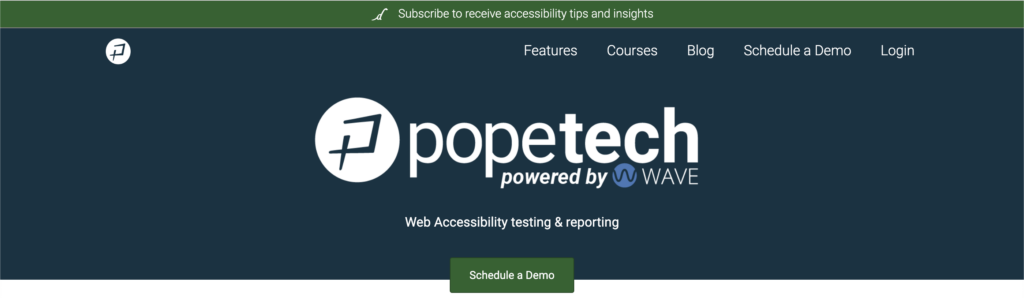
<h1>
<img src="https://pope.tech/assets/logo.png" alt="Pope Tech powered by WAVE">
</h1>5. Can I put other content in a heading tag?
Heading tags usually have text in them. But, they can have images, links, or other content. Accessibility-wise, this isn’t an issue as long as the accessibility requirements for that content type are still met.
For example, if it’s an image, the image should have an alt tag conveying the content. If it’s a link, it should follow link visibility requirements.
Remember, just because you can doesn’t always mean you should. If you’re including additional content like images and links in your headings, think through the reason and user experience.
6. Should I use a heading instead of a table caption?
A table caption helps users find, navigate to, and understand tables. They are also associated with the table, so whenever a screen reader focuses on the table, the table caption is announced. They aren’t required for tables to meet accessibility requirements. But, are usually helpful to give users needed information.
There are arguments for adding a heading tag (within the logical order of the page) directly above a table. The reason is that most screen reader users use headings to navigate a page. So, the table could be easily missed when it’s part of the content.
Using only a heading with a table
If it’s a table that’s critical to the content of the page, it might be worth using a heading instead of a table caption. That way the table is part of the structure of the page, and it’s more prominent for assistive technology and visual users.
Since the heading isn’t associated with the table like table captions are, the table content should start directly below the heading or be the only content under the heading.
Users could still find, navigate to, and understand the table, so just the heading can be sufficient when used correctly.
Using a heading and a table caption
If you opted to use a heading and a table caption, the text in the caption shouldn’t be the same as the heading. This is redundant for all users.
But, if the heading and caption were different and useful, you could use both.
Putting a heading inside of a caption
With HTML5, you technically can put a heading inside of a caption tag, but the support isn’t consistent across screen readers and browsers. This means the accessibility information related to the heading often won’t be exposed to users.
7. How many levels of headings should I use?
There are six HTML headings (h1-h6) you could use to organize content. In theory, a page could use each heading level. But, most pages only use h1-h3. More complex topics could use additional headings though. It isn’t an accessibility issue, but it could be a usability issue if:
- It negatively impacts scanning a page (whether visually or with a screen reader) because there are too many headings.
- The heading levels aren’t styled differently enough to be noticeable as a new section for visual users.
To help you know how many headings your page should use, outline your content first. Some questions to help you know when to make a new subheading are:
- Is this a new idea/topic within the heading level above it?
- Is there enough content (1-3 paragraphs) to support a new heading?
- Does my previous heading have too much content? Should it be broken up into subheadings?
- Should this idea/topic stand out in the content?
8. Can I style the same heading differently on different parts of the page?
The majority of the time, all h1s should look the same, all h2s should look the same, and so on. This helps visual users chunk and scan information. If there’s a specific reason to style the heading differently, it can be okay as long as you’re doing it differently consistently.
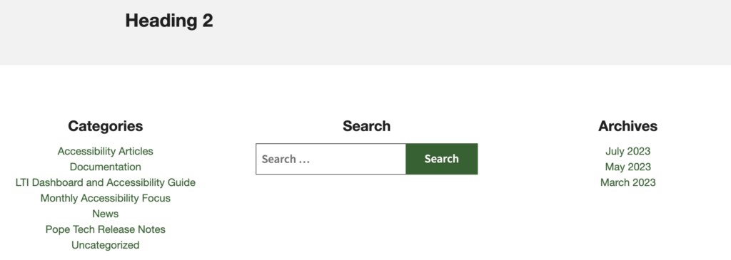
An example of this would be headings in the footer. In the screenshot below, the h2 in the main content is larger than the footer headings. In this instance, that makes sense because the footer headings aren’t the focus. But, we wanted the footer headings to be an h2 to avoid skipped headings and to make sure they were prominent when an assistive technology user navigates using headings. The footer headings will also be the same on each page with the footer, so they’ll be consistent.
Logical and consistent
When using headings outside of the typical guidelines, you should still always have a logical flow and be consistent.
If you do something differently, it should be done for a specific reason. It should also be done differently consistently on your website. For example, if you don’t start a page with an h1, that structure should be copied on other pages within that template.
Learn more about accessible headings: