Low-contrast text issues are the most common accessibility errors on the web according to the WebAIM Million.
Text, icons, and graphics with low contrast can be unreadable for users with contrast sensitivity due to low vision or color blindness.
Take the light gray publish date in the screenshot below. This low-contrast text is difficult for some to read and unreadable for others.

Even though low-contrast issues are the most common issue, they’re also one of the most straightforward issues to fix. The contrast requirements are clear and there are simple tools for designers and content writers to use.
In this article, you’ll learn about three color contrast tools you can use to find and fix contrast issues. Next, we’ll put these tools to use to fix four contrast issues from real websites.
- WebAIM’s contrast checkers and Colorzilla extension
- WebAIM’s WAVE extension
- Chrome Inspect’s contrast checker
- Fix 4 common low-contrast issues
Visit Color contrast accessibility requirements explained for an introduction to text and non-text contrast requirements.
WebAIM’s contrast checkers
WebAIM has two contrast checker tools:
- The first checks color contrast for normal text size, large text size, graphical objects, and user interface components.
- The second checks color contrast for links.
Both these tools work by entering the colors’ hex codes, and then the tool calculates the contrast ratio and whether it passes or fails.
The hex code is a 6-digit number each color has. To get the color from a webpage, you can the contrast checker tools, ColorZilla extension, or get it from your design software.
To use these tools, follow these steps or watch the video below:
- Open either WebAIM’s Color Contrast Checker or Link Contrast Checker depending on what you’re checking.
- Navigate to the page you want to pick the colors from.
- Adjust your windows so you can see both the Contrast Checker and the page you’re picking colors from.
- Select the color swatch then the color picker icon.
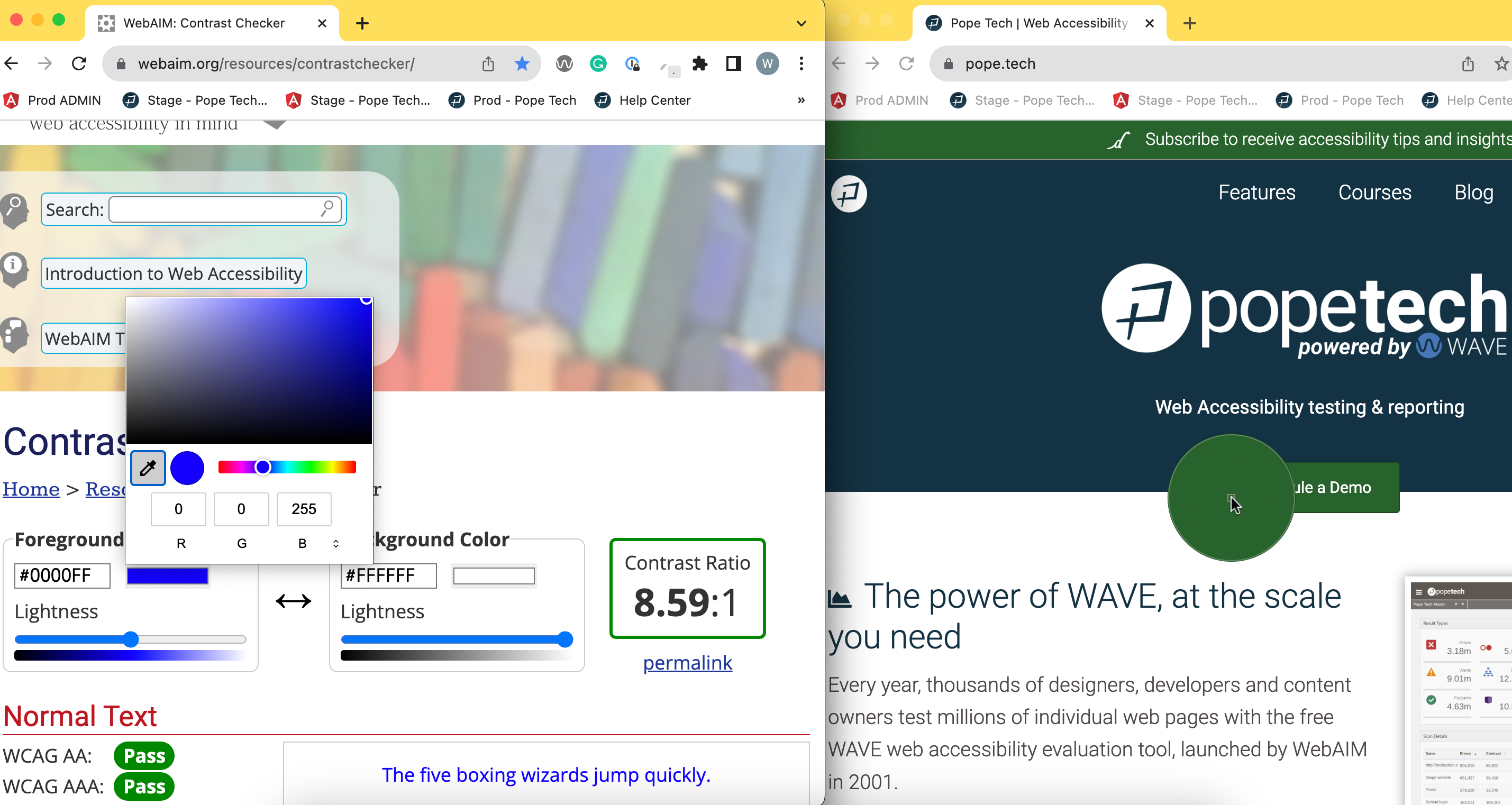
- Select the color you want to pick. Then repeat for the next color.
Now, you’ll see the contrast ratios and if your color combination passes or fails.
TIPS:
- If you don’t want to adjust your windows, you can use the ColorZilla extension. It’ll copy the color hex code. Then, you can paste it into the WebAIM contrast checker.
- Install WebAIM’s color contrast bookmarklet tool to access their color contrast tool on any page.
Watch the video below to learn how to use WebAIM’s contrast checkers and ColorZilla to find and fix contrast issues.
- WebAIM’s contrast checker and link contrast checker
- ColorZilla extension
WebAIM’s WAVE extension to check color contrast
WebAIM’s WAVE extension tests webpages for accessibility issues including low contrast text or CSS icons. It cannot test the contrast in image files or text with an image or gradient background.
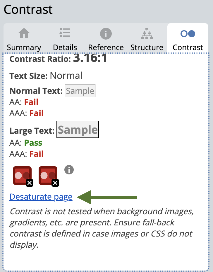
This tool also has a contrast tab where you can use a color picker to select any colors It then gives you their contrast ratio. Or, you can desaturate the page of all colors. Desaturating the page can help you decide if you’re relying only on color to convey any information.
To use this tool, follow these steps or watch the video below:
- Install the WebAIM WAVE extension.
- Navigate to the page you want to test or pick the colors from.
- Select the WAVE extension.

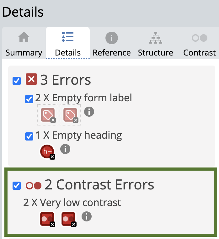
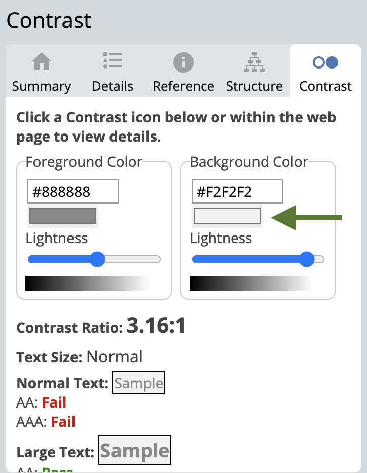
- Check the Details tab for any low-contrast errors. Click on the icon to see where the error is on the page.
- Select the Contrast tab.
- Select any of the low-contrast errors at the bottom to see the foreground and background color. Then, use the sliders to explore different options that would pass the ratio requirement.
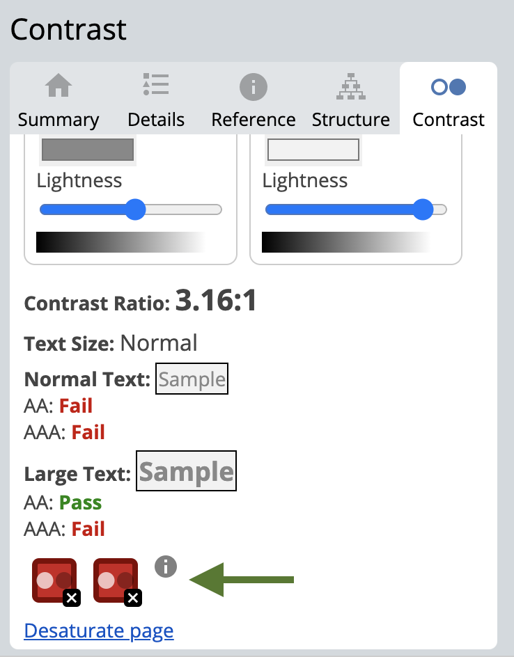
- To pick a color on the page, you can select the color swatch to use your browser’s color picker and pick a color from the page. Then, use the sliders to explore different options.
- Select Desaturate page to remove all the colors and see your page in grayscale.
Watch this video to learn how to use WebAIM’s WAVE extension to check contrast.
Chrome Inspect’s contrast checker
The last tool is Chrome’s Inspect. This tool tells you the contrast ratio between the text color and its background color.
To use Chrome Inspect, follow these steps or watch the video below:
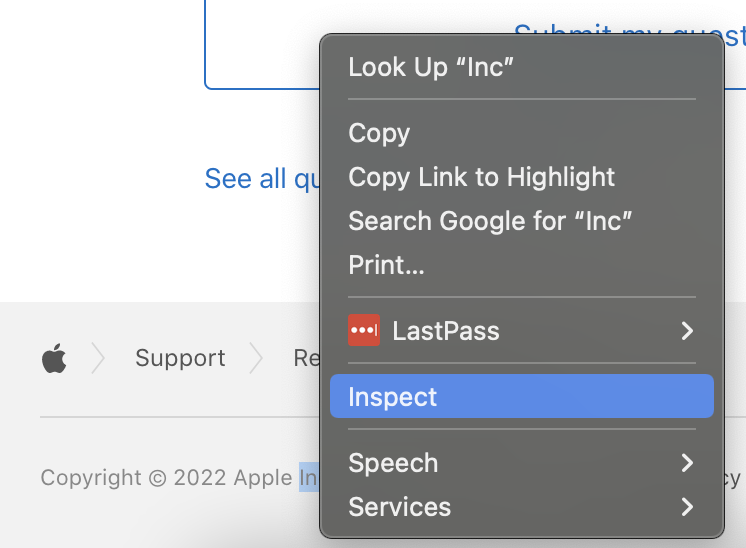
- Navigate to the text you want to check, right-click, and select Inspect. This will bring up the Elements Inspect tab, which has the HTML for the page.
- Make sure you have the text HTML element selected in the Elements tab.
- Either to the right or below the HTML is the CSS for the selected HTML element. Look through this until you find the CSS for the color of the text.
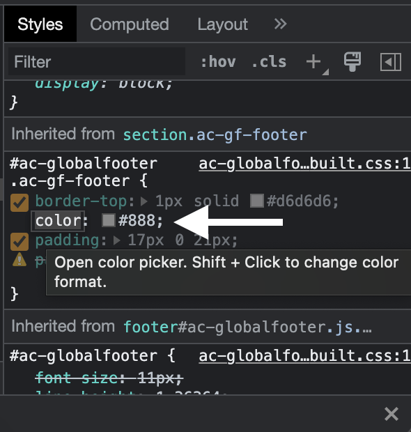
- Select the color swatch for the text color to see the contrast ratio.
- Select the dropdown arrow to see more information including if this contrast ratio passes WCAG Level AA and AAA. There are also lines in the color selector to show what colors would pass.
Watch the video below to learn how to use Chrome Inspect to check text color contrast.
How to fix 4 common low contrast issues using contrast tools
Now we’ll fix 4 common low-contrast issues from real websites using these contrast accessibility tools.
Low-contrast text in a website’s template
Whenever you’re fixing a low-contrast issue, the first step is deciding what type of element you’re working with. Then, you’ll know the contrast ratio requirement you’re aiming for.
For example, text has these requirements:
- Text smaller than 18 point or 14 point bold has a contrast ratio of at least 4.5:1 with the background color.
- Text 18 point or 14 point bold or larger has a contrast ratio of at least 3:1 with the background color.
Now that we know the requirements, let’s look at our text example.
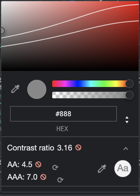
This government website has cards for its news articles. Each card has a publish date. The publish date text is light grey (#7C7C7C) text with a white background, and its contrast ratio is 4.17:1. Since it’s normal-sized text, it needs to be at least 4.5:1.
How to fix
To fix this, I first need to decide what the updated color will be. I’m going to use the Chrome Inspect tool to do this.
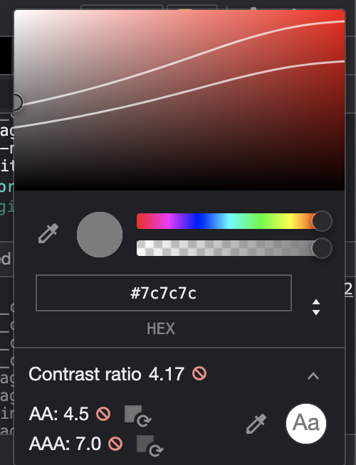
I’m going to use the color picker tool to select a new color that is at least 4.5:1 by selecting a color below the top line in the color picker. All the colors under the first line will meet the 4.5:1 requirement.
The updated color and contrast ratio are:
- Light grey text is now #6B6B6B
- The new contrast ratio is 5.36:1.
Now, I need to update the website with the new text color. Issues like text or link color are usually in a website’s template. A website’s template decides what a website looks like. For example, the text color, size, and font.
So, to fix this, the few lines of CSS code that determine the text color for the article publish date should be updated.
Low-contrast button in a website’s template
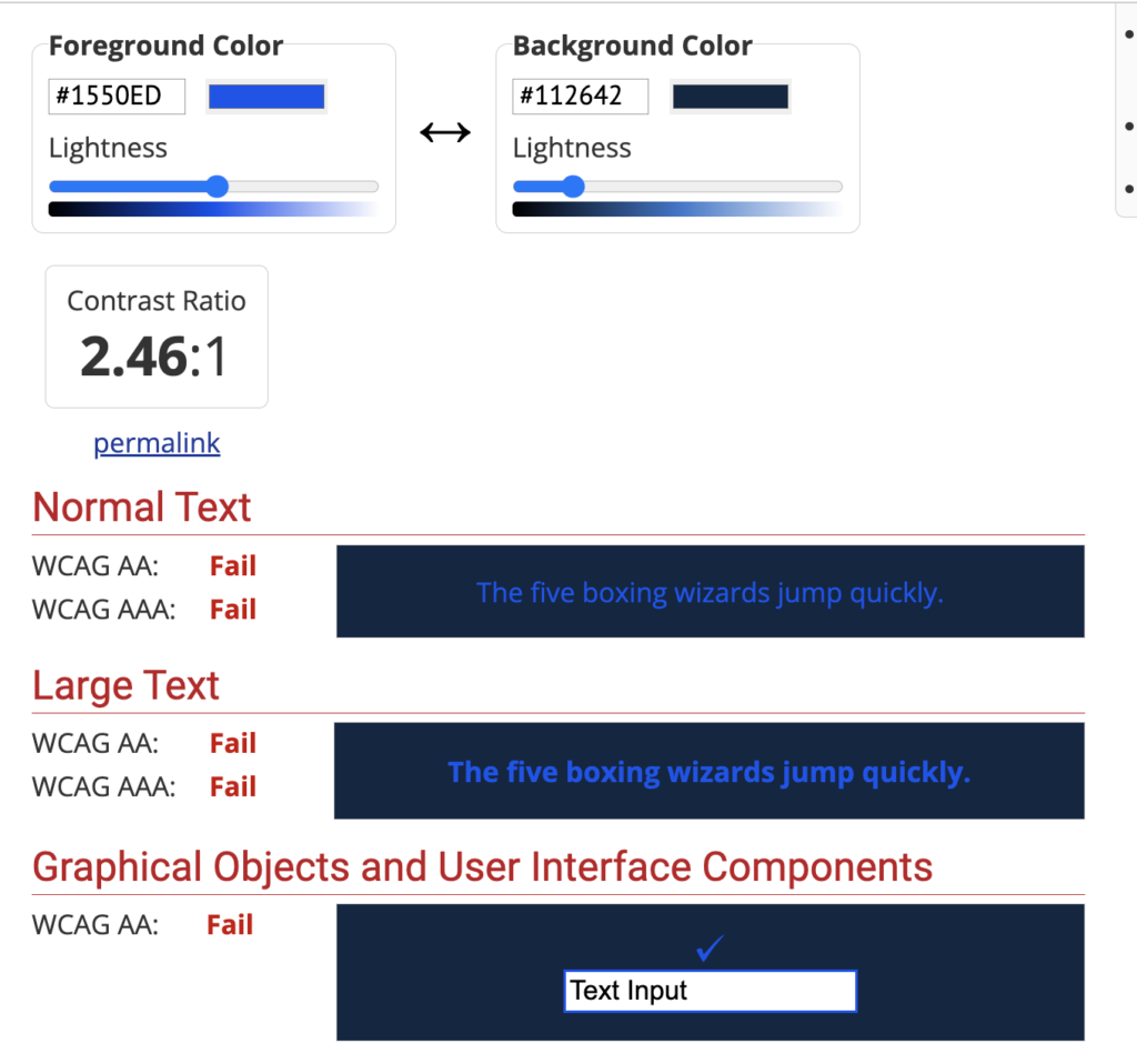
Next, let’s fix a low-contrast button on another government website. We’ll start by reviewing the contrast requirements for graphical objects. The contrast ratio requirement for graphical objects and user interface components is a contrast ratio of 3:1 with adjacent colors.
Now that we know the requirement, let’s look at our example. This is a blue button on a darker blue background. Here are the details:
- The blue button is #1550ED and the dark blue background is #112642.
- The contrast ratio between these two colors is 2.46:1, which is less than the required 3:1.

How to fix
To fix this, I’ll use WebAIM’s Color Contrast Checker to find a new button color option.
After adjusting the slider for the button color, the new color is a little lighter at #3365F0, and the new contrast ratio is 3.08:1.
Here is the button before the change and the button after the change.


Now that we have an updated color option, again, we need to adjust the CSS styling for this button in the code to really fix it.
Low-contrast, non-underlined links in a website’s template
Links that aren’t underlined have these contrast requirements:
- Link text color and body text color must have a contrast ratio of 3:1.
- Link text color and background color must have a contrast ratio of 4.5:1.
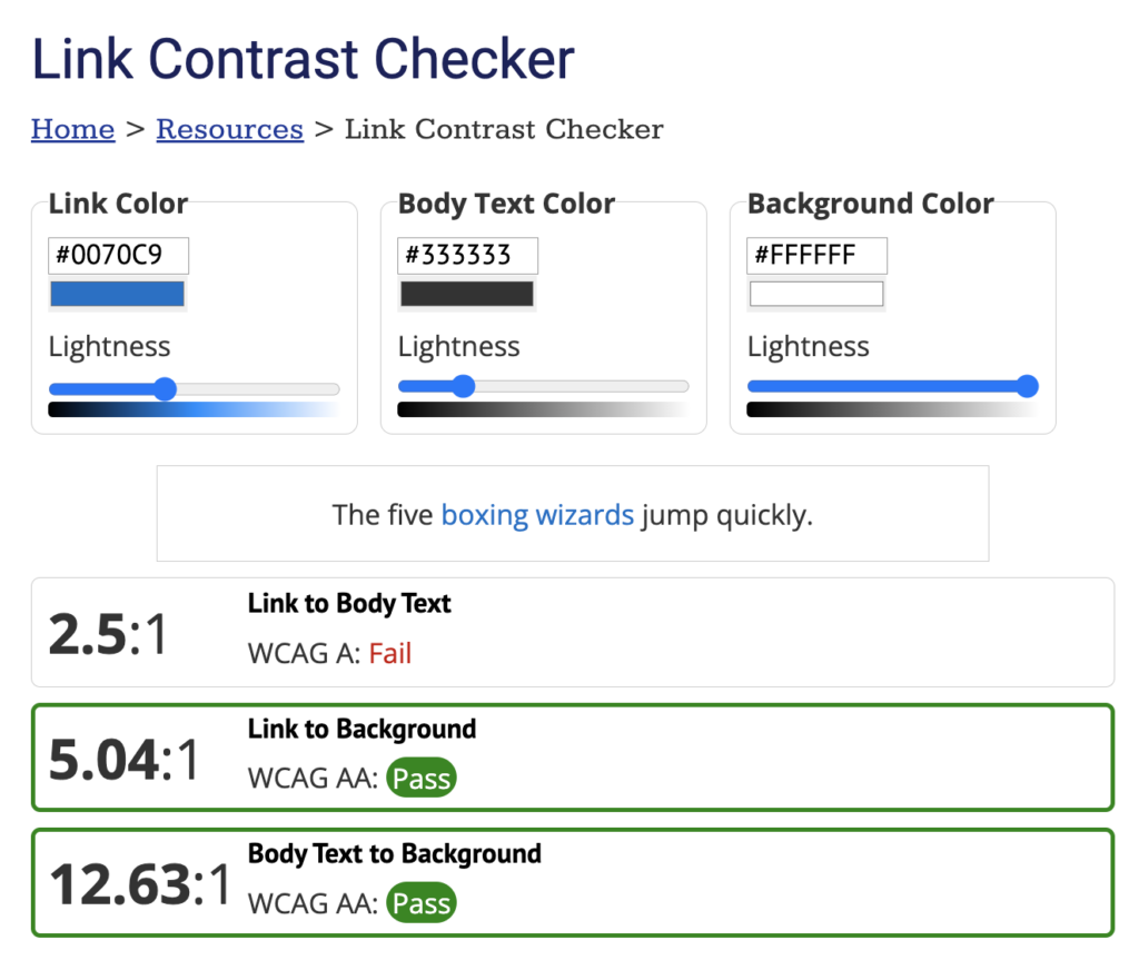
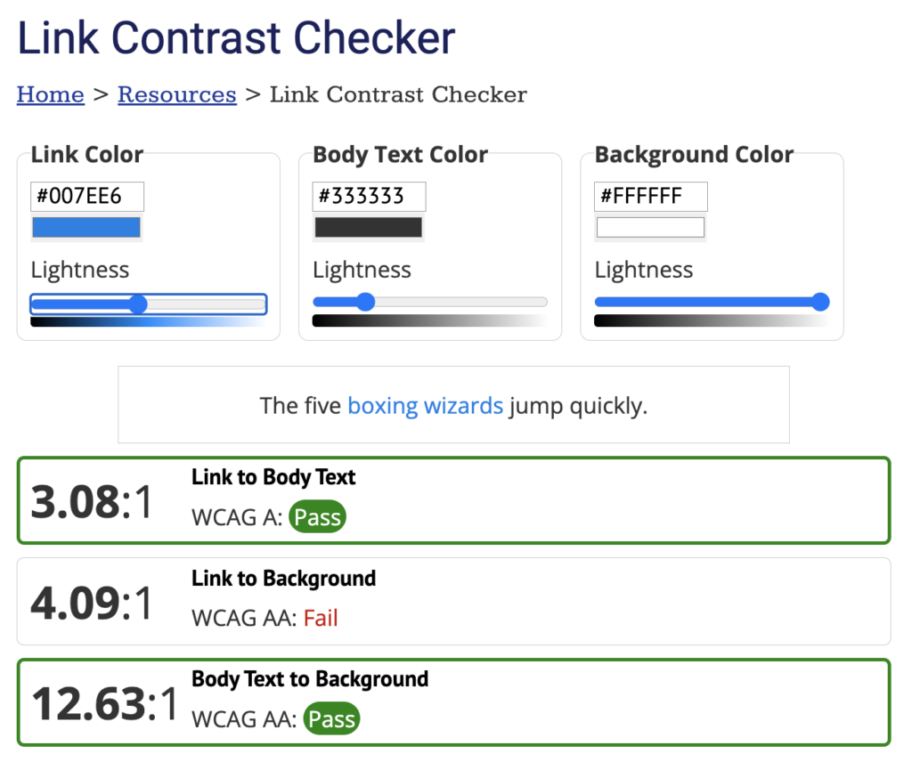
Now that we have the requirements in mind, let’s fix the link below using WebAIM’s Link Contrast Checker.

Here are the contrast ratios for the blue link:
- The blue (#0070C9) link and the dark-grey (#333333) text surrounding it has a contrast ratio of 2.5:1, which is lower than the required 3:1, so it fails.
- The blue link and the white background have a contrast ratio of 5.04:1, which is higher than the required 4.5:1, so it passes.
How to fix
One way to fix this is to decide to underline all links, which is what we’d suggest. Then, they don’t have any additional contrast ratio requirements.
If you want to keep the links not underlined, the colors need to be adjusted. You might think just the blue link color needs to be changed to meet the 3:1 requirement. But, if I use the Link Contrast Checker’s sliders to change the blue link color to a blue that meets the 3:1 requirement, then my link-to-background ratio becomes 4.09:1, which is lower than the required 4.5:1.
This means I would need to adjust both the link and body text colors. After playing around with sliders, here are the new colors and contrast ratios:
- The blue link would now be slightly darker (#0076D6).
- The dark grey text would also be slightly darker (#2B2B2B).
- The link-to-body text ratio is now 3:07:1.
- The link-to-background ratio is now 4.6:1.
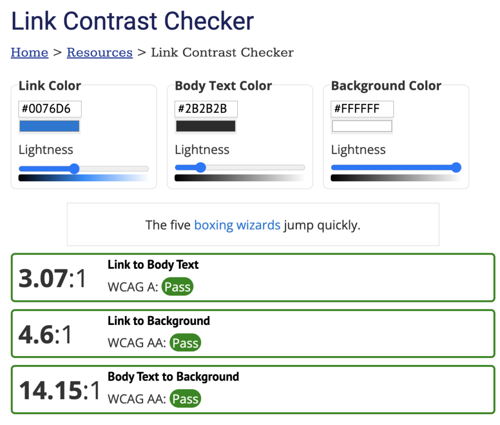
Now, we’ve found one accessible color combination option. But, the problem isn’t fixed yet.
To fix this, the few lines of CSS code that determine the text and link color or whether the link is underlined need to be updated.
Low contrast text on image
In this last issue, we are working with text. The contrast requirements for text, including text on images, are:
- Text smaller than 18 point or 14 point bold has a contrast ratio of at least 4.5:1 with the background color.
- Text 18 point or 14 point bold or larger has a contrast ratio of at least 3:1 with the background color.
Now, let’s review our example issue. This is a banner image from a university homepage. The text at the top is smaller than 18 point or 14 point bold, so it needs a contrast ratio of at least 4.5:1 with the background.

The overlay that gets darker as we go to the bottom of the image isn’t dark enough at the top making this text difficult to read.
When an image has a gradient or a background image with different colors like this one, we suggest:
- Testing the lightest parts to see if they are accessible.
- Test the lightest parts at different screen sizes, which means zooming in on your computer screen. Often text might be positioned in a way that works on desktop, but it fails mobile because of the way the text or images adjust on a mobile screen size.
I used the Colorzilla extension and WebAIM’s Color Contrast Checker to find the contrast ratios on a desktop screen. Here are three spots I tested for this banner image:
- The white text with the lighter green of the tree is 4.42:1.
- The white text with the brick building is 4.65:1.
- The white text with the white window is 2.44:1.
So, there are multiple parts of this background that when paired with the text don’t meet the 4.5:1 contrast requirement.
How to fix
There are a few different ways to fix this. You could:
- Adjust the overlay so it’s darker at the top.
- Move the smaller text down so its background is the darker overlay already there.
- Pick a different image.
Once you’ve adjusted it, check the contrast again using the lightest part of the background on both a desktop screen size and mobile screen size.
Visit November Accessibility Focus: Color Contrast for more articles and video resources.