
Quick summary
Contrast is the difference between two colors, and a contrast ratio is how that difference is measured.
Good contrast helps everyone see content better. But for some users, low contrast can mean not being able to see the text or graphics at all.
There are contrast ratio requirements for accessible text, non-text, and links that aren’t underlined. Once you know the contrast ratio requirements, it’s easy to design to these standards.

Rather watch the video? Check out our YouTube video Accessible color contrast requirements with examples.
Learn about color contrast tools that can help you find and fix issues, or visit November Accessibility Focus: Color Contrast for more articles and video resources.
What are contrast and contrast ratios?
The contrast of this text with the background behind it makes it so you can read it. The contrast of colors in a graph visually represents the data, so you can understand it better. In fact, the contrast between colors is a large part of how we perceive content.
Contrast is powerful for visual users, which is why there are specific accessibility guidelines regarding how we use color on the web. That way more users, especially users with low vision or color blindness, can read text, understand graphs and charts, and get the meaning color can bring to a design.
Contrast defined
Contrast is the difference between the perceived brightness of two colors. For example, if the background color is white and the foreground color is a light-grey, this would be a lower contrast.
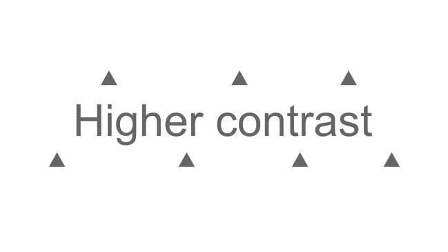
But, if the background color is white and the foreground color is a dark-grey, this would be a higher contrast, or difference, between the two colors.

Contrast ratio defined
The contrast ratio is how the difference between two colors is measured. The ratio can range from 1:1, which would be the same color for the foreground and background, to 21:1, which would be black and white for either the foreground or background.
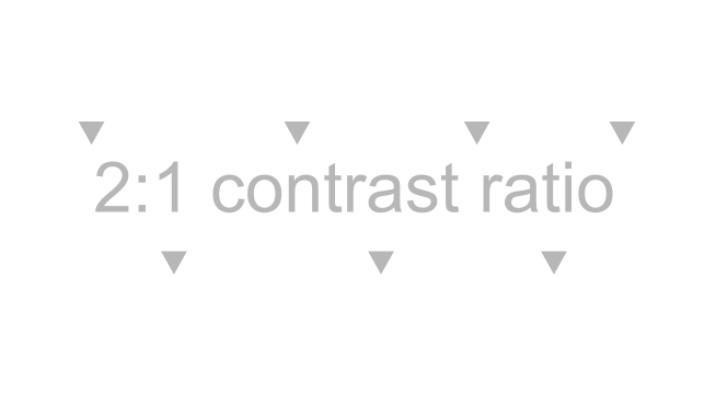
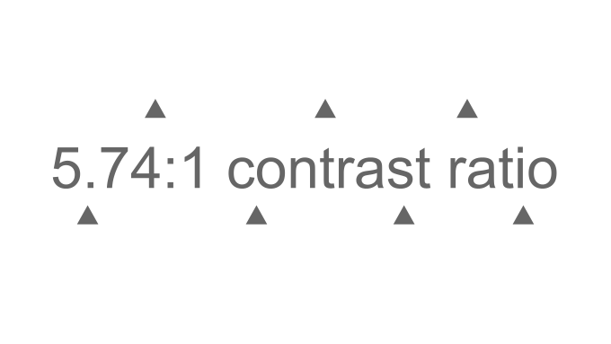
For example, the contrast ratio for the light grey foreground and white background below would be 2:1, and the contrast ratio for the dark grey foreground and white background would be 5.74:1.
Who’s affected by low contrast issues?
Just from the examples above, it’s clear that contrast matters for everyone. Good contrast makes it easier for everyone to read the text and distinguish graphical elements.
But, what might just be difficult to read for some users could be unreadable to a user with contrast sensitivity due to low vision or color blindness.
The numbers below helps build an estimate of the amount of people affected by contrast sensitivity:
- The National Eye Institute estimates that 1 in 12 men have some type of color blindness, which means there are at least 300 million people on earth who are color blind.
- The International Agency for the Prevention of Blindness estimates 295 million people with moderate to severe vision impairment (or low vision).
This means millions of people can face a barrier by a seemingly simple design choice.
Check out W3C’s short description of how Lee, an online shopper with color blindness, is affected by color issues, or watch W3C’s perspective video to learn how good contrast helps contrast-sensitive users:
Text color contrast requirements
Unfortunately, the WebAIM million found low-contrast text on 83.9% of the million tested homepages. Low-contrast text is the most common issue on websites.
To avoid this issue on your website, follow these text color contrast requirements:
- Text smaller than 18 point or 14 point bold has a contrast ratio of at least 4.5:1 with the background color.
- Text 18 point or 14 point bold or larger has a contrast ratio of at least 3:1 with the background color.
- This includes text on images used to navigate or understand the content.
- Logos or brand-name text has no contrast requirement.
Text contrast example
Here’s two examples of these requirements in action.
The text you’re reading right now is 15 pt, so it needs a contrast ratio of at least 4.5:1. The contrast ratio this text has with its background is 14.72:1, so it meets the requirements.
Now the text is 14 point and bolded. This text only needs a contrast ratio of at least 3:1 with the background. Again, the contrast ratio is still 14.72:1, so it meets the requirements.
Non-text color contrast requirements
These requirements are for non-text, which means anything that’s a visual presentation.
A visual presentation can be:
- User interface components. These include buttons, icons, and focus indicator outlines. Really, anything used to navigate a website or application.
- Graphical objects. These include parts of graphics required to understand the content. For example, infographics, charts, or graphs.
The requirement for non-text is there needs to be a contrast ratio of 3:1 against adjacent colors. This makes sense because if we want all visual users to be able to distinguish between the colors of graphics, there needs to be a high enough contrast between the colors.
Non-text contrast example 1
Here are three grey social media icons against a light grey background. There are a couple contrast ratios as play here.
- First, there’s the contrast ratio between the icon and the dark grey circle.
- Second, there’s the contrast ratio between the dark grey circle and the light grey background color.

Each of these needs a 3:1 contrast ratio because this is a user interface component and those are the adjacent colors.
The color contrast ratio for both the icon and dark grey circle and the dark grey circle and light grey background is 6.38:1, so both meet the requirement.
Let’s keep going with this same example. Here are the same social media icons, but now one has a dark blue circle because that’s the hover color. This blue circle and the light grey icon and background also need at least a 3:1 contrast ratio.
The color contrast ratio is now 12.76:1 for both, so again, it meets the requirement.

Non-text contrast example 2
Let’s look at one other use case – a pie chart. This pie chart is a visualization of how many points each team made and is an example of poor contrast. Let’s break it down to understand why this pie chart doesn’t meet contrast ratio requirements.
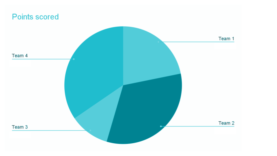
First, let’s go back to our contrast requirements for text. The light blue text of the “Points scored” title only has a contrast ratio of 2.03:1. It needs a contrast ratio of at least 4.5:1 to be accessible.
Now, let’s focus on the pie chart itself. There are four pieces of the pie chart and each one is a different color of blue.
The highest contrast ratio between two of the pie pieces is between team 3 and team 2, and it’s only 2:1. Each piece of the pie needs a contrast ratio of 3:1 with the colors next to it. That way, users with contrast sensitivity can distinguish between the different pie pieces.
Use of color to convey information
Use of color is an accessibility requirements that states:
Color is not used as the only visual means of conveying information, indicating an action, prompting a response, or distinguishing a visual element.
This requirement has other implications on how color is used, but we’re going to focus on two ways it applies to color contrast.
To start, let’s go back to our pie chart example. This chart currently only uses color to tell users how many points each team scored – it doesn’t have any alternative way of getting the information like a value label with each team’s percentage of points scored.
This affects the contrast requirement because without the value label, color is the only way to get the information. Since it’s the only way, it needs to meet the 3:1 contrast requirement for graphical objects.
Links that aren’t underlined contrast requirements
The Use of Color requirement also affects the contrast of links that are NOT underlined.
For example, this screenshot is from a company’s support website. There’s a blue link that is not underlined. This blue link is only using color to convey that this is a link.

Links without an underline must meet all of these requirements:
- They must have a contrast ratio of 3:1 with the color of the surrounding body text.
- They still have to have a ratio of 4.5:1 with the background color.
- They have to have an underline or other visual cue when a user hovers over the link.
To avoid this altogether, we suggest underlining your links. Underlined links (like the links in this article) don’t have additional contrast requirements.
Links that aren’t underlined contrast example
Now, let’s look at an example of how this would affect the color of a non-underlined link.
Let’s apply this to the blue link from the support website.
The blue link and the dark-grey body text have a contrast ratio of 2.5:1. This means it doesn’t meet the requirement to have a 3:1 contrast ratio with the surrounding body text’s color.
The blue link and the white background have a contrast ratio of 5.04:1, so it does meet the requirement of a 4.5:1 contrast ratio with the background color.
Lastly, the link is underlined on hover, so it meets that requirement too.

This non-underlined link wouldn’t meet accessibility guidelines because it didn’t have enough contrast between the link text color and the surrounding body text color.
Key takeaways
- Contrast is the difference between two colors. The contrast ratio is how that difference is measured.
- Text smaller than 18 point or 14 point bold needs a contrast ratio of at least 4.5:1 with the background color.
- Text 18 point or 14 point bold or larger needs a contrast ratio of at least 3:1 with the background color.
- Graphical objects and user interface components need a contrast ratio of 3:1 with adjacent colors.
- Non-underlined links must have a 3:1 contrast ratio with the body text and still have 4.5:1 contrast ratio with the background color.
Fix current contrast issues and design with contrast in mind going forward
Here’s a plan to fix current contrast issues and strategies to design with contrast accessibility requirements going forward.
Fix current contrast errors
You’ll focus on the ![]() Very Low Contrast error.
Very Low Contrast error.
Follow these steps to find and fix low contrast errors on your own website:
- Use the Pope Tech Platform, Canvas Accessibility Guide, or free WAVE extension tool to find Very Low Contrast errors.
- If you’re a Pope Tech user, run an HTML or PDF detail report and configure it for only low contrast results.
- If you’re a Canvas Accessibility Guide user, test your syllabus, home page, and other pages for one course.
- WAVE extension tool – Test the homepage and four other pages you contribute to.
- Review the contrast errors and determine if any could be fixed at the website template level. For example, fixing the color of the body text could fix that issue on every page.
- Review the design of your website and look for design elements that should be checked. For example, does your website use a banner image with text? Do you use a lot of gradients with text? Do you have charts or graphs that should be checked?
- Now that you have an idea of the contrast issues, prioritize the template-level issues first. Then, fix other issues you found based on the content’s priority.
- Make an achievable goal and share that goal with your team or office.
- BONUS: If you don’t have one already, schedule a monthly accessibility check-in (even if it’s just you) to celebrate progress and remove blockers.
Design with contrast in mind going forward
To really design to contrast accessibility requirements, they need to be built into your design system. When your organization’s color palette and font guidelines start with accessibility, you just think about it once and everyone can properly use colors and fonts based on those guidelines.
If you’re starting your design system from scratch, think about contrast accessibility requirements as you design the color palette. If you’re examining a current design system, still start with the color palette and find the issues. You can build suggested changes and guidelines from there.
Here are some other questions to consider:
- Do you use project management software? Consider adding “check design for contrast accessibility requirements” to all design tasks.
- Do all designers and developers know contrast accessibility requirements and the tools to check contrast ratios?
- Can you templatize certain graphics to reduce contrast errors? For example, a template for banner images with text or graphics.
By following these steps, you’re on your way to more accessible content.
Learn about color contrast tools that can help you find and fix issues, or visit November Accessibility Focus: Color Contrast for more articles and video resources.