Quick summary
Links are an important part of how keyboard users navigate a web page. Some best practices include underlining links that are in the page’s content and opening links in the same tab.
Some link accessibility issues include suspicious link text, empty links, broken same-page links, and redundant links. Each of these can cause confusion for users who rely on a keyboard to navigate.
In this article, you’ll learn about:
Rather watch the video? Check out our YouTube Links and Text Playlist.
Visit January Accessibility Focus: Links and Text for more articles and video resources.
How do links help accessibility?
Links are how a keyboard user navigates a web page. When a keyboard user presses the tab key, they go from link to link down the page. You could try this right now by pressing the tab key. Press shift+tab to go back up the page.
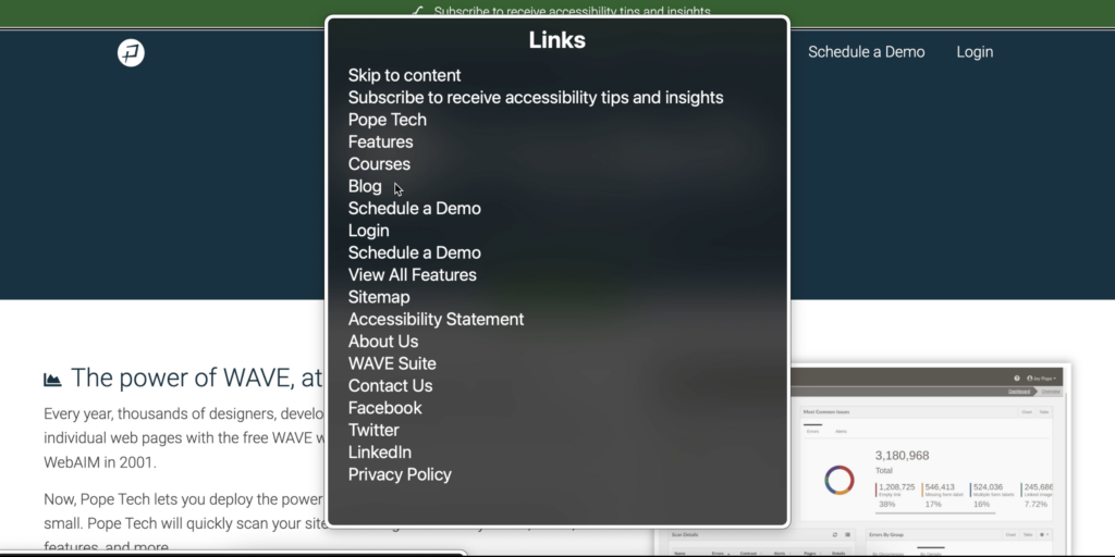
Assistive technology users can also use links to review a web page’s content. For example, a screen reader user might listen to a list of links before deciding where they want to go on the page. This screenshot shows a Mac VoiceOver screen reader’s link list for the Pope Tech homepage.
Accessible links are important because they help all types of users navigate a web page.
Link best practices
Let’s review link best practices that help make websites more readable for everyone, and more accessible for people with visual, physical, or cognitive disabilities.
Underline links in the body text
When there are links in the content, it needs to be clear to visual users that it’s a link and not more body text.
The best way to signify text is a link is to underline it. This quickly communicates that it’s a link.
But, it’s common for websites to stray from this standard and only use colored text for links. This can be okay if the link follows contrast accessibility and use of color accessibility guidelines for links that aren’t underlined.
Links should typically open in the same tab
People often choose to have external links open in a new tab so their users stay on their website. But, this isn’t the best user experience.
When a link is set to open in the same tab, any user can choose to open it in a new tab by right-clicking or selecting it while holding control/command. But, if the link is set to open in a new tab, that choice is taken away – the link has to open in a new tab.
The best practice is, most of the time, it’s better to have links open in the same tab.
To learn more about when links should open in the same tab vs a new tab, read How to make external links accessible.
How to fix 4 common link accessibility issues
Now, let’s get into the common link accessibility issues.
These are 4 common link issues that are detectable by an accessibility checking tool like the WAVE extension or Pope Tech. We’ll go over each and how to fix them.
Suspicious link text
![]() Suspicious link text means it isn’t clear where the link goes based on the linked text.
Suspicious link text means it isn’t clear where the link goes based on the linked text.
“Click here” is an example of suspicious link text. This is a problem because, as we mentioned above, some users use links to navigate a page or review the content of the page.
If none of the links have actual content in them, a user using a screen reader would just hear, “click here” or “read this,” which doesn’t help them know where the link goes or where they are on the page.
To fix suspicious link text, rewrite the linked text, and maybe the entire sentence if needed. Here are two examples of re-written suspicious link text.
Example 1
FROM: “Click here for more information on ambiguous links”
TO: “For more information on ambiguous links, visit Why ambiguous links are problematic“
Example 2
FROM: “Avoid ambiguous language when writing links. Learn how here: https://blog.pope.tech/2018/07/26/why-ambiguous-links-are-problematic/”
TO: “Avoid ambiguous language when writing links.”

For more information on suspicious link text, watch our video Write more accessible link text.
Empty link
![]() Empty links have no text in them, which makes it difficult to understand the purpose of the link.
Empty links have no text in them, which makes it difficult to understand the purpose of the link.
Keyboard users rely on focus indicators to know where they are on the page. A focus indicator outlines an element when it’s tabbed to. If a user is using a keyboard to navigate, they’ll lose focus when they get to an empty link.
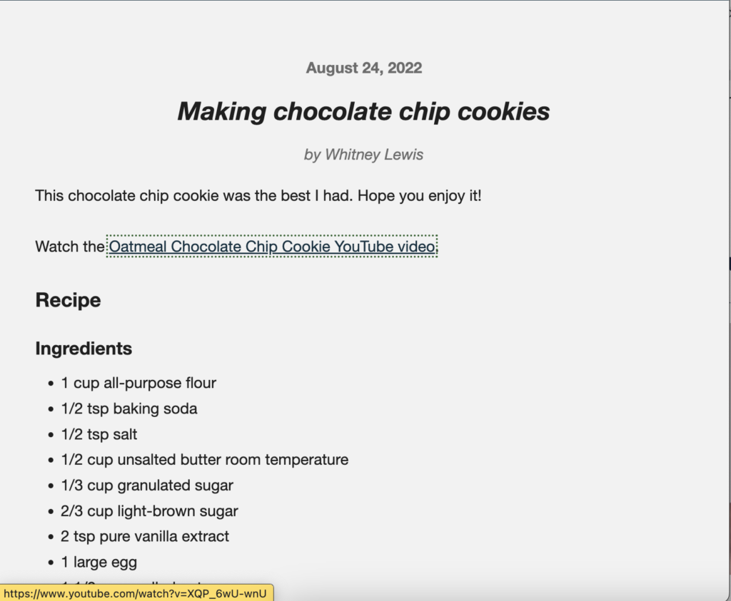
For example, in the first screenshot below, I’ve tabbed to an empty link. There is no element in focus. In the second screenshot, the Oatmeal Chocolate Chip Cookie YouTube video link is in focus, so there is a dashed square, or focus indicator, around it.
Since empty links don’t have a focus indicator, keyboard users can lose where they are on the page when navigating, which is confusing.
Fixing an empty link is easy – either add text to the link or remove it.
Broken same-page link
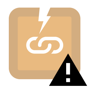 Broken same-page link, or anchor links, link to another part on the same page. For example, the links at the top of this article jump readers to that section on the same page.
These can be helpful for keyboard users because they can jump down a long page using the same-page link instead of tabbing all the way down.
Obviously, a broken same-page link can be an issue for everybody and won’t add a helpful feature for keyboard users either. To fix it is probably what you’d expect – either remove it or fix the link so it works properly.
Redundant link
![]() Redundant links are when two adjacent links go to the same place.
Redundant links are when two adjacent links go to the same place.
These redundant links are an issue because they add more keyboard stops for a keyboard user. For a screen reader user, redundant links also clutter their link list. Each link is also announced as they tab through the page, so they would hear it multiple times. All of this can add more cognitive overhead for the user.
To fix a redundant link, one of the links can be removed or they can be combined. That way, each link is adding value without adding more cognitive load.
Redundant links often happen on product or article pages when an image and text link to the same place. Take this example product listing for Fresca soda. The image and the product title link are two links that go to the same place.
In the code, there are two <a href> elements – one for the image and one for the text. If you press the tab right now, you’ll go to both the image and the product title. This is a redundant link that needs to be fixed.

<a href="https://www.fresca.com><img src="https://blog.pope.tech/wp-content/uploads/2022/12/black-cherry-hero_desktop-150x150.jpg" alt="Fresca Black Cherry Citrus" ></a>
<p><a href="https://www.fresca.com">Fresca – Black Cherry Citrus</a></p>
To fix it, I combined the image and product text into one link. Now the image and text are surrounded by the same <a href> element.
<a href="https://www.fresca.com">
<img src="https://blog.pope.tech/wp-content/uploads/2022/12/black-cherry-hero_desktop-150x150.jpg" alt="" >
<p>Fresca - Black Cherry Citrus</p>
</a>
Now, it just takes one tab, and the link will only be read once fixing the redundant link. And, we’re able to remove the alt text on the image because the product title now acts as the alternative text.
For more information on redundant links, watch our video Why redundant links can be an accessibility issue and how to fix them.
A note on links vs buttons
Now that you know more about accessible links, there’s one other thing to keep in mind – links and buttons aren’t the same.
The main difference is links go somewhere and a button does something. This difference between links and buttons means:
- If it is supposed to take the user to another website, use an anchor (
a href) HTML element to make it a link. - If it is changing data on the back end or how the front-end looks, use a
<button>HTML element to make it a button.
For more information, read Buttons vs. Links.
Key takeaways
- People with disabilities use links to navigate web pages.
- Avoid suspicious link text like “click here” by rewriting the link to be where it actually goes. For example:
- “Click here for more information on ambiguous links” TO “For more information on ambiguous links, visit Why ambiguous links are problematic“
- Links should typically open in the same tab.
- Underline links in body text. If using only color to convey it’s a link, follow contrast accessibility and use of color accessibility guidelines.
- Avoid redundant links that go to the same place by combining links. This often happens on product or article pages when an image and text link to the same place.
- A link goes somewhere, and a button does something. Use an anchor HTML element to make it a link, and use a button HTML element to make it a button.
- An easy way to prevent detectable link issues (plus other accessibility issues) is to use the WAVE extension to check for issues during your publishing process.
Make links accessible in your own content
You know more about link accessibility best practices and detectable accessibility issues, so you’re ready to apply it to your own website.
Below is a plan to fix current link issues and strategies to write with link best practices going forward.
Fix current link issues
These are the accessibility errors and alerts you’ll focus on:
 Redundant link
 Underlined text
 Suspicious link text
Follow these steps to fix existing link issues:
- Use the Pope Tech Platform or the free WAVE extension tool to find the issues listed above.
- Pope Tech Platform – From your Dashboard, drill down to the heading issues.
- WAVE extension tool (free) – Test four pages on a website or course you contribute to.
- Canvas Accessibility Guide – Test the syllabus, home page, and other pages for one course.
- Look over the homepage and the three other pages for links that open in a new tab. Is it clear links open in a new tab or should they open in the same tab?
- Now that you have an idea of the link issues, prioritize the template-level issues first. Then, fix other issues you found based on the content’s priority.
- Make an achievable goal and share that goal with your team or office.
- BONUS: If you don’t have one already, schedule a monthly accessibility check-in (even if it’s just you) to celebrate progress and remove blockers.
Prevent link and text issues going forward
An easy way to prevent detectable link issues (plus other accessibility issues) is to use the WAVE extension to check for issues during your publishing process. Learn what issues to check for as a content writer or developer in our Use the Wave Extension article.
Visit January Accessibility Focus: Links and Text for more articles and video resources.