You want your Google Form to be accessible, so all of your users can fill it out. So, what choices can you make to get there?
In this article, we cover those small choices you can make:
- General considerations for accessible Google Forms
- Accessible date question type
- Accessible images and media
- Color contrast in text and images
- Text accessibility
- Considerations for embedding
Related resources:
General considerations for accessible Google Forms
Enable autosave
Autosave automatically saves people’s progress, so if someone takes longer to fill out your form, or needs to come back to it later, they won’t lose their answers.
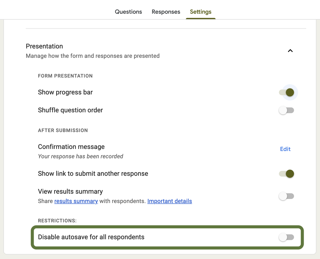
Good news: autosave is turned on by default. Double-check it under Settings > Presentation, and make sure Disable autosave for all respondents is switched off.
Offer an alternative completion method
People with disabilities have a wide range of accessibility needs. Offering an alternative way to complete the form covers any unforeseen issues.
You can do this by adding a note to the form description with a phone number or email address people can contact instead.
Accessible date fields
The issue explained
Date pickers are notorious for being hard for assistive technology to navigate. Accessibility expert Adrian Roselli put it plainly in his article, Maybe You Don’t Need a Date Picker: nearly every date picker implementation creates a barrier for some group of users. He’s yet to find one that doesn’t.
Google Forms’ date question uses the browser’s native input type="date", so its accessibility depends on the combination of browser, operating system, and assistive technology someone is using, not on Google Forms itself. The native picker’s accessibility is generally improving, but since the improvements are recent, it’s hard to know which combinations of tools will work well.
In our own testing, the date picker worked for one user and not for another. Both were using Mac’s Voice Control in Safari, but one was on an older OS version and had to do a major operating system upgrade to get the same functionality.
Since results are still inconsistent, a text or single-select question is a more accessible choice.
This video demos Mac’s Voice Control in the older OS version attempting to navigate the date picker pop-up using the grid feature, and not being able to enter text with voice commands.
Use a text or single-select question for dates
Instead of a date picer, use a single-select field or a text field. Both work with more types of assistive technology than the date picker does.
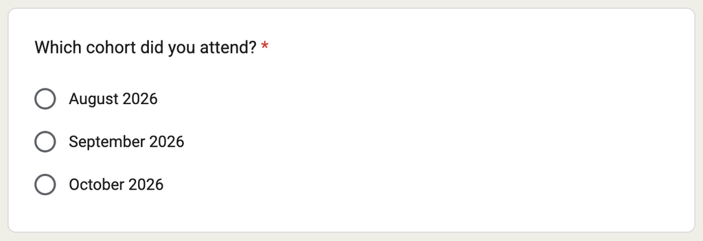
A single-select field works well when you already know the possible dates. For example, a feedback survey for student cohorts might ask which month their cohort started, with each month listed as an option.
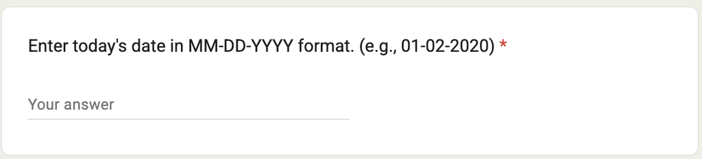
A text field lets people enter the date manually. Since people may enter dates in different formats, add instructions in the question, like “Enter today’s date in MM-DD-YYYY format (for example, 01-02-2020 for January 2, 2020).”
Accessible images and media
Use the caption for alternative text
Images need alternative text, a description of the image, so non-visual users get the content the image conveys. Google Forms doesn’t have a dedicated alt text field, but the Caption field works the same way. Add your alt text there.
To add a caption, select the Options icon on the image, then Caption.
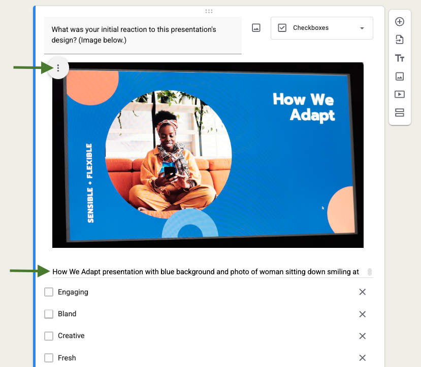
For tips on writing alternative text, check out alternative text in the wild: 5 alternative text examples.
Let the user know when there’s an important image
If someone needs to reference an image, mention it directly in the question. Screen reader users navigating from question to question can miss images entirely since they aren’t announced in the question text. A quick reference in the question tells them there’s more content to find.
Make sure images with text or content are available to everyone
If your image contains text or other important information, include that content in the question or in the caption’s alt text. Assistive technology like screen readers and braille output devices can interact with HTML content but can’t determine what content is in an image.
For example, if responders need to refer to a volunteer schedule before selecting a shift, link to an HTML version of the schedule instead of uploading a screenshot of it.
Let the user know about videos, or link to them
When you add a video to Google Forms, the text above it doesn’t become a heading in the form’s HTML, but question text in every question block does.
Like images in question descriptions, this makes it easy to miss a video, especially since most screen reader users navigate by heading.
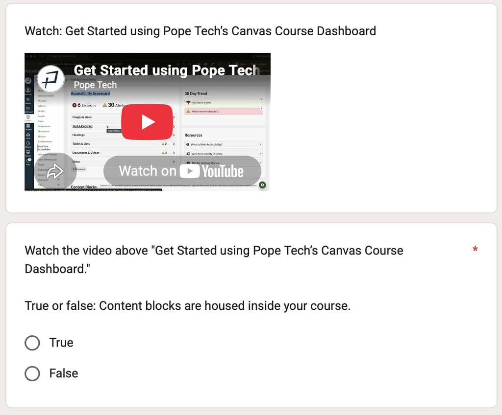
To make sure responders get everything they need, reference the video in your question, or link to it instead of embedding it with Google Forms’ video option. The examples below show both approaches.
In the first example, a video block sits above the question. The question prompts people to watch the video above it, so non-visual users still get a cue that video content exists.
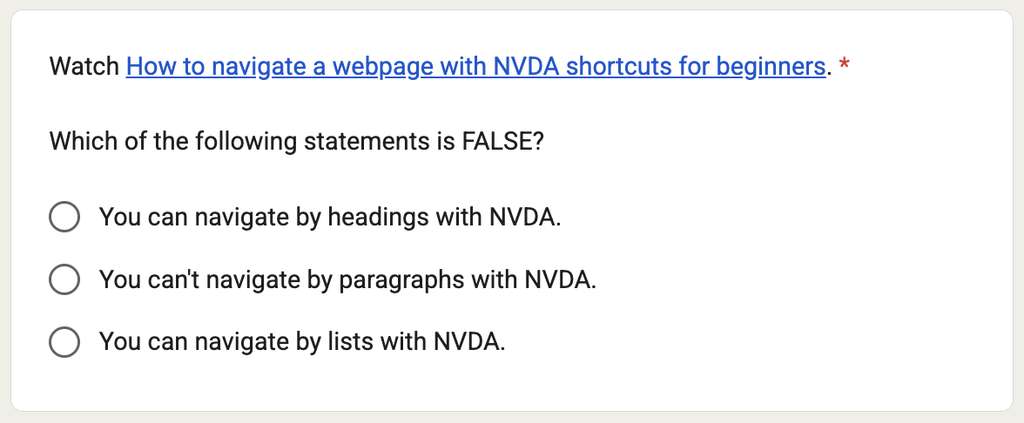
In the second example, the question includes a hyperlink to the video instead, another way to make sure everyone catches the content.
For more on accessible videos, see video and audio accessibility.
Color contrast in text and images
Color contrast is the difference between two colors. Your font color and background need enough contrast between them for everyone to read comfortably. This applies to text in your form questions and in images. It also applies to colors in charts and graphs.
The standard to aim for:
- Normal-size text needs at least a 4.5:1 contrast ratio against its background.
- Large text (18pt and up, or 14pt bold) and colors used in graphics that convey information (like graphs and charts) need at least 3:1.
For example, a medium gray (#767676) on a white background is about 4.5:1, the minimum for normal text. But a lighter gray like #999999 on white is about 2.85:1, which fails. The text below uses these colors as an example.
Medium Gray (#767676)
Lighter Gray (#999999)
If your theme uses light colors, it’s worth checking before you publish. Use a tool like WebAIM’s color contrast checker on any text color you change or images. Plug in your font or foreground color and background color, and it tells you the exact ratio and whether it passes.
For more, see color contrast accessibility requirements explained and two tools for testing use of color (videos).
Text accessibility
Use 12pt font or larger
Google Forms lets you set text as small as 9pt, but use 12pt or larger for all text in your form. Anything smaller can be hard to read for people with visual impairments, and it gets worse on a small screen. 9pt text on a phone is close to unreadable for most people, not just those with low vision.
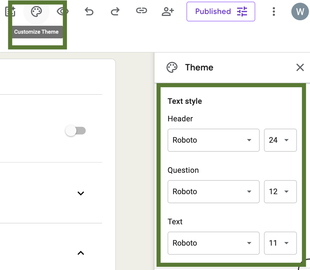
To check your form, select the Customize Theme paint swatch icon at the top. This opens the Theme settings drawer where you can select the font and size for headers, questions, and text. Set each to 12pt or larger, and preview the form on a phone screen before you publish.
For details, check out our beginner’s guide to accessible text.
Write meaningful links
Use descriptive link text that tells people where the link goes. Avoid vague text like “click here” or a raw URL.
For example, this question text gives no context beyond “video” for the example link. We don’t know where it goes or what it’s about.
Watch this video. Which of the following statements are FALSE?
This example uses descriptive link text instead, naming the video’s title and where it’s hosted. We included where it’s hosted since the link doesn’t just go to another webpage. It’s good to let your user know if the link opens a file (PDF, PowerPoint, Word Doc, etc.) or video since these can start a download, open in a document viewer, or automatically start playing.
Watch How to navigate a webpage with NVDA shortcuts for beginners (YouTube). Which of the following statements are FALSE?
For more, see “Click here” to “read more”: why ambiguous links are problematic.
Considerations for embedding
This section is for you if you’re embedding a Google Form on a website or in a learning module. If you’re only sharing a form link, you can skip ahead to the takeaways.
When embedding a Google Form as an iframe, keep these accessibility considerations in mind:
Add a unique title attribute
Adding a title to your iframe lets screen readers announce its purpose. A unique title, set with the title attribute, helps screen reader users identify and find the iframe on the page.
In the code example below, the iframe’s title attribute is “Event feedback form.” When a responder navigates into the iframe, their screen reader announces that title, telling them what the form is about right away.
<iframe title="Event feedback form" src="https://docs.google.com/forms/d/e/1FAIpQLSdjIg0WctD-oNPQC9NmVGyUcmRwBV0YD_Mhfaw/viewform?usp=sharing"></iframe>The video below demos a screen reader navigating into an embedded Google Form, with and without a title attribute:
Prevent double scrollbars
Nested scrollbars, one for the iframe and one for the page, make the page harder to navigate for everyone, especially keyboard users, screen magnifier users, and anyone using alternative input like switch access.
To get rid of horizontal and vertical scrollbars on your iframe, give it a width of 100% and a fixed height tall enough to show the entire form without scrolling. That way, there’s only ever one scrollbar on the page. You’ll want to test the form on mobile to see if it needs slight adjustments for mobile.
In the iframe code below, you’d set the height to be tall enough on desktop and mobile, and the width is 100%.
<iframe src="YOUR_FORM_EMBED_URL" frameborder="0" marginheight="0" marginwidth="0" height"SET TALL ENOUGH TO FIT FORM" width="100%">Loading…</iframe>There are two embedded forms below. The first has a height that’s too short, resulting in a vertical scrollbar on the iframe embed.
The second form has a width of 100% and a height of 950, which is long enough for the full form to show on desktop and mobile.
Test keyboard navigation
Test that keyboard users can get into the iframe and use the form. Since webpages and browsers can behave differently, testing it yourself is the most reliable way to confirm it works as expected. Start by pressing Tab to check whether it moves you through the embedded form.
Takeaways
Start here: add captions to any important images and swap your date picker for a text or single-select question. Those two changes fix a common issue and a real barrier for some users.
From there, work through the rest of the checklist:
- Keep autosave enabled and offer an alternative way to complete the form.
- Note important images or videos in the question.
- Check your color contrast (4.5:1 for normal text) and use 12pt font or larger.
- Write meaningful link text.
- For embedded Google Forms, use a title attribute, full width and height, and keyboard test.