
An LMS (Learning Management System) like Canvas is built with accessibility in mind. But, instructors must make their courses with accessibility strategies to keep a student’s Canvas experience accessible throughout each course.
Using accessibility design strategies when creating or updating Canvas courses means all your students have equal access to learning materials and resources. It removes barriers and frustration for students with disabilities letting them navigate and use your course.
The 8 accessibility strategies we’ll cover in this article are easy to apply once you know what they are. We’ll review exactly what you need for each including what it is, how to do it, and examples.
Pope Tech Accessibility Guide users
The Accessibility Guide does a lot of the work for you. The strategies below have links to video demos of how to fix these accessibility issues with the Accessibility Guide. Learn how to access and use the Accessibility Guide on the Canvas Accessibility Guide YouTube playlist.
Canvas Accessibility Checker
If you don’t have the Accessibility Guide, the article focuses on how to apply these accessibility strategies directly in Canvas. We also include notes of when Canvas’s built-in Accessibility Checker could help. Watch the Canvas’s Accessibility Checker demo video to learn how to access and use it.
Download an example accessible course template
We created a free, accessible Canvas template that includes:
- Homepage with a 2-column and 1-column options
- Syllabus template
- Module1/Week 1 template
- How to use page
Download Canvas Template from Google Drive (.imscc file type)


Alternative text
What alternative text is
Alternative text is used to describe an image to users with visual disabilities. The description should convey the same information a visual user would get from the image.
There are three types of images:
- Decorative: These images don’t convey any content. They’re “eye candy” and don’t need alternative text.
- Informative: These images convey content and need alternative text.
- Functional: These are linked images and need alternative text describing where the link goes.
Alternative text can be in the content of the page near the image, or it can applied to the image’s options in Canvas. If the alternative text is in the content near the image, the image can be marked as decorative in Canvas. (Don’t worry, we’ll go over how to do this further down).
PRO TIP: Ask yourself these questions when deciding if an image is decorative or informative:
- Do these images add needed content?
- Would any information be lost if these images were deleted?
- Would alternative text on these images give meaningful information to a screen reader?
How to write alternative text
Here are tips for writing great alternative text:
- Don’t use “image of” or “link to” language
- Capitalize the first word, and end full sentences with periods.
- Keep it succinct – try to use a few words or only a sentence or two.
- The purpose of the image can change what the alternative text is. That means the same image used in different contexts, or for a different purpose, could have different alternative text.
How to add alternative text or mark it as decorative in Canvas
Accessibility Guide users
The Accessibility Guide finds all image instances including images without alternative text, with suspicious alternative text, and with alternative text. This helps you easily check images’ alternative text. The Guide also applies any changes made to alternative text for you. Learn more in the Missing alternative text Accessibility Guide demo video.
To add alternative text to an image or mark it as decorative, follow these steps:
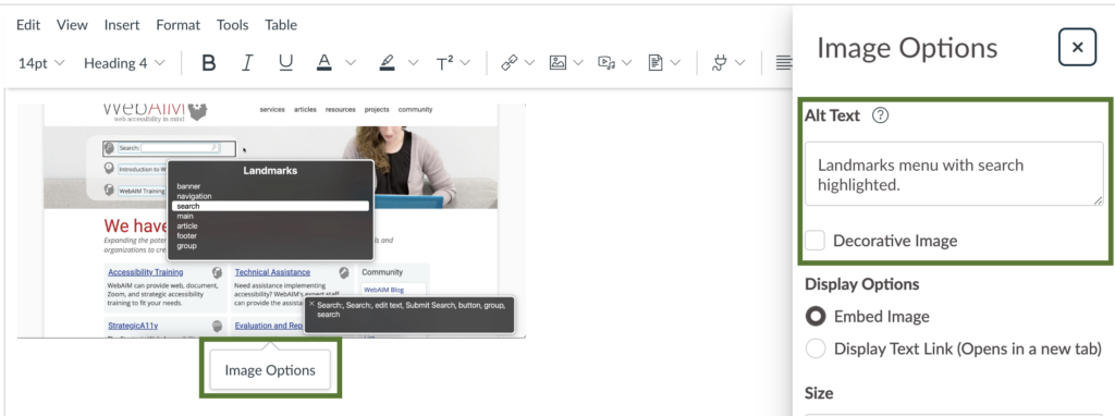
- In Canvas, edit the content with the image.
- Select the image then Image Options.
- Add the alternative text to the Alt Text field or select the Decorative Image checkbox.
- Scroll down and select Done.
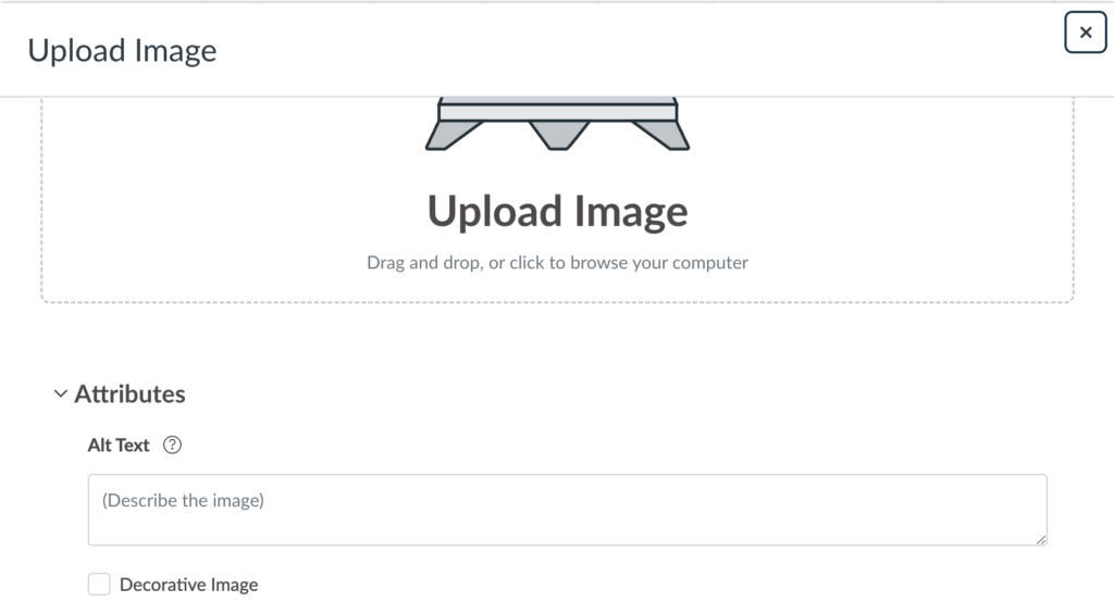
PRO TIP: You can also add alt text to images when uploading them. In the upload dialogue box, scroll down to the image’s Attributes and add the alt text to the Alt Text field.
Canvas Accessibility Checker
If your image is missing alternative text or has alternative text that has a filename extension, Canvas’s Accessibility Checker detects it and helps you fix it. Learn how in our Canvas Accessibility Checker video.
Alternative text examples
Example 1 – Functional images
Often, we try to make the homepage look interesting and organized with icons and images. On the Canvas front page below, there’s a button that’s an image, and the front page also has numbered icons for weeks 1-15. The button image says, “Start here” and links the student to a welcome announcement. Each numbered icon links to that week in the course.
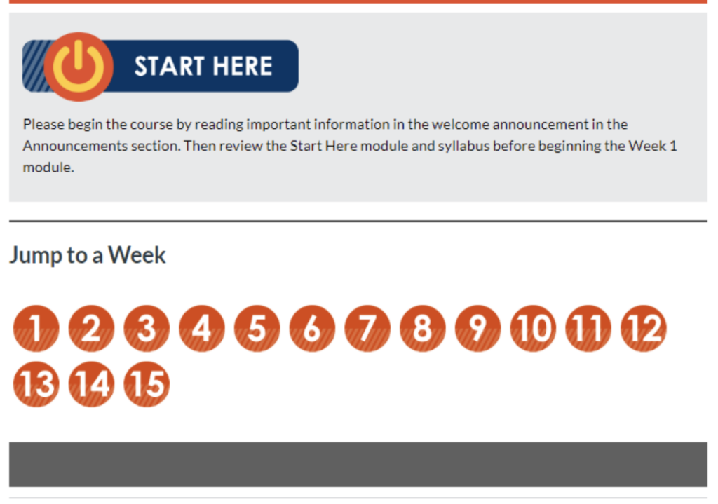
Because each of these is an image that is also a link, they each need alternative text that describes where the link goes. For the “Start here” button, the alternative text could be as simple as, “Start here”. Each numbered icon’s alternative text could be, “Week 1”, “Week 2”, “Week 3” and so on.
Now, when a screen reader gets to that image, it’ll announce that alternative text and give the user the same content visual users are getting.
Example 2 – Informational image
In this example, I’m adding this color emotion guide image to a marketing course. This image conveys a lot of information. There are seven colors with text saying what emotion that color stands for plus over 100 logo examples.
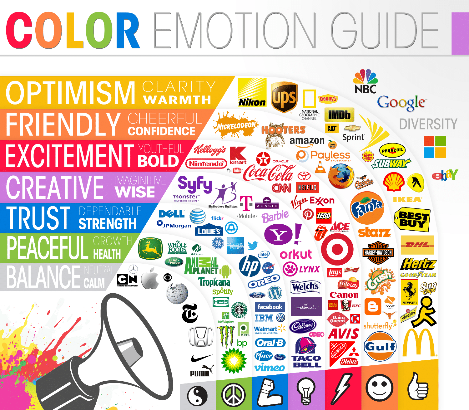
Since there’s a lot of content, it’d be best to put the alternative text near the image in the page’s content. All students would benefit from content pointing out the key points of this image, and it’ll keep the alternative text for screen reader users easier. Since the alternative text is in the page’s content, the image should be marked as decorative in the Image Options. That way screen readers ignore the image.
Next, I need to decide what’s the purpose of this image. Is it what the colors mean? Is it the specific logo examples? To me, the purpose is the emotion each color represents. Then, I can give some of the popular examples. If it was every logo example, the best option would be to make a table organizing the logos by color.
Now, I can write the alternative text, which could be:
There are common colors used for logos because those colors represent a specific emotion. They are:
- Yellow is optimism, clarity, and warmth. Some brands that use yellow are McDonald’s, National Geographic, and Best Buy.
- Orange is friendly, cheerful, and confident. Some brands that use orange are Nickelodeon, Amazon, and Fanta.
- Red is excitement, youthful, and bold. Some brands that use red are Cococola, Nintendo, and Target.
- Purple is creative, imaginative, and wise. Some brands that use purple are Taco Bell and Yahoo.
- Blue is trust, dependable, and strength. Some brands that use blue are Lowe’s, HP, and Dell.
- Green is peaceful, growth, and health. Some brands that use green are John Deere and Whole Foods.
- Gray is balance, calm, and neutral. Some brands that use gray are Apple and Wikipedia.
Example 3 – Informational image
Let’s do one more informational image. Here’s our Canvas content – a list of lab procedures with an image of a student looking through a microscope.

Let’s determine if this image is decorative or informational by answering these questions:
- Does this image add needed content? No, because the lab procedures go over needing goggles, a mask, and using a microscope, which is what the student in the image is doing.
- Would any information be lost if this image was deleted? No, because the lab procedures cover the needed information the image also depicts.
- Would alternative text on this image give meaningful information to a screen reader? Yes, safety gear is important and this image reinforces that idea. It should also be reinforced to screen reader users.
This image could go either way since the accompanying content covers all the content the image depicts. But, as the author, I decided to add alternative text because I added the image to reinforce the lab expectations, so I want to reinforce this using alternative text too.
I’d add this alternative text to this image, “Student with safety goggles and mask looking through a microscope”.
Example 4 – Charts and graphs
It’s common for courses to use charts and graphs to show information. Unfortunately, these are usually images. Giving alternative text describing every data point isn’t helpful. Here’s what you could do instead:
- Include alternative text that describes a trend or important point depending on what the purpose of the chart or graph is.
- Put the data in a table format too. This format is more accessible and lets screen reader users explore each data point.
Here’s a graph of fruit sales.
If the purpose is to identify the fruit that’s selling the least, the alternative text could be: Blueberries sold the least at 60 units. They’re 40 units below the next fruit, which is watermelons at 100 units.
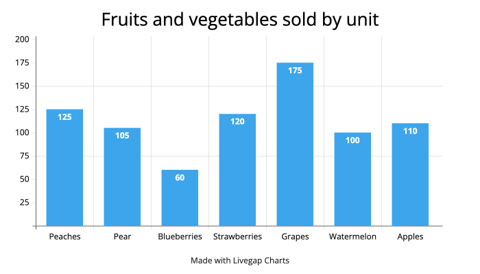
Now let’s pretend the context is just a general overview of sales. The alternative text would change to be something like: Fruit sales bar graph. Sales range from blueberries at 60 units to grapes at 175 units. Peaches, apples, watermelons, pears, and strawberries range from 100 to 120 units.
When the chart or graph has several data points, it’s not realistic to put every point in the alternative text. That’s why it’s important to understand the question you’re trying to answer in the context and to use tabular data to give every data point.
Alternative text resources
If you want to learn more about alternative text, check out these resources:
- What alternative text is, when to use it, and how to write great alt text
- Alternative text in the wild: 5 alternative text examples
- Alternative text YouTube playlist

Headings
What is an accessible heading structure
Accessible Canvas courses use headings to organize the content on the page. For most course content, this means heading 2s that describe the broader main ideas. Then, heading 3s are under heading 2s for even more specific ideas.
PRO TIP: Headings improve the readability of a page because they chunk the content. This can make it easier for students to read your content.
How to create an accessible heading structure
To create an accessible heading structure, there are some heading issues to avoid. Plus, there are some questions you can ask yourself to help create a logical heading structure.
Common heading issues to avoid
An accessible heading structure is logical, so it makes sense when a user navigates the page by headings. To keep your heading structure logical, avoid these issues:
- Empty headings: This is a heading block without any content. Sometimes, they’re used to add spacing to a page. But, these blank headings end up in the screen reader user’s heading list, which is confusing.
- No headings: This is when no headings are used on the page. This could be okay for content pages with little content. But, if there are multiple ideas, use headings to organize them and chunk up the content.
- Skipping a heading level: This is when a heading level is skipped when descending headings. An example of a skipped heading would be going from h2 to h4 without having an h3 between them. An h4 back to an h2 is not a skipped heading. Visually, these don’t look like an issue, but skipped headings are confusing for screen reader users because they rely on hearing a heading structure to help them understand and navigate the page.
PRO TIP: Use CSS styling to make text larger – don’t apply heading styling. This could cause a skipped heading level. But, even if it doesn’t, this is confusing because paragraph text is now part of an assistive technology user’s heading list, which they use to navigate.
Questions to help create a logical heading structure
To create a logical heading structure, start by outlining your content. Some questions to help you know when to make a new subheading are:
- Is this a new idea/topic within the heading level above it?
- Is there enough content (1-3 paragraphs) to support a new heading?
- Does my previous heading have too much content? Should it be broken up into subheadings?
- Should this idea/topic stand out in the content?
Heading structure example
Here’s an example heading structure with issues. There’s an empty heading, skipped heading, and paragraph text with heading styling. So, this is the heading structure a screen reader would announce:
- H1: Syllabus
- H2: General Course Information
- H2: Contact Information
- H4: Instructor (Skipped heading)
- H4: Teacher Assistant
- H2: Course Description
- H3: Learning outcomes
- H3: Communication expectations
- H4: Email responses take 1-2 business days during the business week. (Paragraph text with heading styling)
- H2: Assignment and Assessments
- H2: Policies and Procedures
- H2: (Empty heading)
- H2: Student Resources
- H2: Schedule
Here’s the same heading structure with the empty heading, skipped heading, and paragraph text with heading styling fixed. It’s more logical and accessible.
- H1: Syllabus
- H2: General Course Information
- H2: Contact Information
- H3: Instructor
- H3: Teacher Assistant
- H2: Course Description
- H3: Learning outcomes
- H3: Communication expectations
- H2: Assignment and Assessments
- H2: Policies and Procedures
- H2: Student Resources
- H2: Schedule
Accessibility Guide users
The Accessibility Guide finds every heading instance, so you can easily review your heading outline and adjust the headings directly in the Accessibility Guide. The Accessibility Guide then applies these changes to your content for you. Learn how in the Skipped heading level Accessibility Guide YouTube video.
Canvas Accessibility Checker
Canas’s Accessibility Checker finds and helps fix long headings and skipped heading levels.
Heading resources
If you want to learn more about headings, check out these resources:
- 5 heading accessibility issues and how to fix them
- How to create better (and more accessible) heading structures

Tables
What are accessible tables
Accessible tables have specific HTML code a screen reader uses to navigate and announce the table.
Using the correct code means screen reader users can skip the table instead of tabbing through each cell. It also means the screen reader announces how many columns and rows there are and announces the heading cell related to the data cell while they navigate the table. This is extremely helpful for users who listen to the table data.
The HTML code needed is:
- The table header
<th>tag. Table headers can be assigned to the first row, column, or both. And, when the table has headers, the screen reader announces the header before the data in the cell, so the screen reader user knows what heading the data is associated with. - The scope attribute
<scope>added to the table header<th>tag. Scope tells the screen reader if the header is a column or row header. - We suggest adding a caption with a
<caption>tag. A caption is like a heading for the table, so it should describe what the table is about. The screen reader announces the caption before reading the data in the cells. - Complex data tables should use a summary. A summary describes the layout of a table and is only needed for complex tables with unusual structures. It can help users understand how to navigate the table.
PRO TIP: Avoid using tables to create columns in your page’s overall structure and design. Instead, use CSS to design Canvas content, your institution’s pre-built templates, or our free Canvas course template from Google Drive (.imscc file type) (which uses CSS to get columns).
How to create accessible tables
Canvas’s editor is capable of creating simple accessible tables. You can also use the HTML editor to create accessible tables. We’ll go over both.
Accessibility Guide users
The Accessibility Guide adds row or column headers and a caption for you. Learn how in the Layout table errors Accessibility Guide Youtube video.
Canvas Accessibility Checker
If your table is missing a caption, table header, or scope attribute, Canvas’s Accessibility Checker detects and can help fix that issue. Learn how in our Canvas Accessibility Checker video.
Make an accessible table using Canvas’s editor
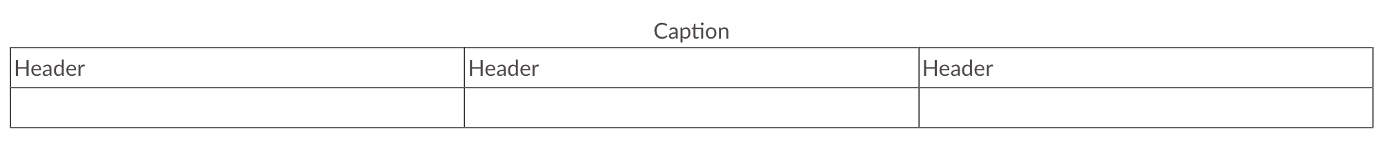
Canvas’s editor only makes accessible tables with column headings meaning the headings are in the first row and are over each column like this:
| Column heading | Column heading |
|---|---|
| Data cell | Data cell |
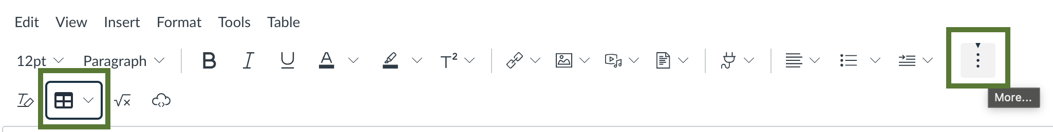
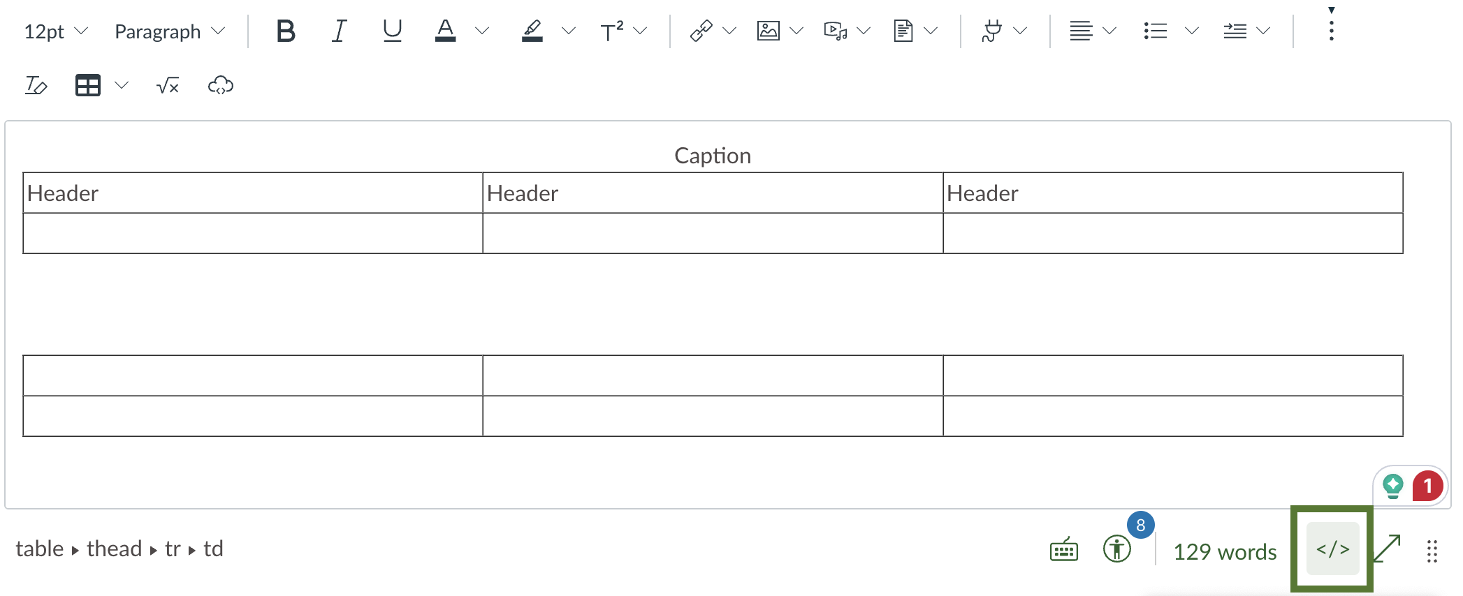
- In Canvas, edit the content where the table will go.
- In the toolbar, select More.
- Select the Table dropdown. Then, select Table and choose how many cells you need. This adds the table to the content editor.
- Make sure your cursor is in the top row.
- Select the Table dropdown again. Then, select Row > Row properties.
- Select the Row type dropdown > Header > Save. The top row is set as a table header in the HTML code. It also has the scope attribute.
- Select the Table dropdown one last time. Then select Table properties > Show caption checkbox > Save. There’s a space above your table where you can add a table caption.
Make an accessible table in Canvas’s HTML editor
If you want row headings or both column and row headings, create your table in Canvas’s HTML editor. We’ll make it easy with HTML snippets you can copy and paste.
- In Canvas, edit the content where the table will go.
- Below the editor, select the HTML editor button. Select it again to go back to the visual editor.
- Find where you want your table to go on the page. You can type “Table here” where you want your table while on the visual editor. Then, when you go to the HTML editor, use Command/Control + F and type in “Table here”. This can help you navigate the HTML editor and find where you want to be.
- Copy and paste the HTML starter table code below.
- Add additional data cells, and fill in your data.
Row headers in the first columns:
<table>
<caption>Add table description</caption>
  <tr>
    <th scope="row">Add row header</th>
    <td>Add data</td>
    <td>Add data</td>
  </tr>
  <tr>
    <th scope="row">Add row header</th>
    <td>Add data</td>
    <td>Add data</td>
  </tr>
</table>
Column headers in the first row and row headers in the first column:
<table>
  <caption>Add table description</caption>
  <tr>
    <td></td>
    <th scope="col">Add col header</th>
    <th scope="col">Add col header</th>
    <th scope="col">Add col header</th>
  </tr>
  <tr>
    <th scope="row">Add row header</th>
    <td>Add data</td>
    <td>Add data</td>
    <td>Add data</td>
  </tr>
  <tr>
    <th scope="row">Add row header</th>
    <td>Add data</td>
    <td>Add data</td>
    <td>Add data</td>
  </tr>
</table>
Table resources
If you want to learn more about tables, check out these resources:
Links
What are accessible links
Accessible links are descriptive meaning they explain where the link goes.
This is important because screen reader users tab through pages using links. If the link says “click here” the student gets no context as to where the link goes.
Accessible link examples
Here are examples of rewriting links so they’re descriptive.
Example 1
FROM: Click here to download the syllabus.
Example 2
FROM: For more on accessibility strategies, review this YouTube video: https://www.youtube.com/watch?v=IGYlUP6dRfY
TO: Review Build an accessibility strategy in your organization for more information.
Accessibility Guide users
The Accessibility Guide finds suspicious link text (non-descriptive link text). You can re-write the text and apply changes from the guide. Learn how in the Suspicious link text Accessibility Guide YouTube video.
Link resources
Learn more about accessible links with these resources:

Contrast
What contrast is
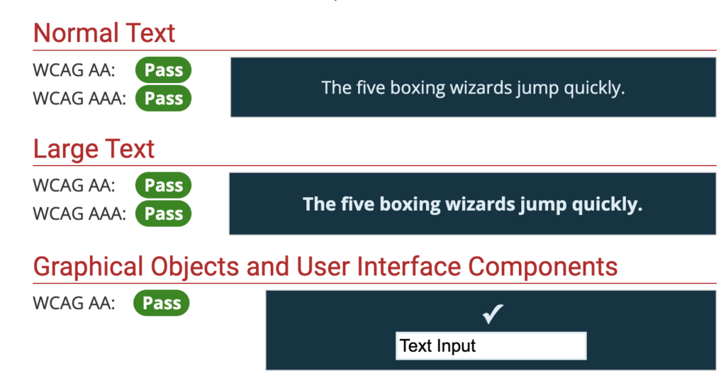
Contrast is the difference between two colors. All users benefit from enough contrast, but low-vision users might not properly see an image or text without proper contrast.
What the contrast ratio is
The contrast ratio is how the difference between two colors is measured.
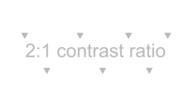
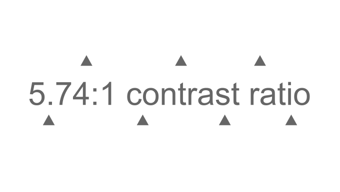
The ratio can range from 1:1, which is the same color for the foreground and background, to 21:1, which would be black and white for either the foreground or background.
For example, the contrast ratio for the light grey foreground and white background below would be 2:1, and the contrast ratio for the dark grey foreground and white background would be 5.74:1.
Make sure you meet contrast requirements
Text and non-text elements (graphics, buttons, images, etc.) have specific contrast requirements. There’s a way to make sure you meet those when creating graphics without knowing all the details, and that’s with the WebAIM Contrast Checker.
The WebAIM Contrast Checker compares two colors and then tells you if they meet contrast requirements for normal/body text, large/heading text, and graphical objects like charts or infographics.
Review Color contrast accessibility tools with examples for steps and a video on using the contrast checker.
How to check contrast requirements
Accessibility Guide users
The Accessibility Guide automatically checks large and small text contrast. You can adjust the text color to an accessible color directly in the Guide. From there, the Guide applies the changes for you. Learn how in Low contrast errors Accessibility Guide YouTube video.
Canvas Accessibility Checker
The Canvas Accessibility Checker detects and can help fix contrast issues. Learn how in our Canvas Accessibility Checker demo video.
Here’s a dark blue button with light blue text that says, “Syllabus.” I need to check the contrast ratio between the text and the button color. I also need to check the contrast ratio between the button and the background color.

PRO TIP: The text and background color are the same. So, I just need to pull the text and button color to check the contrast between the text and button and the contrast between the button and background. I’d also need to pull the background color and check it with the button color if the background color was different.
If you can get the hex code for your colors from your design tool, copy and paste them into the contrast checker. If you need help finding your colors, follow these steps:
- Open WebAIM’s Contrast Checker.
- Split your windows, so you can see both the contrast checker and the window with the colors you need.
- On the contrast checker, Select the Color Picker field.
- Select the Color Picker icon.
- Select the first color. Repeat for the second color.
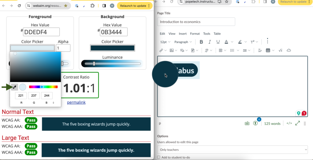
Now you can review your contrast ratio and whether it meets requirements.
The contrast ratio for the button and text color was 11.01:1, which meets requriements for Large text, so the text with my button color is good.
The contrast ratio for the button and the background color is also 11.01:1 (because the colors were the same), so it also meets requirements for graphical objects.
Contrast resources
Learn more about contrast and accessibility with these resources:
- Color contrast accessibility requirements explained
- Color contrast accessibility tools with examples
- Accessible color contrast requirements with examples (YouTube video)
Documents
Different document types have different steps for making them accessible. But, several of the accessibility strategies we’ve gone over still apply:
- Alternative text on images
- High enough contrast for text, images, and graphics
- Proper heading hierarchy
- Descriptive links
- Only use tables to display data
Accessibility Guide users
The Accessibility Guide automatically finds links to PDFs, Word documents, PowerPoints, Excel documents, and other non-HTML documents. Learn how to check a PDF’s accessibility in our PDF document YouTube video or How to check and fix PDF accessibility issues.
PRO TIP: Word, PowerPoint, PDF, and Excel documents aren’t as inherently accessible as HTML web pages. That’s why we suggest creating all your content as Canvas pages (or other content types) as much as possible.
Accessible document resources
If you want to create accessible documents, check out these resources:
- How to check and fix PDF accessibility issues
- WebAIM’s Accessible PDFs guide
- WebAIM’s Accessible Word docs guide
- WebAIM’s Accessible PowerPoint guide

Videos
What are accessible videos
Videos with audio need specific components to be accessible:
- Captions: Captions are the text of the audio in a video. It includes what’s spoken, who’s speaking if it isn’t obvious, music, or noises. Captions are synchronized with the visual content.
- Audio descriptions: Audio descriptions tell users with visual disabilities what’s happening on-screen. They have the original voice-over plus any voice-over needed to describe what’s happening on-screen.
- Transcripts: Transcripts are the text of the audio, which includes what’s spoken, who’s speaking, music, and noises. They are NOT synchronized with the video or audio. The transcript or link to the transcript can go directly below the video or audio file.
PRO TIP: When possible, integrate the audio description into the original script. This counts as your audio description because you’re saying the important information on-screen. For example, if you’re sharing a slideshow, you would say all the text and describe any important visuals in your narration. This is the easiest option and should work for most videos.
Check the videos you link to
Videos you link to should be accessible, so you should check them to make sure they have captions, audio descriptions, and transcripts.
First, turn the video captions on to make sure they are correct. If there are several issues with the captions, it isn’t an accessible video.
If the video is on YouTube and has good captions, it also has a transcript. Select …more on the video description and scroll down to the Transcript section. Then, select Show transcript.
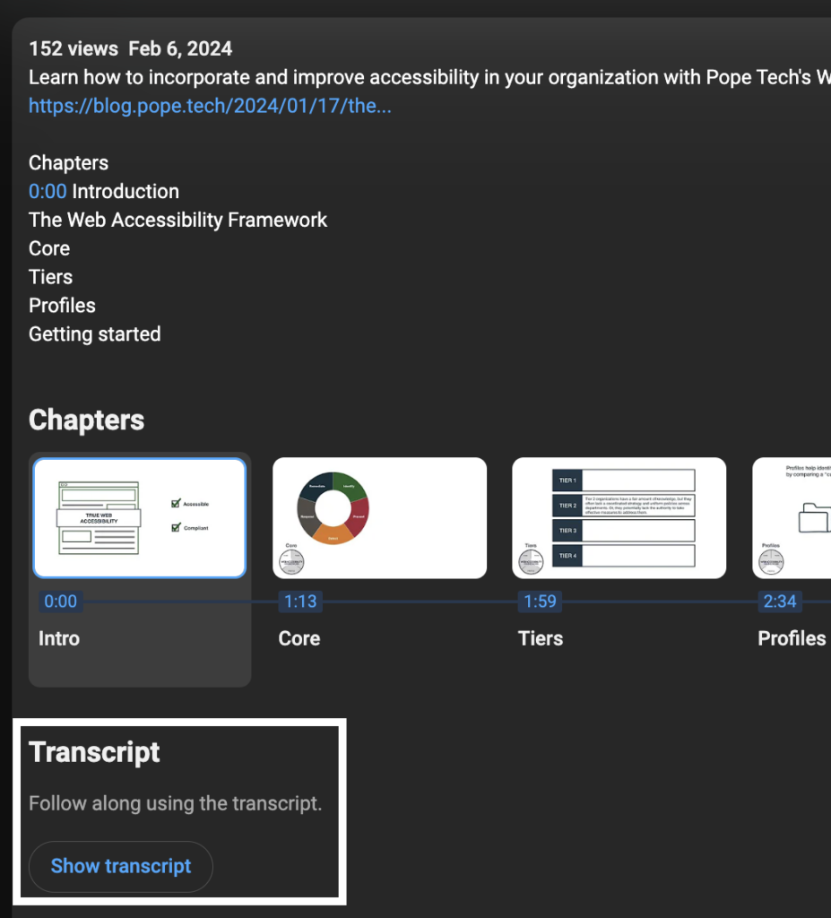
Otherwise, look for a link to a transcript or a button in the interface to display the transcript.
Lastly, make sure the video has an audio description. Audio descriptions don’t have to be separate narration dictating what’s happening on screen. They can be part of the original narration as long as the original narration says any text on the screen and describes any visuals.
Accessibility Guide users
The Canvas Accessibility Guide detects YouTube links and embeds, so you can review the video. Learn How to check YouTube video captions for accuracy (YouTube video).
Make accessible videos for your Canvas course
If you’re making a video for your course, here’s a way to quickly make an accessible video:
- Create a script with the audio description part of it. If you start with a script, you don’t have to spend as much time typing captions and can make sure your audio description is incorporated. Remember to include any text on the screen and describe important visuals.
- Upload the video to your media player.
- Add your script as the captions – make sure it’s still accurate. If you’re using YouTube, use Auto-Sync and just paste your captions in. YouTube will automatically create the time stamps.
- Turn your script into a transcript by adding any formatting like paragraphs. YouTube videos automatically generate a transcript using your captions.
- Link or add the transcript below your video.
Now, your video has captions, an audio description, and a transcript.
Video resources
Check out these resources to learn more about accessible videos:
- How to make videos and audio accessible
- How to create audio descriptions for accessible YouTube videos
- Easy way to create accessible videos with audio

Text writing and formatting
How to format and write more accessible and readable text
Improving your course’s text makes it easier for all users to read and understand. Here are five strategies to make your text better for everyone:
- Use paragraph breaks. This adds white space making it easier for users to read or skim the content.
- Use plain words and avoid jargon. For example, instead of saying “utilize” just say “use.” Or, instead of saying “inquire” use the word “ask.”
- Use short sentences. Write sentences with simple structures instead of adding subordinate clauses and conjunctions.
- Write in active voice. Active voice sentences are when the subject performs the verb versus passive voice where the grammatical subject receives the verb. For example, “Sasha catches the ball” is active. “The ball was caught by Sasha” is passive.
- Write at an 8th-grade reading level for a general audience. You can check your own writing using this Flesch Kincaid Calculator.
Text issues to avoid
These are three text issues to avoid. Each of these can cause accessibility issues for users with low vision or cognitive disabilities.
- Very small text (10 px or less) is difficult to read. To fix it, either increase the size in your content editor or adjust the font size in the CSS.
- Justified text is difficult to read because of the varying size of spaces between words. To fix it, remove the justified text styling.
- Underlined text can be mistaken for links. To fix it, remove the underline and choose another way to emphasize the text like bolding.
Accessible text resources
Learn more about writing and formatting text with these resources:
- A beginner’s guide to accessible text
- Five tips for formatting more readable and accessible text (YouTube)
- Five tips for writing more readable and accessible text (YouTube)
Get started with Canvas course accessibility
The best way to start making your courses more accessible is to use these strategies whenever you create new or edit existing content. Often, instructors don’t have time to go back and fix entire courses, so starting small and applying accessibility strategies as you go is a great place to start.
Looking for a way to simplify Canvas Course accessibility?
Pope Tech’s Canvas accessibility solution helps everyone, admins and instructors, create more accessible courses.
Admins get the dashboards and scalable tools needed to create change, and Instructors get personal dashboards and the Accessibility Guide, which quickly helps fix accessibility issues.